HOME | DD
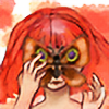
 LemonWizard — Face Practice (Prints available)

#loish #redhead #study
Published: 2016-07-15 15:25:42 +0000 UTC; Views: 457; Favourites: 19; Downloads: 0
Redirect to original
Description
My first stylus drawing! This was made with the help of a tutorial by Prints are available for $10, send me a noteRelated content
Comments: 18

Project Comment:
I'm sorry it took so long to comment, I'm busy, but I saved this because I really wanted to talk about it. It's a striking image. The colors pop and the shadows are dark enough to make the lighter areas really stand out. I like your treatment of the lip color, the nose contours and the shadows in her hair behind her neck; your use of multiple hues in her hair add realism and interest.
But what most grabbed my attention are her eyes. The way you've depicted them is intriguing and unusual. I'll tell you what they tell me, and you can decide if that was your intention. The eyes make her look robotic. I don't mean empty or expressionless. I mean, mechanical. Not only are the irises much larger than normal (which I grant may merely be stylistic), but the orange ring between iris and pupil is not a normal feature of human eyes. This ring gives new meaning to other details, such as the short radiating lines of texture you've included in the irises. Within the context of robotics, those highlights take on new significance.
I think Dranica said about all I'd say by way of room for improvement. Despite the shading on her shoulders, the lack of shading at the edges of her hair, and the sides of her cheeks makes her look a little flat. I know it's daunting and difficult to shad a face and still maintain a feminine look. But give it a shot. You've got a good eye for how and where to add it, in general. You highlighted her chin, rosed her cheeks and put slight shadow on her lower lids--great stuff. You might add highlights to the bridge of her nose and her clavicles, too, though, as well as above her eyebrows.
Nicely done. I look forward to your other works.
👍: 0 ⏩: 1

Thank you! I didn't intend for her to look robotic, but that was an observation I made. I wanted to give her an intriguing look in a simple, quick way and that's what came out of it. Thank you for your advice!
👍: 0 ⏩: 0

Hello, I'm from Project Comment !
I really like this, the skintone is really nice, well shaded. It looks like an actual skin tone which can be hard to achieve. You're really good at highlighting and shading, especially the hair, it looks spot on! I can't get over the hair honestly, its so pretty. You have the highlights and shades looking natural without blending them into nothingness and they follow hoe the hair would fall (not just straight down). There's only two things I want to nit pick on. One, I can still see some of the guidelines under the main picture. I'm sure its probably a style choice but it tends to be a pet peeve of mine personally. The other however is the shading for the iris. First tip I would have is normally the outside ring around the iris is darker then the main underlying color and its usually a little thinner. The other being that where an iris is close to an eye-lid there would be a slight shadow close to the area. It's a little hard to pinpoint where your light-source is coming from, but unless its directly head on, there should be more variation to the base color underneath the radial lines. I see the gradient there already but maybe bring it out a little more because it still feels a bit flat. Now the radial lines look great, the only thing I would do is blend them a little more just at the edges but that's a style choice more then anything. And seriously, when the worst thing I can be critical about is something as small as iris gradient you know you've done good! (I'm not going to be getting over this hair, I'm so jelly of your hair skills)
👍: 0 ⏩: 1

Thank you so much for the encouraging and helpful comment! I'll be sure to look out for the things you mentioned in my future pieces 😄
👍: 0 ⏩: 0

for Project Comment
The overall impact is nice, the colors are pleasing and soft shaded, her anatomy is quite right, she got very nice lips, and a little nose, she's delicious
But her eyebrows are strange, in a female portrait is hard to find such big eyebrows, when I draw a female I usually make her with smaller eyebrows. The shading of her face is good but can be improved. More shading on her glabella and on the right side of the nose could make this painting look better. This looks like a fast unfinished piece and more shading could make it looks better, is a nice piece but it lacks of volumes. The hairs are ok, they got a nice soft orange and they look good, but the left shadow, near her neck is a bit imprecise. Her nose is nice, lovely but still misses shadows on the right and the left side of her nasal bone. I've seen cartoons with only the point of the nose shaded but since you've put a line on the right part of her nose you can't ignore the shading because than the nose looks odd. The cheecks are nice
My general opinion is "a nice painting but more can be archived with a better and precise shading, this painting misses some volumes that would make it shine!".
👍: 0 ⏩: 2

Thank you so much! I was trying to do a quicker piece, but it seems like I could still achieve that while taking your advice. Thank you once again for your input
👍: 0 ⏩: 1

You're welcome! 

👍: 0 ⏩: 0

example of what I mean from a random painting found here on dA: It's sketchy and not completed imo but there are all the shadows and the shading that makes this painting looks good
👍: 0 ⏩: 0

The colors are absolutely beautiful in this, I love how the vibrant orange color of her hair matches her rosey cheeks, nose, and lips 
👍: 0 ⏩: 1

Thank you so much for the kind words and suggestions! I wanted to try to keep it a bit sketch like, but I did it in all the wrong places XD I'll work on that and adding more detail where it's needed I'm also struggling with the pressure sensitivity still, but I'm working on that too 😂
👍: 0 ⏩: 0

I use the Apple Pencil. It felt kinda weird using a stylus when I always use my finger, but I gotta learn eventually. You should check the tutorial out! Mine looks really different and not as professional 😅 but the steps were really helpful. It helped me draw a face a lot faster than I normally do.
👍: 0 ⏩: 0


👍: 0 ⏩: 1


