HOME | DD
 Lub — 'a r m o n i a ...,

Published: 2005-10-22 15:58:00 +0000 UTC; Views: 7160; Favourites: 159; Downloads: 936
Redirect to original
Description
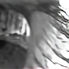
hey all im back, i had so much fun doin this one, i was bored and decided to play with illustrator and ps n this is what came out, i hope u all like it.Related content


Comments: 90


me agrada, es una combinacion sencilla pero efectiva si se le sabe explotar de la manera mas mañosa, excelente resultado, hubiera casi jurado que lo hiciste a manita! !!!
👍: 0 ⏩: 1

Ese fue el plan!
Empezo como vector luego se paso a photoshop hasta que hice ese efecto natural, espero hacer algo asi a mano pronto... gracias
👍: 0 ⏩: 0
muchas gracias, que bueno que te haya gustado
👍: 0 ⏩: 1


wow me gusto mucho sobre todo los colores de fondo ,se ven algo humedo
👍: 0 ⏩: 0


Is there any way to see the full full full size version? I would love to check it out!
")
👍: 0 ⏩: 0


Me gusto mucho esta, apenas estoy emepezando con illustrator, y ni idea tenia de que cosas se pueden hacer jajajaja, pero un paseo por tu galeria ya me dio una muy buena idea.
👍: 0 ⏩: 0

I thought I was watching you! I missed some things, gotta catch up.
👍: 0 ⏩: 0

Gorgeous! I love the colour and composition.. ah.. everything!
👍: 0 ⏩: 1

It looks amazing ! The colors are so beautiful and your whole work looks so pure and soft…
👍: 0 ⏩: 1


wuuuua thats nice  (Smile)")
 (Wink)")
👍: 0 ⏩: 1
all photoshop
👍: 0 ⏩: 0
it is very beautiful...the colours flow together nicely!
👍: 0 ⏩: 1
ty so much
👍: 0 ⏩: 0

Wow, here is an interesting one (I seem to say that in each one I see). You can see a slight difference in your style with this one, but it still holds tight too many of the techniques that you are known for. And I am sure that there are reasons for the slight change.
Starting with the obvious, this image compared to many of your others is quite small. As you said, the original was larger, and I would have personally liked to see a little larger one. It would have allowed for better viewing on the styles that you did, but I can understand with this size. It fits well for all screen resolutions and makes it easy to view (with no scrolling).
Now, the flower in the center is really good. Is that a stock photograph or something you actually drew? It looks like a drawing too me, and a really good one at that. The flower seems to be transparent, just slightly. And the roots of it sit upon a mesh of paint and spots.
When I see this, I think of beauty. The saying goes that beauty is only skin deep or it could be transparent as some say. One may try to pass as beautiful, but down deep they are just glass, hollow shells that has no purpose. The flower is not planted, having no way to gain nutrients, and thus will eventually wither and die. A tragic end to a flower, but when it has no place to grow, that is its fait. The mesh of paint and spots, the true nature of the world around; it wants to be beautiful, it wants to stand strong, but the world is smothering it, not allowing it any chance to survive. It will stand strong for a while, but eventually the toll will come, and then the signs will be noticeable.
I really like this, and I cannot really think of anything that I would try and improve. While I personally like to have things off center, this one works well as it is, and does not need that. The main focus is the center, for that is how beauty is; it wants to be the center of attention.
👍: 0 ⏩: 1
ty so much, sorry for the late answer, im a ll bit busy laterly with school and hw, im glad how this one came out
👍: 0 ⏩: 0


Armonia:
*Equilibrio, proporción y correspondencia adecuada entre las diferentes cosas de un conjunto
*Relación de paz, concordia y entendimiento entre dos o más objetos
Sip, lo lograste sin duda alguna
Me encantan los colores y las flores.
Sin dudarlo
👍: 0 ⏩: 1
muchas graciaz

👍: 0 ⏩: 1


The roughness + colours makes this piece spectacular, that flower is nice as well. I swear i've seen it somewhere else though?
👍: 0 ⏩: 1
maybe
👍: 0 ⏩: 0

Wonderful, i love how the background looks like paper.
👍: 0 ⏩: 1
OH. MY. GOD.
Just when I thought you couldn't get any better!!
Superb!!
👍: 0 ⏩: 1

That does look very cool. I can lose myself in those colours. Very nice piece.
👍: 0 ⏩: 1

")


Oh god this is absolutely gorgeous.
I love the way you made it look like a watercolor painting. I've always loved the splattered mottled look.
👍: 0 ⏩: 1
| Next =>