HOME | DD
 makeaseen — Listen Up.

Published: 2009-08-04 19:21:16 +0000 UTC; Views: 1497; Favourites: 38; Downloads: 74
Redirect to original
Description
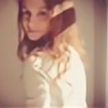
I didn't intend for it to be depressing... but it ended up that way. (Smile)")
15 minutes in my sketchbook. 15-20 in PS Elements 7. Woot.
Brushes from Obsidian Dawn.
No, he's not supposed to look like the Pon and Zi cartoons. I probably should have picked a different color for him though. His color's very similar... but I couldn't find my lavender colored pencil! So now he's blue. :3 I added more blueness on PS because he looked washed out. .__.
Related content


Comments: 22

So sad  - :(")
It's so true as well.
👍: 0 ⏩: 0

Nice. I like the concept behind this piece, and the textures are really good.
👍: 0 ⏩: 1


Awww, he looks so sad T_T
I love your style of art and you colored it wonderfully^^
👍: 0 ⏩: 0

I really love the concept of this. it's just wow.
So lovely <3
👍: 0 ⏩: 0

this is cool...
the gritt adds loads to the image...
very lovable character...
sw33t work...XD...
👍: 0 ⏩: 0


This totally looks like a CD cover. Somehow, your drawings fit really well with with digital additions...D8
👍: 0 ⏩: 1

I can't figure out how to take that comment.
")
👍: 0 ⏩: 1
Lol, you can take it as a compliment!
 (Wink)")
👍: 0 ⏩: 1
okay. :] Then thank you! Though I don't see the whole CD cover thing... maybe it's because it's square shaped. lol
👍: 0 ⏩: 0

I really like the concept and the overall piece from the expression to the text. The colours, I feel, are just right.

👍: 0 ⏩: 1
thank you!
👍: 0 ⏩: 0

That's such a cute drawing! The colours and the textures look great!
Poor little guy...
👍: 0 ⏩: 1
Thanks! He is quite sad. I wonder why. LOL. You'd think I'd know...
👍: 0 ⏩: 0

This is fantastic I love it, I am going to put it in my journal under the feature 15 posting later today (-;
👍: 0 ⏩: 1