HOME | DD
 Manuverse — LUM Poster Complete

Published: 2005-08-26 23:32:01 +0000 UTC; Views: 3308; Favourites: 39; Downloads: 155
Redirect to original
Description
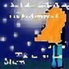
This is the finished version of my previous submission. Like i said before this is for a poster i am designing for the club im a part of. I decided that this one belongs in the digital art category because i spent more time colouring and touching up the pic on my PC than i actually spent drawing and inking it. Anyhoo. I guess its obvious that L.U.M. also stands for Lakehead University Manga in this Poster. (That is why LUM is our mascot... Well other than the fact that she's so freaking cool!)My friend also has a similiar drawing that he based of my original rough draft. Please check his out too, or i will be very sad.
[link]
Update: I resized the image so it will load faster.
Related content


Comments: 116

this one is pretty nice, it could use a little bit more bold shading and some highlights on the skin... but it's pretty good otherwise
👍: 0 ⏩: 1

Hehe. This is an old one, back when i had barely any clue about how to use paint shop pro (the program i was using before i got photoshop) for coloring.
👍: 0 ⏩: 0

My God! You drew a poster for a rival Anime Club? You bastard! I kinda like it though! ^_^
👍: 0 ⏩: 1
Heh..... Um... To tell you the truth, Kris... Im one of the 5 regulars at LUM....
👍: 0 ⏩: 1
I know. You poor poor boy. Oy.
👍: 0 ⏩: 0

I CAN'T BELIEVE I HAD'NT FAVORITED THIS!!!!!!
Oh my god, I'm a horrible person.
👍: 0 ⏩: 0

I really think this is your best picture. And i think everyone else think so too! ^^
👍: 0 ⏩: 1
19 Faves dont lie. Of course its my best
 (Smile)")
👍: 0 ⏩: 1
19 faves? I didnt even notice that!
👍: 0 ⏩: 0

Hi 

👍: 0 ⏩: 1
Its Lum from Urusei Yatsura. Actually Urusei Yatsura is by the same person as Ranma 1/2. ^_^
👍: 0 ⏩: 0


The lines are a little shaky and the skin shadows are a little off, but, looking through your gallery, I think this is your best work.
👍: 0 ⏩: 0

The highlights on her hair are super pretty, & it looks exactly like Lum 

👍: 0 ⏩: 0

")

Fanastic posing ya' got!
I like the animal print little outfit, as long as it faux fur XD
Bravo, I say. Bravo!
👍: 0 ⏩: 0

Wow, this definately looks like something you might see in an import store somewhere. I like it, and she is so freaking cool!

👍: 0 ⏩: 0


This is one of the best pieces by you that I've looked at tonight. My only issue is that the frying pan with the squid in it seems too flat. You've got the shape down, it just seems like there's something missing from it; maybe a little bit of shading?
👍: 0 ⏩: 0

I like this one...The coloring is nice especially within the hair and some of the body tones and the proportions seem very correct except for one of the boobs appearing larger then the other for some reason. I'd possibly like to see a little extra something in the background as its montoneness almost seems to flaten out your lovely lady. Other then that, the crookedness in the linework is the only other thing that bothers me and I saw that someone eles already commented on that.
👍: 0 ⏩: 0


Damn straight. She's actually my favorite anime character. Ive got a newer deviation of her in my gallery too called "Lum, Again" if you want to check that one out (Only if you want to of course)
👍: 0 ⏩: 0

Good job, love the colors. Nice detail in the hair.
👍: 0 ⏩: 1


glad ya like her. Yeah she is quite a beautiful character. Thats partly why i like her so much. ^_^
👍: 0 ⏩: 0


Hey you did a dang good job on Lum! The linework is excellent... 
I think though that Lum is done so well that the text seems a bit bland.. hm I think Lum probably deserves a snazzier text.. aside from that you did really well. Good job!!
")
👍: 0 ⏩: 0

The show she comes from is Urusei Yatsura, which is made by the same talented lady who wrote the Ranma 1/2 manga. ^_^
👍: 0 ⏩: 0

Lamu? Is that what they call her where you come from? I've always known as Lum. ^_^
👍: 0 ⏩: 0
Whoa.
...nothing more to be said, 'cept good job.
👍: 0 ⏩: 0


gotta love the manga ladies. what do you think of diablo honey i my gallery?
👍: 0 ⏩: 0


My first impression is that the best way to improve this piece is to just DESIGN it better-- work on the fonts and the placement, and make sure the elements in the image balance each other into a neat form. You should google up free fonts pick 24 fonts you like and use them, because certain fonts just look so damn generic-- like you know they came out of Microsofts OS and you've seen it before. You want piazz. I think the linework is fine what what it is, just a amateur's reproduction of Lum, the only way to actually improve upon it is to taper the lineweights, very few pros use a constant line in character work. It would also be cool to see hand details, but if you experiment and don't like what you see (probably on a new PS layer), then don't bother, because not having the hand details doesn't make it look AWFUL. I also wish your pan was rounder-- you should have used a circle stencil to plop one on.
👍: 0 ⏩: 0

This is awsome! She looks just like she is supposed to! Great job
👍: 0 ⏩: 0

Very cute, your drawing skills are great, I'm gonna go check out the rest of your stuff now, thanks for showing me!
👍: 0 ⏩: 1
This picture is my pride and joy. I worked quite hard on it and am glad you like it. ^_^
👍: 0 ⏩: 0

Lakehead University?! No way man! I go there too!
I like her outfit, hehehe, meow!


👍: 0 ⏩: 1
Thats a cool coincidence that some one else in thunder bay came across my page. Actually I dont go to LU actually. I want to be a Chef so im taking culinary management at Confederation College. However Im a regular member of the LU Manga club and currently the guy who designs advertisements for the club. We are actually in the process of getting out a 2nd poster for the club (This one was just used for club day) so if you see one pop up around the campus, im the guy who drew the picture. Anyhoo... If you like anime we are looking desperately for members now. We meet in the lecture theatre inside the agora building from 4 to 8 every saturday, just in case your interested...
👍: 0 ⏩: 1
Hey, that's awesome! I know someone who went through as a chef and it's a pretty interesting course (by the looks of it). Good luck with that!
And i'll definitely have to check out this club - as I do like anime and am a terrible manga addict.
👍: 0 ⏩: 0
| Next =>