HOME | DD
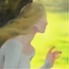
 melukilan — Pretty Cardinal

Published: 2005-10-20 05:52:19 +0000 UTC; Views: 2108; Favourites: 62; Downloads: 193
Redirect to original
Description
Not perfectly happy with my color choices, not in tears over them either. This turned out about as well as I expected it to.First in my series of 'How many different-looking pretty ladies can Rah draw without going mad or flunking college in her final term?'
Related content


Comments: 15


I think the colour choices are great ... its really a lovely picture. I actually came across it in a very strange way - someone is using it as a pic on a quizilla quiz and I thought omg that's lovely. It had your name on, so I googled that, found your elfwood gallery, and recognised the pics there with luna moths in. Ran over to dA and searched for luna moths, and voila! Your account ")
👍: 0 ⏩: 1

Hee, awesome. I actually made that quiz for a Psych project - I didn't expect it to work as advertising, too! Nice to meet you.
👍: 0 ⏩: 1
a psych project? *giggles* amazing how stuff re-appears when you least expect it!!!
👍: 0 ⏩: 0
Through the entirety of this wonderful pic, my favorite thing in it comes to be the little rose vines on her sleeve. That little detail somehow makes everything all the more perfect.
👍: 0 ⏩: 0

Love the simplistic colour job here, it goes really well with the lineart!
👍: 0 ⏩: 0

OMG I love art nouveau! This is very beautiful, expecially the skin tone!  (Smile)")

👍: 0 ⏩: 0

Wow, GEORGEOUS. The lineart and coloring are both beautiful. I do agree with the one comment above: the red is just almost a bit *too* overwhelming - you might consider just making your 'frame' a little smaller. But that is a small thing compared to the overall high quality of the picture.
...And this is the part where I demand to know how you did that so FAST. My cg's take me *forever*, so can't help wondering to myself, what am I doing wrong?? *cries*
👍: 0 ⏩: 1
Let's see. I ink the picture on paper, and scan it in. Then I have the drawing in Paintshop, and I select bits with the magic-select and fill them with the base color for that section. Sometimes I'll do all the shading while I have that bit selected, especially if it's a lot of small seperately-selected bits (like the sky behind the vines) that would be a pain to re-select. Other times, I fill a bit with the base color and then skip to the next bit, and come back when I can see better how the colors work together. If I'm working with a color scheme, I tend to keep my colors handy by putting a dot of the pure colors in some out-of-the-way, undetailed area. Then, whenever I want a particular color again, I can use the eyedropper tool to get it back. When the picture's done, I color over my palette.
I'm working on learning to use layers and do lineless, oil-painty type computer pictures, but I'm not very good at it and it makes my wrist and shoulder sore. It also takes way more time than ink-and-fill.
👍: 0 ⏩: 0

I think its lovely but its not as if you can't color the lineart again sometime, assuming you saved a seperate file for it.
👍: 0 ⏩: 0

Your skill is amazing. The balance of this picture is perfect, and really appeals to the eye. I also love your choice of colours. Wonderful work!
👍: 0 ⏩: 0

I like the effect gained with the flesh tone. Nice use of blue and/or grey to help make the subdued yellows and reds pop. It has an interesting conglomeration of textures, it seems, from somewhat cel-shaded look in the clothing, to watercolorish look with the skin.
👍: 0 ⏩: 0


the red is a little overwelming but over its a really good pic!
👍: 0 ⏩: 0