HOME | DD
 MercurytheWereWulff — What's Under the Eyepatch, Winslow?

#eye #fat #fatfur #fur #pirate #shark #special #vampire #winslow #wobbegong
Published: 2016-08-10 11:33:58 +0000 UTC; Views: 3476; Favourites: 20; Downloads: 9
Redirect to original
Description
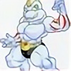
So Winslow is always wearing that eyepatch, ever wonder what's under it? Well now you know!After Yuuki's death, Winslow went on a search to find some way to defeat who killed Yuuki. This led him into Zalethe (a sort of realm for vampires...kinda like Oblivion if you need an analog?). There he was able to find a very powerful part of some special items.
What he found was the Ozemdráǧel, a jewel part of a set of jewels that belong on a crown of a long dead vampire king. Having obtained it, he needed to have it worn on him somehow but to where it would be hard to steal from him. Since Winslow already had a bad eye at this point, he underwent a surgery to replace his defective eye with the jewel.
The Ozemdráǧel is made of a Zalethian gemstone called venerite, a dark stone that if you chip away, will be iridescent underneath. There's alchemy symbols that are inscribed into it that intersect at two points. Generally he keeps this eye covered by his patch since it's powerful enough that if it's uncovered he can't control it.
What it does? You don't wanna know. (i.e.: I am still developing it)
So tell me what you think! (please feedback would be very appreciated!
 (Smile)") )
)
Related content


Comments: 39

Well looks like this fat shark is creepy when we see his creepy left (or right) eye
👍: 0 ⏩: 1

Yeah he is.
And it'd be his right eye. His left eye is normal.
👍: 0 ⏩: 1
Ok... everytime I see it, it reminds me of fradman that he passed away
👍: 0 ⏩: 1

Nice story/design, also like the big fat dude.
👍: 0 ⏩: 1
ah thank you very much! Glad you like the story and the big fat dude XD
👍: 0 ⏩: 0


Lol his eye looks like a series of Twenty One Pilots symbols
👍: 0 ⏩: 1
Lol some of the symbols just reminded me of Twenty One Pilots': brandonrike.com/wp-content/upl…
👍: 0 ⏩: 1
huh really? I don't see it.
Those symbols btw are actual alchemy symbols (except the center one).
👍: 0 ⏩: 1
Lol I didn't mean that they exactly look like them, but more that they just reminded me of them because of the style in which they're drawn and how a few of them look, that's all. A few in particular just reminded me of this one (The skeleton one): www.pinterest.com/pin/39160213… Anyways, his eye looks really cool, especially with the light colors on grey to make it really pop.
👍: 0 ⏩: 1
that link didn't send me anywhere specific, just to a bunch of results on Pinterest.
And thanks, I liked the idea of having a very dark eye with the symbols being iridescent.
👍: 0 ⏩: 1
No problem and yeah, Pinterest is weird
")
👍: 0 ⏩: 1
yeah I wish the site was better i hear it's good for picture references. But it doesn't like non pinterest users
👍: 0 ⏩: 1
Exactly! I never use Pinterest just because I don't really like it lol.
👍: 0 ⏩: 1

omfh (he's hotter up close...) Er, this is a pretty good drawing. I feel like it could be brightened up a bit, though, that way people with dimmer monitors can see it easier.
👍: 0 ⏩: 1
Well the point was to have it shadowed, having it too bright would've destroyed the mood of the pic.
While I understand some people have dimmer monitors I feel like if I did brighten it, it'd ruin the picture.
And thanks for saying he's hot? XD
👍: 0 ⏩: 1
True, but there are other ways to create a mood like that. And yw I guess, sorry if it was creepy?
👍: 0 ⏩: 1
Well if you have any ideas tell me then so I know next time if I do something along this line I can put it into practice.
It's ok actually XD I mean I don't find it really creepy (not as much as I have found other "ooh this is hot" comments) yours was pretty tame.
👍: 0 ⏩: 1
Well an easy way to create an atmosphere of mood is just contrast, which you did perfectly with Winslow's eyes. However I would recommend maybe having all of the shading around the lower half of Winslow's stomach and right between his hair and eyes, while making it so his eyes stand out while also showing where he is. A way to do that in-universe is to have him wearing a long-brimmed hat, like a "baseball cap" or a straw hat.
Silent Hill 3 is really good for referencing in how to do a disturbing atmosphere, like this screenshot of heather: i11d.3djuegos.com/juegos/5184/… It shows how you could have Winslow be menacing, like he's a lot brighter than the background but uses more subdued colors. Maybe try to draw him with a palette around 75%-50% saturation and lighter shades, with a background that's 80%-100% saturation but uses darker shades. That's what I would suggest at least.
👍: 0 ⏩: 1
While I see these are good suggestions, there are some issues with how these would at least fit to this picture, since you are still focusing on how to fix this picture: first off the shading that is going on is coming from straight up and Winslow's pose indicates that he is hunched over, so no shadow would logically fall on the top part of his belly. Where the shadow falls here is logical.
Second, Winslow doesn't wear hats for the only reasons that one: it would obscure his face a lot and I don't want to do that and two: I hate drawing hats XD.
And I am very familiar with Silent Hill 3 (in fact all first three games). However while, yes, your saturation method would make him pop out I do object to changing his palette. His palette is set and I don't mess with it unless there is different lighting present.
Also I feel the picture is maybe a very bad example since the reason that Robbie the Rabbit is lit up is due to Heather's flashlight. Also because of it's nature, it will naturally stand out (since it is a pastel pink against the very grimy colors of the Otherworld). Plus Silent Hill, very notorious for not having things pop out. If you've ever played Silent Hill 2 and been in the apartments then you know what a pain it was to see a lot of things.
Also, and this is a the biggest thing: Winslow in general wasn't really meant to be seen in full detail. The fact he is so obscured was conscious, his eyes was meant to be the focus. Everything else because very dark was so your eye was drawn to his eyes. A key thing in horror is not showing everything: there's some uneasiness about something that is heavily shadowed.
While I appreciate your critique of this I feel that for this picture these wouldn't work. It's asking for shading that doesn't make sense to the pose, and changing palette. Thank you though, in the future I will try to at least take into consideration if people's screens might not be bright enough to see detail.
👍: 0 ⏩: 1
Okay, I was just giving suggestions. Sorry if it was less helpful than I thought it was :/
👍: 0 ⏩: 1
Yes I know you were giving suggestions, I did say in the future I would put these into consideration.
👍: 0 ⏩: 0
something wrong?
👍: 0 ⏩: 1
Nothing, just find the guy's gemstone eye to be a little creepy
👍: 0 ⏩: 1
well good thing is that he doesn't have it out all the time, but that is the point that this was supposed to be creepy
👍: 0 ⏩: 1
So what will happen if he used it someone?
👍: 0 ⏩: 1
Like I said in the description, I don't honestly know yet.
👍: 0 ⏩: 1