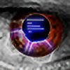
HOME | DD

Metal-CX — Things

Published: 2006-02-12 15:45:43 +0000 UTC; Views: 1851; Favourites: 16; Downloads: 407
Redirect to original
Description Imagine your own story...

Related content
Comments: 24

pooop [2006-05-02 19:09:35 +0000 UTC]

COOL

👍: 0 ⏩: 0

Metal-CX [2006-04-28 13:34:55 +0000 UTC]

:dev32498755:
:thumb32498755:
:t32498755:

👍: 0 ⏩: 0

Rchitkara [2006-03-07 18:56:00 +0000 UTC]

i like the atmosphere of the piece, just i'm not fond of the colour

nice job though

👍: 0 ⏩: 0

sythe101 [2006-02-19 09:16:14 +0000 UTC]

to dark, and plain

👍: 0 ⏩: 0

Sobering [2006-02-14 03:44:09 +0000 UTC]

oh sorry, the customicons guy is me ooops

👍: 0 ⏩: 0

CustomIcons [2006-02-14 00:25:33 +0000 UTC]

i forgot to add hypernurbs to the render dang lol. well yea good job on the ps'ing metal

👍: 0 ⏩: 0

Tw1tcH-cx [2006-02-13 13:20:46 +0000 UTC]

dull

👍: 0 ⏩: 0

L33tM0b1l3 [2006-02-13 05:09:49 +0000 UTC]

Looks like dolphins swimming in the sea. Pretty sweet mang.

👍: 0 ⏩: 0

DyceIBG [2006-02-13 01:30:25 +0000 UTC]

I yhink its pretty cool. I like the abstractness of it, and it's colors and contrast. I think it's a nice peice, and I like it alot.

👍: 0 ⏩: 0

Godhand4 [2006-02-13 00:08:47 +0000 UTC]

im not liking it, ur way better then this

👍: 0 ⏩: 0

masterchief1191 [2006-02-12 20:26:27 +0000 UTC]

no more contrast its perfect as is, great job

👍: 0 ⏩: 0

WishRM [2006-02-12 19:40:30 +0000 UTC]

Could do with some contrast but still looks great!

👍: 0 ⏩: 0

happienoodleboy [2006-02-12 19:05:45 +0000 UTC]

👍: 0 ⏩: 0

Knecke [2006-02-12 19:04:02 +0000 UTC]

add a little more contrast and I'd love it nice job

👍: 0 ⏩: 0

fenrir-br [2006-02-12 19:03:56 +0000 UTC]

it lacks contrast , colors , lightning , everything

👍: 0 ⏩: 0

M-e-t-a-l [2006-02-12 18:08:44 +0000 UTC]

not bad, render looks really choppy though, and theres not enough contrast for me.

👍: 0 ⏩: 0

jongos [2006-02-12 17:36:16 +0000 UTC]

I think there should be a little more color, but the render is very nice.

👍: 0 ⏩: 0

N-Q [2006-02-12 17:28:35 +0000 UTC]

monotone. bad.

👍: 0 ⏩: 1

M-e-t-a-l In reply to N-Q [2006-02-12 18:08:03 +0000 UTC]

whats up with monotonophobes these days? monotone works better than multicoloring in some cases...

👍: 0 ⏩: 1

N-Q In reply to M-e-t-a-l [2006-02-12 23:15:32 +0000 UTC]

whats up with fanboys

👍: 0 ⏩: 1

Metal-CX In reply to N-Q [2006-02-13 14:28:22 +0000 UTC]

what's up with bitter fuckers like yourself

👍: 0 ⏩: 0

Brandonc1 [2006-02-12 16:28:02 +0000 UTC]

Nice. has a nice feeling and atmosphere.

👍: 0 ⏩: 0

Kitten-Kati [2006-02-12 15:53:59 +0000 UTC]

I like it.
Very nice job on the brushes.
I like the coloring.
Looks sort of..
Dark..
Unimaginable.
Good job!
Reminds me, of a Collasus.
I really like it. That's the point.
Love,

Kati.

👍: 0 ⏩: 0

static06 [2006-02-12 15:47:44 +0000 UTC]

I dont liek the contrast, brightness.... or color

👍: 0 ⏩: 0