HOME | DD
 MichaelFaber — Everlasting

Published: 2007-03-03 09:14:00 +0000 UTC; Views: 728; Favourites: 16; Downloads: 19
Redirect to original
Description
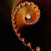
Apophysis + PS for colour adjustmentsI rendered this a while ago, but wasn't very happy with it. Let me know what you think
Related content


Comments: 32

I like it, actually I like all of your work. Congrats
👍: 0 ⏩: 0


Fantastic details, makes me think of a specimen collection ... there's always one that stands out!
👍: 0 ⏩: 0

Looks good to me, like a lithograph - some amazing textural details in there
👍: 0 ⏩: 0

I love the texture. Colour palette looks a bit dull to me and the composition isn't doing much for me either but I can't see where I would crop it to make it better. It looks cool though, it has some nice depth to it and I think the contrast is perfect.
 (Smile)")
👍: 0 ⏩: 1

Thanks for the comment Trystian!
👍: 0 ⏩: 0


no words to describe it. only props to you the apo king. a
👍: 0 ⏩: 0

oh man you should be happy with it. This is awesome.
👍: 0 ⏩: 1
Thanks for the complement
👍: 0 ⏩: 0

Great fractal... I think it might be lacking in intensity of color... but then I'm a bit of a color freak. I love the pattern and repetition!
Hugs,
Anj
👍: 0 ⏩: 1
Thanks! I appreciate the criticism
👍: 0 ⏩: 1
Oh, I didn't mean for you to take it that way... it was a suggestion and a totally subjective one at that! Please don't feel I'm criticizing your art because that was not my intention. I said what I said only because you felt there was something lacking and I am a color-lover, K?
Hugs,
Anj
👍: 0 ⏩: 1

👍: 0 ⏩: 1
Welcome! I suppose you are right. It was meant as a critique from my point of view and not criticizm. I also appreciate comments that tell me how I might improve so I do understand. You know what I think it is? I feel such a tyro compared to you that I am a little uncomfortable walking the line of critique. I definitely cannot critique on a technical level... that leaves colors!
Hugs,
Anj
👍: 0 ⏩: 0

Great title, and I love the concept, as well as your fractal representation. Very cool design and weave, lovely colors and contrast. Excellent work, all the way 'round.
👍: 0 ⏩: 1


I can't quite put my finger on what i like so much about what you do with fractals - they are generally very different from what i generally see form other fractal artists, and i like that. I would be interested to see what this one looks like with more intense colours, it looks a bit dull there
👍: 0 ⏩: 1
It's a very unique pattern - which means it's atypical of the usual flames that are posted - which usually means some hesitation on the artist to submit.
I actually like this because it is different from the usual fare. I also like that it first appears to be symmetrical, and yet it is not. And so, I give you composition marks on this as well!
👍: 0 ⏩: 1

looks nice to me, looks much better in full view, especially the coloring!
👍: 0 ⏩: 1
Always full view
")

👍: 0 ⏩: 0

I uh. Picked up Apophysis much earlier today, just to see what it was/did/how it worked and stuffs.
o_o And I can't really do much.
[link]
xD Sorry.
👍: 0 ⏩: 1
It will take a lot of time and trials to figure it out
Have fun with it
👍: 0 ⏩: 1

This image has some very painterly elements to it: the shading; the areas where it looks almost like brush strokes; the lack of very straight lines; and the colors that seem to mix and blend. I like this one.
👍: 0 ⏩: 1