HOME | DD
 MichaelFaber — Infinite Doodle

Published: 2006-06-10 05:44:44 +0000 UTC; Views: 1411; Favourites: 30; Downloads: 277
Redirect to original
Description
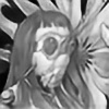
Apophysis 2.04 betaThanks for looking! I hope you hate it! Let me know what you think!
Related content
Comments: 68

Love the gradient ... the subtle details and the whole flow ... fantastic flame!
👍: 0 ⏩: 1


👍: 0 ⏩: 0

LOL @ "I hope you hate it." I hate it so much I had to fave it.
👍: 0 ⏩: 1

Just to torment you
Thanks for the support!
👍: 0 ⏩: 1

well that' summ..nice of you
👍: 0 ⏩: 1

Very smooth buddy !
I like what your doing in this
Your showing Good Power that can come from Apoph
👍: 0 ⏩: 1


👍: 0 ⏩: 1

Maybe you could help me out with Apoph, I might even Like Using the thing !!
👍: 0 ⏩: 1

No prob. if you got any questions i can probably answer them, or point you in the right direction
👍: 0 ⏩: 0

Thanks for the fav! i'm glad you like it!
👍: 0 ⏩: 0

Looks like a painting! It's awesome!
Well, if you hop it, i guess i hate all of your work.
👍: 0 ⏩: 1

Interesting piece. How do you create this kind of art? What program do you use?
👍: 0 ⏩: 1

I use apophysis 2.04 beta. it is a free open source flame fractal program. you can get the latest version here [link]
👍: 0 ⏩: 0

I really like this, Ive been trying to do fractal art for a while now, but every time i search DA for fractal art I see stuff like this, and it takes my breath away. Did you get this image straight from apophysis or is it several fractals combined in another program? Despite toying around with every option available to me in apophyisis, Ive never been able to get the 3-dimensional looking or planar fractals that some seem to have. I've been limited to just stringy looking flames at best.
I really like the glowing areas and the combination of thick lines with thin "doodles". Awesome deviation 
👍: 0 ⏩: 1

everyone starts with the stringy looking flames 
this is just one flame, as with all of my other posts. most of my images have lighting adjustments, but if i recall correctly, this one is pure, save for the signature.
Flame on!
👍: 0 ⏩: 1

thanks for the advice, and yea, its hard to get away from stringy looking flames, but im working on it! it just seems that the amount of detail and flame that you get in your fractals is something i can never manage to get - is there some trick or setting that i havent discovered yet that changes the way all the fractals look?
👍: 0 ⏩: 1

it is no setting, it is just knowing how to use the variations, and experience
👍: 0 ⏩: 1

I only hate it because I can't do it...yet.
Looks like a tweak to "Gold Rush." I'm surprised you managed to get the swirly effect inside of the bubbles, if I tried that it would throw off the entire image.
👍: 0 ⏩: 1

'Gold Rush'? You mean 'Fools Road' [link] ?
👍: 0 ⏩: 0

It 's a very nice one. good job. Maybe I'll try hating it tomorrow.
👍: 0 ⏩: 1

Thanks for the fav Paulo!
👍: 0 ⏩: 1

Very cool flame and colors.
I think that you don't like the random design of the fine lines all over the flame. True?
👍: 0 ⏩: 1

Thanks Pakar! The 'doodle' part isn't super structured, like i usually do, but this was done on purpose. it gives it a soft textured look, which i thought went well. if you are interested, the 'doodle' part was created with one default (no translation, scaling, or skewing) transform with two variations. What i don't like is stringy whisps that look like the random generated flames.
👍: 0 ⏩: 0

Thanks for the fav Antonio!
👍: 0 ⏩: 1

... You hope we hate it?... Wha?
I like it, so HA!
👍: 0 ⏩: 1

Haha! Thanks for the fav Patrick!
👍: 0 ⏩: 1

how could I not fav this?
A lot of this oddly reminds me of techno. X_x
👍: 0 ⏩: 1

Thank you for your support! I'm glad you like it!
👍: 0 ⏩: 0

Oh man shithouse , booooooooooooooo terrible .. the worst flame i have ever seen ..makes me wanna puke 


👍: 0 ⏩: 1

Don't forget to clean your monitor up when you are done puking... and maybe grab some tp too.
👍: 0 ⏩: 1

Very beautiful. Not much more I can think of to say though. I'm still in awe over what you are capable of pulling off with fractals
👍: 0 ⏩: 1
| Next =>


