HOME | DD
 michaelharris — The Cardinal

Published: 2007-10-01 06:47:50 +0000 UTC; Views: 1440; Favourites: 27; Downloads: 21
Redirect to original
Description
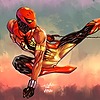
I did this for Lordnephalim.deviantart.com 's jam about making yourself as a superhero. This guy is also my main character on City of Heroes. HIs story goes as such:He is one of a genetically engineered team of soldiers created by the Vatican to do secret missions for the church(this team is called, The Cardinals, after the the people next in line for the papacy.) This guy, Number Seventeen of the (Archangel) Michael series, became disillusioned with the morality of his missions and went rogue. He now fights crime in the states and avoids retribution from the other Cardinals. He doesn't have "powers" per se, but he was bred to be stronger, faster, smarter and he heals faster than average humans, and was trained in a curriculum that encompasses all human knowledge in the areas of combat and military strategy. He also makes a mean chicken salad casserole.
Related content


Comments: 15


I fucking love this dude. Fanart may be forthcoming. Or even better, I hope we get matched up in the Jam.
👍: 0 ⏩: 1

be careful what you wish for...
👍: 0 ⏩: 1


really nice looking hero dude. I think you just need to improve on your colours, but the drawing is dynamic and ace!
")
👍: 0 ⏩: 0
Great design and cool color technique! I like it very much!!!
👍: 0 ⏩: 0

I just had an Idea...
The yellow seems to be a bit too distracting and almost seems out of place. Maybe mute it a bit or replace it with white and use cool grey shadows. Like 50% cool grey or more.
Mainly because on preistly robes etc. you don't see that much yellow or gold. Just piping or edging on robes.
Still a sick design. I think the color change would make him even more official lookin.
👍: 0 ⏩: 0
Nice!
I like the colors a lot. It's like he wants to be seen and feared.
👍: 0 ⏩: 0


Wow, I really like this guy.
Is he an original character of yours then? Cause the backstory is fantastic.
Great work all around.
👍: 0 ⏩: 1
yeah he is myoriginal character, thanks!
👍: 0 ⏩: 1
Well that just blows my mind.
Impressive work

👍: 0 ⏩: 0