HOME | DD
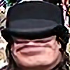
 MililaniMak — kU (II)

Published: 2012-07-21 06:33:22 +0000 UTC; Views: 1526; Favourites: 50; Downloads: 0
Redirect to original
Description
More fun with textures.")
CREDITS:
Kane:
KOZZI.com for [link]
Pahi:
for [link]
The textures used are my own resources; and there's a bit of painting w/CS5.
Mahalos to all!
Related content


Comments: 47


* Blending of texture into skin done very nicely.
* Background looks authentic, like it is supposed to be there; I especially like two opposite angles in bottom corners, a subtle way to increase depth.
* Would love to see it with beautiful, uniquely-designed, strong, light-to-medium, beautiful brown eyes for a different effect, maybe would give it a different focal point (but that is purely my opinion).
* Looks like artwork has a predominantly cool tone, which makes the slightly warm tones on face stand out.
* Also, I like the way my eye travels from top-right to bottom-left (going against what was taught long ago in high school art classes); I like that!
* Very nice signature logo...looks neat, professional, but not overpowering.
👍: 0 ⏩: 1

mahalo for the critique, Donna Marie. very much appreciated!
re: the eyes, i was specifically trying for a carved in wood effect, so i actually removed the eye detail. i supose i could've added a couple of rings & shadows simulate some carved eye details, but given the scale, well, i just didn't.
aloha 'oe, Mak
p.s. love your textures! so colorful & unique. hope to use them sometime soon.
👍: 0 ⏩: 0


This excellent artwork is featured in my journal. [link]
👍: 0 ⏩: 0


👍: 0 ⏩: 0
ıt is like a sculpture of Buddha!...your fantasy world adds much to all my dear friend
👍: 0 ⏩: 1
👍: 0 ⏩: 1
çok rica ederim my dear Bro
👍: 0 ⏩: 0
* Blending of texture into skin done very nicely.
* Background looks authentic, like it is supposed to be there; I especially like two opposite angles in bottom corners, a subtle way to increase depth.
* Would love to see it with beautiful, uniquely-designed, strong, light-to-medium, beautiful brown eyes for a different effect, maybe would give it a different focal point (but that is purely my opinion).
* Looks like artwork has a predominantly cool tone, which makes the slightly warm tones on face stand out.
* Also, I like the way my eye travels from top-right to bottom-left (going against what was taught long ago in high school art classes); I like that!
* Very nice signature logo...looks neat, professional, but not overpowering.
👍: 0 ⏩: 1
👍: 0 ⏩: 0

👍: 0 ⏩: 0


 (Smile)")
👍: 0 ⏩: 1


great work....you are getting very expert at these manipulations.... A++
👍: 0 ⏩: 1
mahalo for that grade, brah! wow!!
👍: 0 ⏩: 1


He seems really powerful and he's beautifully textured , nice work mon frère ! 
👍: 0 ⏩: 1
mahalo beaucoup, mon 'Alopeka!
👍: 0 ⏩: 0


Beautiful, very powerful, both subject and your rendition.
👍: 0 ⏩: 1
👍: 0 ⏩: 0

This is amazing!
You did a great job on the textures.
👍: 0 ⏩: 1
👍: 0 ⏩: 1


👍: 0 ⏩: 0