HOME | DD
 ming85 — Blue jump

Published: 2007-06-17 23:05:37 +0000 UTC; Views: 14086; Favourites: 367; Downloads: 229
Redirect to original
Description
EDIT: Thanks everybody who gave advice and tips, I tried my best to make it better and am now quite happy with it. (Smile)") I consider it finished now. [/EDIT]
I consider it finished now. [/EDIT]Something experimental, inspired by that madonna video 'jump' which I really like.
This style of colouring is completely new to me, so I have no clue if this is finished or not. Advise?
It's driving me crazy and i can't choose: The sketchy, paintery style of the background, or the half painted, half cell shaded foreground. Some parts have lineart, others don't, it's a complete mixed mess.
So.. good or unfinished??
Again: this is a half succesfull experiment. Critique very much appreciated, but only on the coloring style: Im quite happy with the messed up perspective and composition.
I also kindof like Capricorn's face, and the sketchyness of Scorpio.
---------
From l to r:
Capricorn, the Gemini twins doing reckless stuff, Scorpio,
Originally I also wanted to include Cancer, but the composition didn't work. Im confused. See it here: [link]
-----------------
Adobe photoshop, reference was used for the background.
zodiak characters © me
Related content


Comments: 64


I think your composition is wonderful. The placement of the characters really pulls the viewer into the scene, and the blue background really helps. Great work!
👍: 0 ⏩: 1

Thanks, the background makes me cringe these days but still like the composition.
👍: 0 ⏩: 0

Ooh, I love the crisp sort of urban feel to this. The composition is lovely, and though your color scheme is relatively simplistic, it works really well!
👍: 0 ⏩: 0

Absolutely love the composition and perspective, the way you have arranged with elements in the foreground, middle, and background, really create such an interesting depth and a very real sense of space
👍: 0 ⏩: 1
Thank you, such a comment coming from you means a lot. Thank you for your thoughts, happy you like it!
👍: 0 ⏩: 0

I like veryily much. Sketchness suits the um... Mood (?) I guess. [[prolly wrong word but it fits for the moment]]
👍: 0 ⏩: 0

really dynamic composition, and i love the colours. favz up<3
👍: 0 ⏩: 0

This is absolutely brilliant. I love the stark colors and the amazing composition of this.
👍: 0 ⏩: 0

Oh wow, it feels so kinetic, particularly the clothing in motion.
Your choice of palette is beautiful as usual
👍: 0 ⏩: 1
Sycle! You're still here!
I have to rewatch you, somehow you've escaped
👍: 0 ⏩: 0


Hve you ever read the book Angel Experiment? It's a good book, and ur art reminds me of it :3
👍: 0 ⏩: 1
no, but sounds interesting that title
I'll check it out!
👍: 0 ⏩: 1
Yeah it's a great book! My mom loves it too. And while I read DH she finished the second book of the trilogy and now she's on the third @.@
👍: 0 ⏩: 0

Cool atmosphere! I'm going for something like that, but am totally unable to get it right (incl. the ..euhm...kikkerperspectief ")
I think you should ad a little bit of detail to your background though.
👍: 0 ⏩: 0


I think the one with Cancer is better 
👍: 0 ⏩: 0

Oh wow. I like it as it is actually ")
*blinks innocently* I'm not biased *shifty eyes* That said, I love how sketchy she is, but there's enough detail to actually see that she IS scorpio.
And... have I ever told you how much I love her character and composition throughout your zodiac series? Her outfit here rocks; looks like what I would wear XD
The "gradient" from detail to sketchy just flows into each other. So much <3
As for the background, the style actually adds to the whole thing, really.
Just my opinion
 (Wink)")
👍: 0 ⏩: 0
This is amazing. It seems a bit unfinished, but I really like the way it is now. I just love the unfinished quality about it. Like the sketchyness of Scorpio. But there's something about Capricorn's face that's just leaves me in awe about this whole pic. I really love this. Amazing work.
👍: 0 ⏩: 0

Hm, a bit unfinished, but I think that's because the characters in the forefront don't have lineart all the way down. If they did, it would give a better illusion of closeness--plus it looks odd with the left-hand girl having her head inked and, well, not much else. I suggest doing the lineart for her in detail, the lineart for the girl to the right in partial detail, and the two in the background being left as they are.
👍: 0 ⏩: 1
Thanks! From all the advice i got for this piece, i took yours and tried to fix it
Merrrci.
👍: 0 ⏩: 0


I like this style, very free and easy looking. It's cool and kinda relaxed. Heheh wonder how Taurus would look in this style.
👍: 0 ⏩: 1
hmmm probably more loose clothing? Or sportive? hehe
Thanks for the comment!
👍: 0 ⏩: 0

I like this experiment just as it is.
The sketchy painty background is like the "far away" version of what you see in the cell-painted looking characters. Besides, the greater attention to detail and definition in the characters with their coloring style keeps the viewer focused on the people, and therefore, the action of the frame. I like very much that the charcters and their backdrop aren't competing for the viewers attention.
I judge that this piece is complete!

👍: 0 ⏩: 1
OK! Thanks for your indepth comment, appreciate it a lot!
To me it still feels incomplete, but maybe my opinion will change over time.
Thanks again!
👍: 0 ⏩: 0


👍: 0 ⏩: 0

compositie en kleurtoepassing is echt heel mooi.
als ik erover nadenk, stoort het alleen misschien dat je de organische vormen (mensen/kleren) heel strak gekleurd hebt terwijl je de strakke vormen heel schilderig -dus organisch- heb ingekleurd. hoe je kleurt moet te maken hebben met het licht, dus ik denk dat je blijer bent als je juist gaat schilderen op de oppervlakken van huid en kleding, om de textuur van deze over te brengen, en just iets strakker kleurt bij gebouwen, die een homogenere textuur hebben..
ik weet niet wat je hier aan hebt, missch niks
👍: 0 ⏩: 2
Ik bedoel natuurlijk jouw aanpak, het klinkt heel logisch dat gebouwen strakker gekleurd zijn dan organische dingen. Ik denk dat ik onderbewust voor een soort anime look ben gegaan? Uitgebreide schilderachtige achtergrond, strakke celshading voorgrond? Maar dan halverwege van gedachte ben veranderd... tja.
Bedankt voor de goede tips!!
👍: 0 ⏩: 0
ooh dat is een goede! Het is nog allemaal heel random aan geklooid, niet echt over nagedacht. Ik vind dit een mooie theorie/ aanpak.
👍: 0 ⏩: 0

I really like it...
cold, but still warm, if U know what I meen...(U didnt choose cold blue colors but warm blue colors)... Great job
👍: 0 ⏩: 1
thanks, that was exactly the kind of color I was aiming at.
happy it somehow shows.
Thank you for all the great comments!
👍: 0 ⏩: 1
Your very welcome... U are one of my favorite artist inhere
👍: 0 ⏩: 0


but where's Virgo? ;_; XD;; anyway, I'm also torn. it looks pretty much finished to me, but still there's something... I wouldn't do any rigorous changes, but some additions...? like some clouds... but then not so that they stand out too much?
👍: 0 ⏩: 1
nah I kinda like the impossible blue sky
Maybe all it needs is some time, and then BAM I'll see the problem right away. Guess it needs some rest.
Thanks for the comments!!
👍: 0 ⏩: 1
true, there's something charming about it, too
anyway, you're welcome
👍: 0 ⏩: 0

You keep amazing me, Mei-ing.... At first I thought the smooth gradient in the sky conflicted too much with the sketchy approach of the foreground, but it seems too bring some rest to the picture. Too bad Cancer didn't make it, but this also made the composition more open.
👍: 0 ⏩: 0

the characters and prespective are just amazing
👍: 0 ⏩: 0

I like it the way it is; an "unfinished" sense makes the picture interesting. Excited to see zodiac pictures again
👍: 0 ⏩: 0


I'd go for the style of the foreground. The sketchy-paintery background is cool, but in my opinion it's too solid for that style.
it also reminds me of a video of a dutch freerunning group they showed on tmf a while ago
👍: 0 ⏩: 0

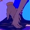
I think the lineart for the character up front is definitely needed, especially for the right hand, keeping it nice. It'll seperate it from the background. I like the backgrounds being in that style. Works well, and for the characters in the background as well. Maybe touch up a little bit with the building in the far back right. Keeping it straight as possible. Other than that, it blew me away when I first viewed it. As well as inspiring too.
👍: 0 ⏩: 1
hee thanks for the great ideas, I agree on the hand, definitely needs more work.
I'll touch this one up soon, but not now. Thanks for your suggestions!
👍: 0 ⏩: 1
You're very welcome. Glad I was able to help in some sort of way.
👍: 0 ⏩: 0

I loved the way u coloured it... It almost reminds me of a naivelish graffity. It's really neat. And about the composition I really like also, kinda messed, but I like it... it's not unppleasant, as usually messes compositioned pictures become. (I'm sorry if I sound confuse...but my english can be very bad sometimes...)
👍: 0 ⏩: 1
no, it's very clear! Thanks a lot
👍: 0 ⏩: 1
| Next =>