HOME | DD
 Miokomata — Fluttercakes

Published: 2012-02-26 14:18:23 +0000 UTC; Views: 2505; Favourites: 55; Downloads: 77
Redirect to original
Description
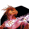
This is a bit different then what i usually do because i never understood the brushes and blending, but after watching a video on youtube to understand what does what and stuff, I then tried it out on a picture i had ready to go which resulted in this i like it a lot and its a lot easier then what i usually do. Might go this route. Which style do you like better? Feedback would be nice. *update* my tablet stopped working on the program earlier for some reason but its good now and wanted to fix things that i couldn't before.Related content


Comments: 13

:hay hay hay stay out of my shed
me: :thinks is evil: me: derp
👍: 0 ⏩: 0

As much as I HATED Shed.mov I did weirdly seemed to like Butchy 0-o
maybe because I like creepypasta...
👍: 0 ⏩: 0


")

I agree with what fernindt said. It could definitely become more frightening.
👍: 0 ⏩: 1

frightening?, colors seem more with the pictures and not as flat yet similar to my previous ones.
👍: 0 ⏩: 0

Quite amusing, but if you're looking for feedback... I prefer your more traditional style. The division between the different parts of Fluttershy's face seems too abrupt here despite the more realistic shading overall-- for instance, the very sharp definition of the mouth and the way the edge of her mane / hair is a single precise line with no variations (no hairs emerge from her scalp in front of or behind the line; all are RIGHT ON THE LINE).
This actually gives it a more artificial look than your more obviously drawn / cartoonish style. There, it makes sense for there to be a definite line between different parts. Here, it looks odd.
So this COULD be good but look to someone better at art than I to tell you how best to adapt to this shading / appearance / style.
Really nice job on the outer edge of Fluttershy's mane though; that looks good. It's just where it meets the scalp that it's too precise.
👍: 0 ⏩: 1
I used the same style on the hair like i do on the other drawings except that i basically used only blending methods since its my first time after learning how the brush effects work, yes it does seem more sharp and adds realism to it, but I'll see what happens when i use this style it on something that not evil and make it cute because i noticed it gets more attention. How come everyone hates evilshy???
👍: 0 ⏩: 1
Everyone hates Evilshy because she's so territorial. I mean geeze, why does she always want us to stay out of her shed? >8 (
👍: 0 ⏩: 0