HOME | DD
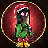 MismeHellawes — Grumpy Cats Need Hugs Too

#angeldust #digitalpainting #hugs #husk #spiderdemon #hazbinhotel #hazbinhotelfanart #hazbinhotelangeldust #hazbinhotelhusk #huskxangeldust #angelhusk
Published: 2020-03-26 11:57:10 +0000 UTC; Views: 3035; Favourites: 121; Downloads: 0
Redirect to original
Description
*facedesks repeteadly*I. Can't. Draw. Wings. For. Shit.
Husk is supposed to kind of hug Angel with one of his wings and I only added that wing because the sketch looked imbalanced without it. Now when I think of it while writing description, I simply could've drawn his wings folded and have Angel put his arms around them too *groaaaan* Anyway, feel free to redline it, because sure as hell I made tons of mistakes.
On the bright side, I enjoyed painting this piece - Husk's design is far from my comfort zone and I'm glad I tried to draw him. Also I finally [sorta] drew all of Angel's arms. Time for toast, lel.
Angel Dust & Husk (c) Vivienne Medrano
Related content
Comments: 11

👍: 1 ⏩: 1

👍: 1 ⏩: 0

👍: 1 ⏩: 1

👍: 1 ⏩: 0
Hiya! You invited me to talk about art critique so I'll give it a go
Cause actually this one is quite a nice piece to look at, and it's worth digging in more
What works well on this one is the color scheme - it looks simple but not dull, and using closeby colors makes a harmonious palette. Good balance of light and dark colors too. And good use of colors to distinguish objects. Did you choose colors according to design, or did you have to pick what you use? In any case I like the result. I love the colored contours too, but it bugs me a little on the spider guy's gloves - there's not enough difference in value between color and outline, and they are reversed too, outline brighter than the color... Not sure, again, if you follow some existing design but to me it would probably look better if the outline went dark purple on these darker parts of him. While the contour in his body looks perfectly fitting in color
I think you did a more or less accurate work on contours, but maybe more variative line thickness and more smooth line would do better.... I take it that you draw on your phone? And probably with finger? If you're limited in drawing materials it's trickier to do lineart, I can tell 

The pose and faces work quite well here too. I actually think that emotions and people interactions is the key point of you art as I see it - something that interests you the most. Am I right? 

You complained about not being good with wings, so I put together a little scheme. Not a good enough tutorial, but just some explanation that maybe can help to understand a bit, how wings work. Hugging with wings is an awesome way of hugging <3 good that you kept it this way xD and didn't come up with the idea to wrap them around his body to save the effort.
Hope some of this is helpful 
👍: 1 ⏩: 1

Thanks a lot 
I mostly followed colour schemes of the original designs, except the spider's lineart. In the original, his lineart's colur is dark brown, much like his eyebrows/right sclera, but when I tried to draw him for the first time it just didn't sit well with me. I think it's because of the line's thickness? So I started using dark purple for his lineart. When you mentioned how colour of the lineart clashes with the gloves' I realized the colour of the spider's lineart has become brighter since the first time I painted him 
About the tools, I uh use graphic tablet and laptop 
You nailed the thing about emotions and interactions being the key point in my art! Like, I love observing people, especially their facial expressions - there's so many emotions expressed just in the eyes, and then variations of these emotions, variations of variations, the list goes on. And it's individual for each and every human being, it's impossible to fully capture it. In fact, I spend a little too much time on drawing faces and then I'm like "Hands what? Body language who?" xD Anyway, I'm super happy you liked the way I drew their emotions
Small note: the spider actually has three sets of arms, because spiders have eight limbs ;3 The reason why only two sets are visible for the most of the time is because the creator took mercy on animators - this many arms would be too hard to animate x'D So he pops out his third set only when necessary.
Thank you for this tutorial, it's great help! Gotta admit, I sketched the wings as the last part and for a second I wondered if it wouldn't be more logical if the cat put both his wings around the spider. Then I realized it would completely obscure their bodies and I was like "ah screw that, I messed around with their hug for too long to cover it now!" xD
Your critique is super helpful 
👍: 0 ⏩: 1

Hey-hey
Glad you find the feedback useful 
With lineart - then I guess you have tools that will let you explore the line and that's GREAT 
Well, if your grandpa has pressure control, then I suggest to try varying line thickness for better lineart. Thinning out ends of lines look more neat than worm-like lines 
Talking on phone can make a person relaxed and improve their accuracy, no? 
With lineart color - like I said, the purple you chose works very well with the lighter skin. So only the gloves area needs altering. I haven't seen brown variant, but when I imagine it really doesn't seem like a good idea 
Yeah emotions are interesting 

And that's a crazy design with all the extra limbs. But an interesting challenge as well. And wing hugs poses were a challenge for me as well - there doesn't seem to be an angle that shows it properly, because in life it would only be a boring bundle of wings with all the interesting things happening on the inside
👍: 0 ⏩: 1

My god, digital drawing with a finger instead of pen does sound like pain x_x As for pressure control, I tested it in both programs. In Artweaver it works fine; the line is a little shaky, but perhaps it's a matter of practice. In Gimp it's like "lol no". I don't get it, it seems like my grandpa tablet prefers AW over Gimp xD
Dark brown line goes very well with his original design and it looks good in other people's fanart. Then again, my lineart here is a bit thicker than in most drawings of him (not to mention the original design) and brown colour doesn't look very well here
Heh, I'm trying to go out of my comfort zone a bit ^^" (lol I didn't even realize that, thanks for pointing that out ;D)
The next step shall be spider's legs and hoo boy they're scary x'D
Haha, it seems that when it comes to wings and hugs, we're allowed to get creative just to avoid boredom
👍: 0 ⏩: 0

Welcome to natural habitat were we have a gay spider hugging they're adorable pray this is what
A cutest couple looks like 👌
👍: 0 ⏩: 1

Ahaha, I read this in Richard Attenborough's voice 
👍: 0 ⏩: 0


