HOME | DD
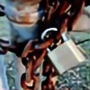
 MissingThePicture — Abstractions in HDRI

Published: 2006-11-22 05:51:45 +0000 UTC; Views: 747; Favourites: 4; Downloads: 37
Redirect to original
Description
Took my explorations into HDRI and threw some abstraction into it for those of you who like my abstract work") , lemme know.
, lemme know.
Related content


Comments: 10

I like it, but I think the shadow is a bit too powerful. Otherwise, great work.
👍: 0 ⏩: 1

this looks very nice..I love the shapes and the color. and I also like the shadow
 (Smile)")
👍: 0 ⏩: 1

thanks
👍: 0 ⏩: 0
It's pretty sweet... all random and stuff. Nice use of color.... though I kind of agree, the shadow is a but blurry.
👍: 0 ⏩: 1
I dont know why the shadows so blurry, it just... is, at times.
👍: 0 ⏩: 0

woaaa
i like how the blue one looks sort of wet
but the shadow looks kind of odd, like it's a little too blurry for such a crisp......uuh.....figure...?
👍: 0 ⏩: 1
