HOME | DD
 Monique--Renee — Pastel Buns

#buns #copic #copicmarkers #copics #girl #hair #kawaii #markers #tan #tanpaper #traditional #traditionalart #traditionalmedia #pastelgoth #tonedtan #pastel
Published: 2015-07-28 21:13:09 +0000 UTC; Views: 738; Favourites: 26; Downloads: 0
Redirect to original
Description
More fun with toned tan paper. I really experimented with value in this one. I also wish my hair was this color! Maybe some day.~~~~~~~~~~~~~~~~~~~~~~~~~~
BUY MY ART:
STORENVY: moniquereneeart.storenvy.com/
~~~~~~~~~~~~~~~~~~~~~~~~~~
FOLLOW ME ON SOCIAL MEDIA:
FACEBOOK: www.facebook.com/MoniqueReneeA…
YOUTUBE: www.youtube.com/channel/UCdjDT…
INSTAGRAM: instagram.com/chronically_cute…
TUMBLR: chronically--cute.tumblr.com/
IF YOU'D LIKE TO COMMISSION ME
1)NOTE ME OR 2)EMAIL ME AT
monique.renee.art@gmail.com
Related content


Comments: 22

Lovely work on merging your colours here! Great attention on where the tones should go for skin and hair. What a pretty eye colour and hair colour, too. ")
 (Wink)")
👍: 0 ⏩: 1

Thanks so much! The colored paper really brings something else to coloredpencils, I really want to do more work like this when i have the chance!
👍: 0 ⏩: 0

Looks fantastic! I wish I could handle markers like that...
👍: 0 ⏩: 1
Oh gosh, thank you! I've definitely had a lot of practice with them. They're my favorite media at the moment c:
👍: 0 ⏩: 0

now this is what makes a artwork piece a true masterpiece, and thats having you take a picture of the art materials you used to create this headshot drawing piece. The fleshy tone skin color is perfection, love how you gave it the buttery circulation effect when blending the pinkish and orangish color like blends to create the skin color onto her face. And the hair color sketching draft is amazing! i can picture how you actually were able to stroke the hair lining as if your mowing the lawn back and forth and thats how it gives your hand the same effect to create the hair stroke lining effect, which is truly done very well. The facial details is like giving your own face the inside brain mirror effect which makes you instantly realized how a face should be drawn and created with fine detailing and drafting which is very stunning! The only suggestion and advice I've in mind to give you is that you take two shots of the photo, one is your whole workspace and the other is this close shot of your artwork which has name labels of what art tools your using to create this piece. it not only displays your artwork and art tools you've used but also gives more viewers and artistic people a more clear minded idea on how to create their own art using your choice of artistic tools. So keep on drawing

👍: 0 ⏩: 0
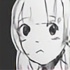
Wow, really effective thumbnail in this piece! Her facial contours are quite nicely shaded however anatomically there are a few hiccups in the work; though the image is cropped at the shoulders, they're squeezed too closely together . I do love the way you did the hair and your stylistic choice to use white gel pen in select areas, it lights up the whole piece! Keep going at it
👍: 0 ⏩: 1
Thank you so much! You're right about the shoulders, I kind of added them as an afterthought, I should have paid more attention to them. :/
👍: 0 ⏩: 0

The eyes are beautifully rendered. However, they are too large (if you're going for realistic style); in front view, the face is the width of five eyes. They are also too high. Given you used copics, mixing colours must be difficult, but you manged both values and a 3-effect.
👍: 0 ⏩: 1
I didn't notice that about the eyes, thank you <3 And while I wasn't quite going for super realistic, I do think they are a bit too large. Thank you <3
👍: 0 ⏩: 0

I will say that the colors and shading is really good.
However that does not distract from the poor facial structure, the eyes are way too high, that chin looks too masculine.
While having a focus on an aspect is good don't forget to work on other aspects.
👍: 0 ⏩: 1
Thank you <3 You're right about the eyes for sure, I didn't realize how high they were!
👍: 0 ⏩: 0
Here's a link: www.dickblick.com/products/str…
I use the tan one c:
👍: 0 ⏩: 1
Thankyou  (Smile)")
👍: 0 ⏩: 0


Copic eh? I never touch that medium because I can't afford it but I can tell it's not easy to blend the colors, I think you did a pretty good job here ^^v
personally i just think the position of the eyes seems rather off but that might be because of your certain style or maybe i'm biased since i'm used to see everything on anime style
keep up the good work, i'm sorry for not being so helpful
👍: 0 ⏩: 1
Copics are hella expensive, but in my opinion, 100% worth it!
The eyes could be a tiny bit off, but I'm not sure. I know that my facial anatomy needs work though.
👍: 0 ⏩: 0

The style here is very nice, but the colouring is what really makes this picture~
I would have to say my hair is my favourite part of it; the only thing that 'bugs' me about this picture
is-when it is a thumbnail it looks rather perfect, but when you look at it fully here something seems off. After
taking a moment to analyze it-I think it is because everything is so softly blended together it makes the harder
lines in the eyes pop almost too much while the nose and mouth fade away. It is an odd trick of the mind that
way. The eyes appear even harder than the earrings. It is being picky to say this, but that is good in your
situation =3 means that this picture is so good one has to be nitpicky to help you out more.
My only advise because of that is-if you do want something to pop-that is fine, but remember to not let certain
things fade away too much. A little more noticeable set of lines for the mouth and nose could help this~ Other than
that-this is fantastic. I like when people merge soft and hardness together-it turns out wonderful if done right which
you already seem to have a natural feel for considering you did this~.
Well done my friend =3 I still love the white lines haha~
👍: 0 ⏩: 1
You're absolutely right! I didn't even notice that, but I did make the eyes harder than anything else. I honestly put more effort into the eyes and hair than any other part of the face, so I should definitely work on that c:
Thank you so much for this, and thank you for all the nice words as well! <3
👍: 0 ⏩: 1
=3 you are very welcome lol and I do that too, work harder on the eyes
than anything else XD
*0* I just love yes and hair~
👍: 0 ⏩: 0

Thank you c': I can't wait to develop it more!
👍: 0 ⏩: 0