HOME | DD
 munds1984 — Unknown Field Somewhere
by-nc-nd
munds1984 — Unknown Field Somewhere
by-nc-nd

Published: 2008-03-20 12:24:06 +0000 UTC; Views: 287; Favourites: 5; Downloads: 1
Redirect to original
Description
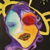
It just came out this way. Somehow, people did like it.Enamel and Acrylic on Drawing paper
9x12
Related content


Comments: 14

thanks  (Smile)")
👍: 0 ⏩: 0
thanks
👍: 0 ⏩: 1

I feel the color is off. I cant really say my reasoning but i feel if it was turned over it would help the color. if it was to stay like this. a green instead of red might have controlled the bottom better. Right now the piece is best upside down or its right side being the bottom.
👍: 0 ⏩: 1
Hmm, upside down? That would be different, it will give the art a certain look.... prolly will catch anyone's attention I say.
👍: 0 ⏩: 0

A snail, frogbaby's and a hamster
I love the colours
")
👍: 0 ⏩: 1
what an odd mixture! hahaha.
👍: 0 ⏩: 1
Hahahaha, yeah that's what I saw!
👍: 0 ⏩: 0

invoking ang image na to. maganda ang composition.
👍: 0 ⏩: 1
salamat, kuya. Medyo aksidente ang pagkakayari nito kasi napaka-surreal na niya. Wala naman shades of red na damuhan? Haha!
👍: 0 ⏩: 1
ung red, pwede ring magrepresent nang emotional state yan.
👍: 0 ⏩: 1
oo nga ano. Color harmony nasa isip ko tuloy hehe.
👍: 0 ⏩: 0