HOME | DD
 NataliaDrepina — Dead

Published: 2014-05-04 19:33:11 +0000 UTC; Views: 9114; Favourites: 309; Downloads: 0
Redirect to original
Related content
Comments: 6


Hi there, this is a very admirable photo, so great job!
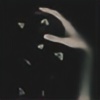
The composition is very nice. The hand reaches out to us which is something quite original. The fact that the audience only sees a hand and the rope reaching out from the misty white gives a strong 'less is more' effect. the background seems very open but is unrevealing at the same time.
The colours and the quality of the shot are good. The hand looks very dirty which adds to the grim implication of the photo.
The impact is really good. By revealing so little and implying so much at the same time, this picture becomes quite powerful. I believe this picture to be very poetic in its nature and it does make me want to know more about the story that is portrayed here (which we obviously will never get).
There is however something that I find odd but nott out of place in this picture (because it is important to the composition). The long grey/white descending mass that connects to the wrist (which is the rope I believe) is somewhat hard to process and makes this picture a bit confusing, and not in the secretive good way, but in the slightly annoying way. But that is pretty much the only thing I can find about this photo that could be improved up on (if at all possible, because it doesn't bother me that much, but hey, I am struggling to find some weak points).
In the end, this picture puts quite a smile on my face (oddly misplaced, I know) because I think it's creative, original and well executed (lol). The topic of death is an enormous cliché and has been, by many, bludgeoned to a mushy pulp. Somehow you've put back some life into it which is something I admire.
👍: 0 ⏩: 0

This made me stop and look twice. A sign of art when you go back and really see. Very well done.
👍: 0 ⏩: 0


