HOME | DD
 nelena — Nicolas and Kelorian

Published: 2005-08-15 21:55:09 +0000 UTC; Views: 1857; Favourites: 35; Downloads: 104
Redirect to original
Description
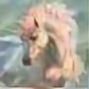
Yay, finally a new picture of my two stallions Nicolas and Kelorian. The first (and only) picture I drew of those two has been three years ago and finally I did them again XDAt the beginning Kelorian (the grey stallion) was supposed to be the more dominant one but somehow it changed in my mind... so here he is ^,^
Nicolas is Nelena`s brother btw XD
Nicolas and Kelorian are © by me
Media:
Ink and colored pencils
Related content


Comments: 42

Awrrr... no more subby Nicolas? *ggg*
It was about you did those two again! *nodnods* Such a sweet cuople. I still love Kelorian's design a lot.
The only thing that ... it doesn't disturb me, as a matter of fact, but it doesn't really look as nice as the rest of the picture and that is... Nicolas' wings. As there is not a single bit of structure in them, they ook very flat and two dimensoinal.
Mrrr.. but I love Kel's spotted butt and his jewelry and his hair!
👍: 0 ⏩: 1

I don`t know, Nicolas simply looks more dominant with those huge wings (irgendwie "mächtiger"). And I know I messed up the wings... it looks a bit better in the original 
And I hope I`ll do more of this two in the future
👍: 0 ⏩: 1
Will you make him be the dominant part forever now? I thought it was funny him being a bit less dominant and daring than his sister. ;D *chuckles*
Nyah... kennst mich und meinen Fluegelfetisch ja. Ich hab da immer ein besonderes Auge drauf.
So do I! *wiggles tails inanticipation*
👍: 0 ⏩: 1
*nods* Yupp, he`ll probably stay the dominant part... but actually I always thought his sister is a bit more submissive
*lol* Yo, ich weiss... und mittlerweile find ich die Flügel auf diesem Bild schrecklich und wünschte mir ich hätt ein bisschen mehr Mühe reingesteckt
👍: 0 ⏩: 1
Oh... I guess, I misunderstood that part then.
Nyah. XD Enfach nächstes Mal besser machen, hm?
👍: 0 ⏩: 1
*nick* Ich geb mir Mühe ^,^
👍: 0 ⏩: 0

this looks really nice
only thing that i would recommend simply is to ado a little more definition in the wing detail to give it a little more depth. Beautiful work on here
👍: 0 ⏩: 1
*lol* You`re the third person saying that
Thank you so much for your nice comment
👍: 0 ⏩: 1
what dpi resolution you scanning at, that might have something to do with it
👍: 0 ⏩: 1
Well, I scan with 300 dpi... usually that should be enough... or not?
👍: 0 ⏩: 1
that should be okay - you might want to try one at 150 to see if it gets a little more distictive with the color scan
the other thing i would recommend is to play around with the color settingss of the scanner to see if that does the trick
👍: 0 ⏩: 1
Hm, I will try it with 150 dpi with my next scan, thanks for the advise ^,^
The problem with my scanner programme is, that I can`t change the color settings. I have to change them in photoshop and there it never really ends up satisfiying >_<
👍: 0 ⏩: 1
try doing a scan through photoshop then, that might be a way to fix the prob too ")
👍: 0 ⏩: 1
I already tried that, but Photoshop uses the same programme I`ve installed for my scanner, so no change there >_<
👍: 0 ⏩: 0

Oh my goodness, the markings on the gry unicorn are FANTASTIC!
👍: 0 ⏩: 1


👍: 0 ⏩: 0

Absolutely adorable pic *hugs it tightly* xP
The proportions are nicely done, as are the features and marking on the both of them. The wings seem a little flat to me, but that may just be me, but I do love the earrings...er, um... wingings? *shrugs*
👍: 0 ⏩: 1
Thank you so much for your nice comment 
*nods* About the wings, as I already said to someone else, the wings have much more shading in the original, but my scanner hates grey-shading *sniffs*
👍: 0 ⏩: 1
*bops your scanner* Hey! Stop hating against grey-shading! Hating is bad! *glares at it with a snort*
👍: 0 ⏩: 1
*nods* Tell him >.< Stupid scanners *sighs*
👍: 0 ⏩: 0

EK!!! Nel's anthro horses!!! Ooo.. These guys are beautiful!! Great work!! When your not busy, we really need to do a trade!!
👍: 0 ⏩: 2
Your so welcome hun!! 
👍: 0 ⏩: 0
Thank you so much for your nice comment
👍: 0 ⏩: 0

Very beautiful.
I love the poses and colours.
Great job.

👍: 0 ⏩: 1
Thank you so much hon
👍: 0 ⏩: 0


AWESOMLY drawn 

👍: 0 ⏩: 1
Thank you so much for your nice comment
👍: 0 ⏩: 0

Turned out beautiful, absolutely love it. You don't draw unicorns as much anymore it seems and wow these are great. Love their faces and the coloring and everything.
👍: 0 ⏩: 1
Thank you so much for your lovely comment
👍: 0 ⏩: 1
Yay! I love your unicorns, they're so uniquely done.
👍: 0 ⏩: 1

Noticed you welcomed critique  (Wink)")
👍: 0 ⏩: 1
Thank you so much for your comment. Yes, I really do appreciate critique, because it helps to improve my artwork. Thank you ^,^
As for the wings. I know wings are one of my really week spots. It does look a bit better on the original because my scanner tends to kill grey shading, but still I don`t really know how to make a good 3D effect on wings
I`m not sure though what you mean by the "the space the figures seem to occupy"
👍: 0 ⏩: 1
May I suggest using blue as a shadow colour on white, and off-white for the main part of the wings? This leaves white for the highlighted areas. Even if you do not like the Idea of using blue as a shadow for white (it does happen under some kinds of natural light ) Using the off white will allow for better highlights which will help a fair bit. In my opinion.
Actually taking a closer look I think you have done that, but the contrast is so low that it is difficult to see the highlights. You can use your scanner software to adjust contrast and brightness when you are scanning your art work. If you are not already doing this it will help more (If you are already doing this lower the brightness and increase the contrast). If you have any image editing software they have features that can aid this process. (That's a whole other can of worms though.) I think I said before increasing the contrast of color in your work will help a lot. Contrast in colour is important. Your hoof's, for example appear as a medium brown-grey at their darkest. Making them darker and richer with the same highlights will make them "pop" and they will have a more three dimensional appearance. They will "occupy" more space, that is have a greater depth, allowing a more realistic appearance. That is what I was referring to when I was talking about the space occupied by the figures. Is the depth of things.
It's kind of hard to explain this all with out gestures. lol Your wings, your wings due to the placement of your light source, should have 4 bright spots. Two on each wing. (BTW: You also have the left wing brighter than the right, which doesn't fit with your light source.) The 4 bright spots are on the main parts of the wings, with the edges, of the wings, falling into a sort of shadow (only because they are not in the bright spot). If you like I can edit your picture to show these areas, not to fix the problem though. That way it will be easier for you to conceptualize what it should look like.
Well, I'm done. I hope you don't think me over bearing or over critical or anything. I'm trying to be helpful to you. I think you have a lot of talent, a little bit of schooling and you could take things a lot farther.  (Smile)")
👍: 0 ⏩: 1
Hm, I did use another "shade of white" for the wings... I don`t know if it is off-white, but it`s a tiny touch more yellow, but you can`t see it on the scan... like I said I have a horrible scanner. As for blue highlight... I did it all the time in the past and don`t really like it anymore
As for brightness and contrast... I did try to change that, I usually use photoshop, but somehow not matter how much I change brightness and contrast I can`t get it right :/ Like I said, the wings have much more depth in the original but I can never catch white shading >_<
But I will try to add more dark shading on future pictures. I`m alsways afraid it gets to dark that`s why I`m careful with shading
I didn´t realiced the thing with the wings though (the light source thing) because I really don`t take much attention for light source... and I know I should
And thank you again so much for the critique and the help. I always appreciate it
👍: 0 ⏩: 1
No problem.
👍: 0 ⏩: 1
Hm, if you like, of course. If it`s not to much trouble for you?
Perhaps you could give me some tips then how to change my pictures in PS so they look more like the original
That would be really great
👍: 0 ⏩: 1
I took half an hour and played a bit. I have two scraps in my deviations for you to look at.
👍: 0 ⏩: 0