HOME | DD
 OniNoTenshi — Fluoxetin

Published: 2011-12-08 22:57:51 +0000 UTC; Views: 2387; Favourites: 22; Downloads: 2
Redirect to original
Description
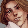
My second piece on the tablet. 1 brush + OpacitySame with this as my last one, I leave some things "sloppy" to get more of a painted feel. Some lines, some shadows. Small things that look plastic if over done.
Started out as a sketch with color pencils I made under the influence of high fever. Since my tablet refused to let me trace the paper I had to redo it from scratch a second time.
The apple represents the Fluoxetin, or even sin for those who like biblical things. Something you lean back and catch like a snowflake on your tounge in desperate times, something bad for you, but it just falls into your mouth to soothe.
If anyone read my poems you might know I've used the term "Apples fall into mouth" before, and it's a phrase I quite like.
The apple originaly symbolized the ecstasy pill "red apple", and even back then it meant the same as here. Something that releases the pain in maybe not the ideal way. But it's a quick fix.
Enjoy, and feel free to ask/comment/critique!
 (Smile)")
Related content


Comments: 55


I understand the wanting to go for the "painted" look, and it works up to a point, but I feel like more could be done to the apple in particular. otherwise, cool picture and nice concept.
👍: 0 ⏩: 1

Yeah, the thing in this picture that I'm not entirely satisfied with is actually the leaf. It looks wet or something. Makes it a bit flatter than the apple and mouth..
Any concrete suggestions on what more I could've dont? Working on 5 more sketches and since I'm new to this I'd appreciate all the advice I can get
👍: 0 ⏩: 1
The leaf looks fine to me actually, though you could always try stronger highlights or shadows to give it more depth, maybe add some reds or warmer colors into the shadows.
with the apple, the shiny patch at the center doesn't look like a white to me, it looks oddly gray, maybe it's my monitor but I'd look into that if I were you. Also, I'd extend some of the highlights further to the center because it looks flat there.
The tongue's shadows could be a little darker, but the mouth looks great to me.
👍: 0 ⏩: 1
Oh, the highlights on the apple are a blue grey on purpose actually. Just because blue is the opposite of red, but I needed a bright highlight tone. And ice blue would've ruined the whole thing. (On the sides that is) And on the top center I used an almost white, to set a atronger light from above than from the sides.
So I tried the blue grey and actually loved it (myself, of course)
And in the absolute center of the apple I fut a dark red tone on the whole thing, but if you look closely there are some tones of the brighter red in there as well, and also the dark part that is some kind of "damage" to the apple itself. (I of course have no idea if all these things are shown better on my monitor, and that's something I've been paranoid with on all my works. Digitals and photos alike)
When I tried a more white shine it looked a bit like a wax apple, and that really didn't do it for me :/
I'll play around with it a bit though (I probably won't upload a new version, atleast not until I'm alot better at all this) with your tips in mind. So I get some training for the other pieces I'm working on.
So, thank you for your honesty! Really. A breath of fresh air with someone who tries to help.
👍: 0 ⏩: 1
Unfortunately, it just doesn't read that way, it just reads as a little weird and maybe dirty to me sorry.
It's possible it's the monitor because if i look extremely closely, I see some spots, but maybe if you punch those up a little brighter, it'll be easily seen by more monitors. You could always try changing the brightness and contrast of your own monitor to see what other people may see too, who knows what you'll find out.
And this is very good for an early try, good luck on future endeavors!
👍: 0 ⏩: 1
Oh, thing is my first work I did on my laptop. And when I got to my regular pc I noticed a huuuge difference, and went paranoid about not knowing what other people saw.
So before I made this I reset to factory defaults. Just to be sure the majority would see what I did.
👍: 0 ⏩: 0
I like the colours, try to play with them more C: like blue or more green not only in places like leaves C:
👍: 0 ⏩: 1
Thank you
Hm, My...5th piece I'm working on right now (5th sketch in queue for finishing) is more conceptual. So for that piece it's an awesome idea, thank you ")
This one I wanted to keep really "clean" though, like the choice of having no background. Adding blue to some shading or in the lips would look good, but it would take some focus away I think unless really subtle. All focus should be on the relaxation in the mouth knowing the apple is on it's way.
👍: 0 ⏩: 1
Oh I understand the no-background idea C: But I think colours can make objects more... Hm, 3D? XD" I don't know how to name it... Uh. But you know what I mean, you look at the picture and you see not drawning, but something that looks like a figure. And also I love painting-like effects, but shhhhh, haha XD"
👍: 0 ⏩: 1
Haha I think I get what you mean xD
Eh.. I'm just scared while making them that they'll get "too realistic" if you get my drift?
Ehm.. That it looks TOO real you know. I want to make it look exactly like I would've made it on the canvas, so I'm looking for that balance between realistic, and painted.. Like, making the shadings more clear and linear than flowing and perfect.
-rant over, sorry- xDDD
👍: 0 ⏩: 0


You executed the artwork amazingly, and the concept is well thought out. Good job.
👍: 0 ⏩: 1


Amazing! I love this work! It gives me an appetite!
")
👍: 0 ⏩: 1
Haha! xD
Thank you so much, really glad you liked it!
👍: 0 ⏩: 1


very nice, you can feel the hints of lust in the piece despite its simplicity and minimalism
👍: 0 ⏩: 1
Thank you so much!! It really warms my heart hearing so

👍: 0 ⏩: 0

Wow, the lips are colored very well! Love the lights.
👍: 0 ⏩: 1


Thanks man! A sequal will be up soon hopefully!
And thank you for the fav <3
👍: 0 ⏩: 1

i'll wait for it! and no problem XD
👍: 0 ⏩: 0


I like the composition. But i think it could use a little more practicing on the shading.
👍: 0 ⏩: 1
Yeah, thing is I want a rough painted feel. So I actually made some shading "worse" on purpose.
Thanks for the input though. I DO want to get better at it AND keep the painted feel though, so I take it to heart
👍: 0 ⏩: 0
| Next =>