HOME | DD
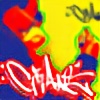
 onisan — Sketch

Published: 2004-05-18 14:06:58 +0000 UTC; Views: 1834; Favourites: 27; Downloads: 700
Redirect to original
Description
A green , maybe a bit DBZ Piccolo loooking char with green style.Related content


Comments: 21

 (Smile)")

")


wow i just started looking at your stuff and all iof its really good....im watching you now...keep up the good work...your really talented
👍: 0 ⏩: 0
dope man character is ill too the piece reminds me of klor dope
👍: 0 ⏩: 0


ja hab ich nur früher genommen ^^
Thanks for your comments
👍: 0 ⏩: 0

der style rockt, das will ich an ner wand sehen.
aber warum nimmst du immer kariertes papier? das macht voll viel kaputt...
👍: 0 ⏩: 0


SweeeeeeeeeeeeeeeeeeeeeT. I love it. good colors, and the character is crazy. I wonder how it would looked if it were more involved with the lettering
👍: 0 ⏩: 0


You got a good feeling for balance and I especially like the compactness of the whole piece and the way it flows. Choice of colors is good, the character has good expression. The only flaw I can find is the a in the centre of the whole piece, where the bottom right green stripe goes into the graff. It looks to simple compared to the rest. (Well, if it's not supposed to be an "A", then okay, it bugs me a little, no matter what it is) Well done!
👍: 0 ⏩: 0


dude awesome wild style...awesome character...now PUT THAT SHIT UP....especially in cleveland...people would flip for your shit....good work man, keep it up...
👍: 0 ⏩: 0

Sweet! Good style you got going on here.
Nice colours, good character.

👍: 0 ⏩: 0