HOME | DD
 Pasternak — 110508
by-nc-nd

Published: 2008-05-12 02:17:23 +0000 UTC; Views: 1596; Favourites: 50; Downloads: 82
Redirect to original
Description
...Related content
Comments: 16


You have earned yourself an Imager's Fractal Daily Deviation for Thursday, March 11th, 2010!
If you would rather not be featured, please let us know via NOTE and we will remove your piece immediately.
In the meantime, however, CONGRATS!
You can find your IFDD here: [link]
👍: 0 ⏩: 0

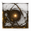
Thank is absolutely fantastic! It looks like it's bleeding (or perhaps blowing?) away! And I love the colors as well.
👍: 0 ⏩: 0

Four variations on a theme, all fitting together perfectly!
👍: 0 ⏩: 0

I really, really like this. It looks like a spinning wheel, maybe a target, a circular saw or perhaps a record or a CD. It seems to be throwing out some kind of red liquid-like something from the centre. It could be interpreted as blood I suppose or paint. I love all the other circular shapes in the image and the details and layering created with the different tones of gray. The texture with lots of arcs and lines looks great.
👍: 0 ⏩: 0

Love that fact that you use of color is constant.............it makes a great statement about you. Great composition.
👍: 0 ⏩: 0

Seriously cool. I like the balance it has and the textures are incredible!
👍: 0 ⏩: 0

So dark !
I'd have it turned clockwise because I feel it would strenghten the 'bleeding', but I can do this in my head 
👍: 0 ⏩: 1

Wow. I'm not really sure what else to say, other than that this, in my opinion, is definitely one of your best works.
👍: 0 ⏩: 0


