HOME | DD
 phillll — The Sentinel

Published: 2009-03-07 16:06:52 +0000 UTC; Views: 826; Favourites: 5; Downloads: 14
Redirect to original
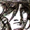
Description
To get through that gate, you are going to have to get through Him")
Idea inspired by the awesome game oblivion, and the seemingly unresting people who guard the various parts of it XD
No references used, all my own work
")
Made on Photoshop CS3 with a Wacom Bamboo Basic tablet.
Time taken..... around 12 hours
Featured here:
[link]
Thx to all who Featured
Related content


Comments: 22

Really awesome! I really like the whole look of this. The way you used the perspective makes it seem like he really towering over me! Good job!

👍: 0 ⏩: 1

thank you thank you thank you, that is exactly what i was trying to acheive, but i thought i had kinda failed to successfully portray that feeling by the end of the work
thx muchly for the comment
👍: 0 ⏩: 1
Your welcome! You definitely achieved that feeling!
👍: 0 ⏩: 0
It looks like you've definitely used some perspectives here. It was used to give the guard the impression that he looms over those who stand just outside the gate and see him.
I like the cape; it seems to compliment with the reddish color on the armor. And the blank face adds to the mystery of the guard's intentions. But the armor, the sword, and cape itself seem to say that this is a guard with shadowy intentions, and that he is not willing divulge it with trespassers.
The slanted doors are a nice touch as well. It helps add to the perspective of the looming guard. I can't say much on anatomy, but his fingers seem to clump with one another in such a way that it is difficult to determine as to which fingers go to which hand.
But overall, this pic is good. I like the perspective, color, and background of this guard.
👍: 0 ⏩: 1
wow
thx so much for the comment
oh and as to the hand, seeming as i suck at drawing them, i made loads of drafts, took the best looking one, flipped it and put it ontop of the other, i was trying to make it look like he is resting one hand on the pommel of the sword, and the other hand ontop of that one.
and again
👍: 0 ⏩: 1

lol, thx, he'll probably only walk into a wall though... seeing as his mask has no eye slits XD
thx for the comment
👍: 0 ⏩: 0

 (Smile)")

... woah.. epic.. and amazing.. love the colouring of this !!!.. the shadings fabo aswell
👍: 0 ⏩: 1
thx thx thx
👍: 0 ⏩: 0

There are only 2 things that I would suggest for this piece. First his head looks disproportionally small for his body and second the image seems really dark. And not ambiance dark, just hard to see dark. Other than that its really cool
👍: 0 ⏩: 1
yeh, on my monitor it looks not dark, but when i checked it on the college comps, it looks generally dark
and the head being small is kinda a result of my failed attempt at perspective
and thx for the critique
👍: 0 ⏩: 0


thx, that was loads of colour dodge layers and blending XD
👍: 0 ⏩: 0
