HOME | DD
 Psy-Pro — overFLOW

Published: 2005-08-14 11:39:10 +0000 UTC; Views: 1823; Favourites: 37; Downloads: 399
Redirect to original
Description
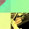
Made for my new art group starting in full swing only in Jan 2006..AURAL REALMS
about the group: AURAL REALMS:
it will have two categories....one for budding artists and one for elite artists.....so there will be two packs released with the same theme simultaneously one by the budding artists and one by the elite members.....both following the same theme/name. this will give both experienced and new comers a chance to show their work and if the budding artists improve over time, they will get promoted as elite members.....we will also have music releases as its one of my areas of speciality (producing psytrance and goa trance tunes) the music also will have 2 categories of members releasing the tracks simultaneously for every exhibit/pack........
Related content


Comments: 47


which piece does it remind u of?
amake dakhao kontaa!!
👍: 0 ⏩: 1

i didnt said piece just the overal concept / style...
amake dakhao kontaa... yes very much kontaa.
👍: 0 ⏩: 0

reminds me of my old work lol, you even used my logo
")
👍: 0 ⏩: 1
u mean the three 45 degrees rounded rectagles?? is that ur logo? if it is exactly ur logo and u want it removed let me know pete....i got the idea of the 3 rounded rectangles after seeing the SONY WALKMAN logo on my CD player......
looks like which one of ur old pieces? got a link bud?
👍: 0 ⏩: 1
just reminds me of my old style I guess, not one piece in particular, and my logo was 2 of the rounded rectangles..but dont worry man its cool
👍: 0 ⏩: 0

render is okay but you totally stole pete's typography, logo thingy, style of font, but well your placing is horrible so it doesnt matter.
oh original name man, you even did the flow in caps like the overflow group used to do. heh.
👍: 0 ⏩: 1
typography? from which piece ? logo thingy is simple 3 45 degrees rounded rectangles and the idea was from the SONY WALKMAN LOGO on my CD player.....the text is my fav and i have used it in several other pieces in the past.....i didnt even know there was a group named overflow.......check some of my other work and u will see i like combining either 2 colours or mix bold with italics or small with caps if i use 2 words in the title so thats how i made flow slightly bigger (not caps) than over which is smaller....
👍: 0 ⏩: 0

This is soooo cool!!!! 

👍: 0 ⏩: 0


")


Fantastic work bro. If this is what the preview looks like, I can't wait to see the group.
👍: 0 ⏩: 0

fantastic as usuall..need i say more?
i like this style
👍: 0 ⏩: 0
heeeeey ")
 (Smile)")
👍: 0 ⏩: 1

i will speak to U 2morrow on MSNger...
👍: 0 ⏩: 0


Oh daymmmmmmmmmmmmmmmmmmmm that is slick as hell.
im LOVIn the colors
👍: 0 ⏩: 0

You know I don't usually like the text overlays, but in this case it makes the piece look polished and profesional. Wonderful work!!--AG
👍: 0 ⏩: 1
eeerrrr *professional..sorry...it's early and my typing skills are minimal 
👍: 0 ⏩: 0

sh*t man you keep on getting better and better 
👍: 0 ⏩: 0


Yay
👍: 0 ⏩: 0

Wowza! Thats alot of detail, must have taken quite awhile to complete!
👍: 0 ⏩: 0


Woh! Looks really wicked! I always wonder how people make stuff like that. Impressive!
👍: 0 ⏩: 0

yea i love this one! Fav! This looks controlled.. some other work of yours ([link] ) is a bit too chaotic, in my opinion..! But that's my personal taste
👍: 0 ⏩: 0


nah! it will be named AURAL REALMS
👍: 0 ⏩: 0

nice work as usual
I really like the perspective
keep itup
👍: 0 ⏩: 0


I don't like the colours but really great pic anyway, GJ
👍: 0 ⏩: 0


way to add an extra shape to wirestyle's logo and call it your own (n). Sad.
👍: 0 ⏩: 1
what r u on about? its a simple 45 deg rounded vector rectangle.....its not even used as a logo here its just a design....u want to see what my logo is like then visit [link] and [link]
👍: 0 ⏩: 1
[link] - wirestyle
[link] - look at the top ( the angel wings and the circle )
[link] - the rounded triangles, same angle...
maybe im paranoid or something
👍: 0 ⏩: 1
the angel with wings is a set of brushes i downloaded......these brushes were found through google so i dont know if that wings thing is Pete's or the person who made those brushes.....
👍: 0 ⏩: 0


")
👍: 0 ⏩: 0


 (Wink)")