HOME | DD
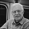
 rdungan1918 — Window Light

Published: 2012-12-10 23:34:24 +0000 UTC; Views: 608; Favourites: 22; Downloads: 0
Redirect to original
Description
Exposed at ASA 100Filter: None
Camera: Zeiss Ikona Taxona
Developed in Caffenol C-L 35 minutes semi stand method
Scanned on Epson V600
Adobe Elements 10
121208zit-27g-1
Related content
Comments: 7

Love the snappy tones of this.
Have you looked much at the work of Ansel Adams and Minor White?
👍: 0 ⏩: 1

My wife did not like this image at all. But, I did, so, I put it up anyway. Glad you enjoyed it.
Ansel Adams work is familiar. I am not familiar with Minor White, but, will google him to see his work. I have seen a number of Ansel’s images in museums and was not that impressed. They were 8X10’s and did not seem to portray the life and vitality of some of the posters of his images. His images when viewed on the computer screen also seem better. Maybe the large size made them more impressive.
👍: 0 ⏩: 1

It is a rather 'eclectic' piece. What my wife would call 'arty' at times
I've never seen an original of either (bit far away!), but have seen prints - mostly the rather nice gravure prints in the TimeLife photography series, on which I cut my photographic teeth some three decades ago. Mostly I remember them for "The Zone System", whereby they went to great lengths to get a good spread of contrast in an image, from deep velvety black through milky white. Adams would process each plate according to it's exposure and lighting conditions.
I used to tweak my Ilford HP5 in HC110 either by temperature or time to get the contrast I wanted. I then tweaked the print developer with drops of Hydroquinone. Sometimes I even got it right!
I now just play with the contrast curve shape in GIMP, and its MUCH quicker and easier, but the principles were learned from Adams and White.
This image has that crispy spread of contrast that still appeals to me, and can take an OK composition, and lift it into something a bit more special.
👍: 0 ⏩: 0

Thats probably the most best part of the image.
👍: 0 ⏩: 0


