HOME | DD

Rodier β€” Urban two

Published: 2006-12-19 08:11:28 +0000 UTC; Views: 12696; Favourites: 103; Downloads: 3766
Redirect to original
Description 
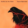
Alright, this is my most recent font, I havent edited it yet for typing. I just wanna know what do you think about it.

I've made 3 variations as you can see, I love the fat one *D

cheers!
Related content
Comments: 60

pansy-muncher [2010-04-17 07:53:59 +0000 UTC]

Love numbers 1 and 3. (: Good job!

πŸ‘: 0 ⏩: 0

NezGraph [2009-11-02 05:15:49 +0000 UTC]

If you make this font available let me know. Its great.

πŸ‘: 0 ⏩: 0

umar123 [2009-06-19 14:43:41 +0000 UTC]

I love this font... faved it

btw will it be ever available for dowload???

πŸ‘: 0 ⏩: 0

adrianvincent [2008-09-22 19:16:29 +0000 UTC]

sexy

πŸ‘: 0 ⏩: 0

FreezingInTheSno [2008-06-06 14:11:56 +0000 UTC]

did you ever make this into a font? i really like it.

πŸ‘: 0 ⏩: 0

deuce6000 [2008-05-01 03:57:13 +0000 UTC]

It looks great!!I hope it is released soon.

πŸ‘: 0 ⏩: 0

EvilStarship [2008-04-02 10:52:52 +0000 UTC]

From a typographer's point of view - theres some damn bad fonts on deviant art - even if they have nice forms the kerning is almost always screwed... but this one looks real good! please edit for typing!

πŸ‘: 0 ⏩: 0

Encre8 [2008-03-05 23:55:28 +0000 UTC]

man i de font style very refreshing keep it up ,when is it gonna be available for download?

πŸ‘: 0 ⏩: 0

pyros [2008-02-17 19:48:51 +0000 UTC]

fiiinish it!

πŸ‘: 0 ⏩: 0

Assassinatorsalbum [2008-01-05 00:59:53 +0000 UTC]

Please edit for typing


why don't you put the fat one in as bold?

πŸ‘: 0 ⏩: 0

mizuai [2007-09-04 09:01:48 +0000 UTC]

weww !! XD please edit them, man!! it's totally awe me love the fat one also btw~~
i'll be waiting man~~

πŸ‘: 0 ⏩: 0

arpad [2007-06-08 03:00:45 +0000 UTC]

The fat one is my favourite!!

πŸ‘: 0 ⏩: 0

exchequer598 [2007-05-17 06:08:20 +0000 UTC]

i like all 3!!

πŸ‘: 0 ⏩: 0

trinityz [2007-05-09 18:54:20 +0000 UTC]

safe.. keep it up..

πŸ‘: 0 ⏩: 0

Furi-ku [2007-04-23 08:31:59 +0000 UTC]

Please finish this font soon i really love it and would like to use it lol

πŸ‘: 0 ⏩: 0

YSR1 [2007-04-04 10:37:29 +0000 UTC]

Nice, is there a link to download??

πŸ‘: 0 ⏩: 1

Rodier In reply to YSR1 [2007-04-04 10:41:18 +0000 UTC]

i havent edited it for workng with it yet.... shame on me.

πŸ‘: 0 ⏩: 1

YSR1 In reply to Rodier [2007-04-04 10:46:41 +0000 UTC]

No, man no problm. I'll wait

πŸ‘: 0 ⏩: 0

energizerrabbitx [2007-03-28 02:22:51 +0000 UTC]

Love at first sight? I believe so! Faved.

πŸ‘: 0 ⏩: 1

Rodier In reply to energizerrabbitx [2007-03-28 02:55:49 +0000 UTC]

alright! cool! but i still haven't edited it for using.
thanks for watching!

πŸ‘: 0 ⏩: 1

energizerrabbitx In reply to Rodier [2007-03-28 04:56:20 +0000 UTC]

You should, I would love you forever.

πŸ‘: 0 ⏩: 0

andaska [2007-03-21 06:13:44 +0000 UTC]

yeah that would be a wicked font.. def make it!

i would use it!

πŸ‘: 0 ⏩: 1

Rodier In reply to andaska [2007-03-21 06:38:36 +0000 UTC]

I'll definately make it indeed !
checked my new murals?

πŸ‘: 0 ⏩: 1

andaska In reply to Rodier [2007-03-21 11:01:59 +0000 UTC]

not yet.. but i will now.. promises!!

πŸ‘: 0 ⏩: 0

lucasaguirre [2006-12-29 18:56:01 +0000 UTC]

first one first one!

πŸ‘: 0 ⏩: 0

paysm [2006-12-23 00:23:55 +0000 UTC]

love bold one!

πŸ‘: 0 ⏩: 0

Interpolny [2006-12-21 18:33:57 +0000 UTC]

they look awesome! I agree with everyone that the fat one is the best

πŸ‘: 0 ⏩: 0

FiruL33T [2006-12-21 15:56:28 +0000 UTC]

Tan buenas... Pero la bold no se entiende mucho en Beautiful...

πŸ‘: 0 ⏩: 0

TheNotoriousGAB [2006-12-20 12:06:54 +0000 UTC]

Thats HOT!
I'd definately use it.

πŸ‘: 0 ⏩: 0

FrescoGD [2006-12-20 00:45:16 +0000 UTC]

yeah realy stylish dude, great color choice too

πŸ‘: 0 ⏩: 0

Par4noid [2006-12-19 21:54:51 +0000 UTC]

Me gusta mucho mucho, sobre todo la primera

πŸ‘: 0 ⏩: 1

Rodier In reply to Par4noid [2006-12-19 22:08:58 +0000 UTC]

esssa muchacho gracias!!

πŸ‘: 0 ⏩: 0

nize-one [2006-12-19 21:47:09 +0000 UTC]

fat one is the best imo

πŸ‘: 0 ⏩: 1

Rodier In reply to nize-one [2006-12-19 22:09:23 +0000 UTC]

indeed!

πŸ‘: 0 ⏩: 0

RIPIX [2006-12-19 17:26:31 +0000 UTC]

lookin great, good job !

πŸ‘: 0 ⏩: 1

Rodier In reply to RIPIX [2006-12-19 17:44:05 +0000 UTC]

thanks!

πŸ‘: 0 ⏩: 0

caesar1996 [2006-12-19 16:56:43 +0000 UTC]

first one mixed with the second (as alternates) would be hot

πŸ‘: 0 ⏩: 1

Rodier In reply to caesar1996 [2006-12-19 17:43:57 +0000 UTC]

indeed!!

πŸ‘: 0 ⏩: 0

audiophile [2006-12-19 16:14:05 +0000 UTC]

wait, you have to buy it?

im confused
(nice font tho)

πŸ‘: 0 ⏩: 1

Rodier In reply to audiophile [2006-12-19 17:42:49 +0000 UTC]

I havent edited it yet for writing.
thanks *D

πŸ‘: 0 ⏩: 0

SickBoyB [2006-12-19 15:59:29 +0000 UTC]

La primera version MUY buena !!!!

Las otras dos las encuentro un poco confusas...

Muy buen trabajo !

πŸ‘: 0 ⏩: 1

Rodier In reply to SickBoyB [2006-12-19 17:43:47 +0000 UTC]

jaja, de eso se trata paradojizar la lectura en no lectura.

πŸ‘: 0 ⏩: 1

SickBoyB In reply to Rodier [2006-12-19 21:31:45 +0000 UTC]

jeje, es la dislexia (?)

Igualmente, me gustaron, habria que verlas en algun diseΓ±o como quedan

Saludos !

πŸ‘: 0 ⏩: 1

Rodier In reply to SickBoyB [2006-12-19 22:08:39 +0000 UTC]

soon very fakin soon

πŸ‘: 0 ⏩: 0

DaPoZZ [2006-12-19 15:20:48 +0000 UTC]

Funky font man.. will surely steal it from time to time

πŸ‘: 0 ⏩: 1

DaPoZZ In reply to DaPoZZ [2006-12-19 15:22:17 +0000 UTC]

Just saw it isn't for download yet

I like the first and last font best. First font in general is just nice. Second is a bit too off, but has its uses.

πŸ‘: 0 ⏩: 0

skaiser [2006-12-19 13:51:51 +0000 UTC]

ta buena, pero deberias estudiar mas las contraformas en la heavy, la interletra y la interlinea.

slds.-

πŸ‘: 0 ⏩: 0

Y0o [2006-12-19 11:43:35 +0000 UTC]

wow!! very good jobs, like you'r works man ^_^

πŸ‘: 0 ⏩: 1

Rodier In reply to Y0o [2006-12-19 13:41:21 +0000 UTC]

thanks man *D

πŸ‘: 0 ⏩: 0

spokeart [2006-12-19 11:01:32 +0000 UTC]

me likes the first one! its probably the best one to read. but the fat one is nice too!

πŸ‘: 0 ⏩: 1


| Next =>