HOME | DD
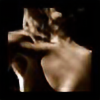
 roflraffa — Contrasts

Published: 2005-12-18 14:37:46 +0000 UTC; Views: 1901; Favourites: 31; Downloads: 227
Redirect to original
Description
having more and more time (Smile)")
stocks:
sxc.hu
Related content


Comments: 23

i love this, the hand and face is amazing. the touch of blood worked out too
👍: 0 ⏩: 0


wow that's so great... i also know the picture of lara...
yours is the complete contrast-- and i was just breathless while seeing whta you've done with it.. great work really
the skull fits so perfectly and also the thing with her hand...
think you did a great job


👍: 0 ⏩: 0

It's quite an amazing piece!!! ^^
Soooo creative!!!
")
👍: 0 ⏩: 0


That truly is a contrast. I love the work you've done on her hand.
👍: 0 ⏩: 0

")

I really like the lighting in this, the manipulation is great. Although I dont like the hand. I think that if the hand were normal it would be way better. The skull itself is striking enough without having to add the skull to the hand. I just think the face would pop out more.
👍: 0 ⏩: 0

ooooooooooo thats creepy lol. You blend things very well, is that a horse skull in her hand?
Lets see the only critique I have is the skull is just a touch too far forward to look realistic, but if you moved it back you would lose that creepy upturn in the corner of the mouth... Ok never mind lol.
I normally don't like creepy stuff, but you did such a good job I can't help but fave it
")
👍: 0 ⏩: 0


i know. not necessary. in fact, i don't like the idea,but the work is very good.
👍: 0 ⏩: 0

 (Wink)")

OMG this is soo creepy
to creepy
but the manipulation is amazing
^^
well done!!

👍: 0 ⏩: 0

gut gemacht... gefällt mir sehr gut. Bisschen mehr Contraste wären vllt. gut gewesen.
👍: 0 ⏩: 0


