HOME | DD
 SchluffyMuffin — Moss Agate [Contest Entry]

#contest #contestentry #gemsona #stevenuniversefanart #stevenuniverseoc #gemsonastevenuniverse
Published: 2017-03-12 21:51:18 +0000 UTC; Views: 619; Favourites: 15; Downloads: 0
Redirect to original
Description
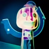
Entry for 's OC contest! I love Moss Agate, she's so adorable!Related content


Comments: 15


I KNOW, SHE'S SOOO CUUUTE!
👍: 0 ⏩: 1
Coming from projectcomment.deviantart.com/
I like the varying tones of green you used here, but I would have liked to see a little brown incorporated some how. Right now the green makes her come across as possible a forest spirit, maybe even sea water of some sort. A little brown added to her, maybe in the shading, would drive home the Earth tones, which I think was the intention?
The face, the eyes, the hair, really all of the anatomy are really well done. It shows a skilled hand and a considerable amount of natural talent. The pose looks natural and not forced and it is easy to see the emotion and personality in her face.
I like the eyes in particular and the faded out appearance you gave them. The light reflection in them is a really nice touch and something that can often be overlooked. Your use of it here has breathe some life into what could have been a static, flat portrait.
That being said, I would have liked to see some little details that give an insight into her personality. Maybe a necklace or some sort of trinket that would give a hint to her nature. Right now most of that is left up to the viewer, which may not be the intention if you are showcasing an OC.
Maybe even a bit of background to the scene, nothing too detailed, but just hints of what her normal environment would be like? Since that would speak volumes to her nature and personality.
And I agree with you, she is very adorable and you did a good job in executing it.
👍: 0 ⏩: 1
Thanks for all your tips about background, I know I suck at them, so I often do things like this instead if "real" backgrounds. As for all your other tips, Mossy isn't actually mine (as much as I'd like her to be ) so you'd have to ask her original owner.
Still, I'm glad you like it! Thanks!
👍: 0 ⏩: 0

Hello!! I'm here from ProjectComment 
 (Smile)")
")
The hand need a bit of improvement - but hey, nothing you can't reach after doodling a lot while looking at references ! Here on dA I can advice you to look around SenshiStock 's page, they're a profile dedicated to take and post amazing ref pictures! 
Finally, I like the colors you choose for the support circles, but the position of the bottom one makes Mossy looks like she's floating a bit - nothing that can't be changed by repositioning.
That's all! Keep up your great work, friend, and best of luck on the contest!!

👍: 0 ⏩: 1
Thanks for your critique! Yeah, I noticed the hair shine, but only AFTER I had uploaded the piece to my page. I do have a habit of turning layers off and on again so I can see what I'm doing, I think it's safe to say there was a mishap here. As for the spots, I don't know, you'd have to ask her owner.
Still, glad you like it! Thanks again!
👍: 0 ⏩: 1
The layers get us lost, I feel you 
and you welcome! keep your art going!
👍: 0 ⏩: 0


AHHHH She looks adorable!!! ¨
I love the pose and the hair! Just so adorable!!!!
I want to say more, but I'll wait until the contest is done!
Thank you soo much for joining, good luck! <3
👍: 0 ⏩: 0