HOME | DD
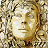
 sculptin — Goldfish

Published: 2005-06-15 22:07:10 +0000 UTC; Views: 1844; Favourites: 38; Downloads: 112
Redirect to original
Description
Montana Burgundy Soapstone8 inches tall
Related content


Comments: 24

Wow - simply WOW! You definitely have an eye for catching shapes! You have many wonderfully sensual carvings posted here, but this one is my favourite. The stone itself is a beauty, too. Congrats!
Do you create the shape of your sculptures along the way, as you sculpt them, or do you do sketches first? I just started to carve soapstone and mostly do it the 'along the way'-style, starting from a rough sketch...
👍: 0 ⏩: 1

More often than not I just start and the rest follows.
👍: 0 ⏩: 0


is there any reminiscence/r reminiscence reference to polynisian fishing hooks?
absolutly stunning!!!
J.
👍: 0 ⏩: 1
I have researched Maori styles and I'm sure it has influenced my work.
👍: 0 ⏩: 1
I am not surprised...I have a strong attraction to South Pacific sculpture myself....
J.
👍: 0 ⏩: 1


WOW~ pretty~~
love all the detail and the elegance of it balancing there
amazing!! as usual X3

👍: 0 ⏩: 0

 (Smile)")

wowie... This is my fav af all your stuff so far... well... almost... the flaming vagina is still right up there... but this has a real style to it that really comes across... very polished yet raw thing to got going on here, i loves it!
👍: 0 ⏩: 0
I--blank--I [2005-06-16 12:01:26 +0000 UTC]
this is great. I'm loving the extra details and those teeth! Looks almost dangerous
")
👍: 0 ⏩: 0

Amazing....I'd like to see a 3/4 shot too...I very like the soft-cruelty that come with this one!!! very unusual and different from ur standards...did u feel angry sculpting this?!? ")
+fav
👍: 0 ⏩: 0
Is this the stone you can't get anymore? Amazing color. The fins/teeth and the execution remind me of Giger, for some reason--intense piece!
👍: 0 ⏩: 0

It looks different to your usual style but it is very very beautiful,reminds me of native american wood sculptures
👍: 0 ⏩: 0

*gasp* I wan't one!!!! Oh god this is my favourite one so far. Puts me in the mind of Maori bone carvings but this is fare more fee form becaust you are not confined to the shape of a bone. I love it! 
👍: 0 ⏩: 0
I love the shapes in this one, especially the toothiness. Very cool. Love the swirls, the circles, the fishiness - a definite fave. 
FYI: My eye is drawn immediately to the art so where your name is placed makes no difference to me, and I like the frame, although my monitor is so dark that I didn't notice the red until it was pointed out. I do think it would be better if the lines in the background on the right picture weren't there though.
👍: 0 ⏩: 0


interesting... imfinding myself bothered by the double framing that you are using and the upper placement of your name. it is programmed into us to read from top to bottom right to left. here you have placed your name upper top left. i look and begin reading your name when i should be looking at the piece. same for the fancy framing of the pictures. it doesnt add to your piece in my view but takes away from it. your pieces are earthy and fluid and here you have a sleek neon-like frame.
however this could be a personal preference of mine and not the view of others, so if you disagree its aok.
👍: 0 ⏩: 1
Neon as in the red band in this dev? I was playing with colors, just putting together my recent devs. Do the white ones bother you? Or do you prefer all black? Or any border at all? .I figured I'd try it to see. I do concur this one is quite gaudy.
As for the placement of my name I too concur. It does interfere with the natural flow. Perhaps a title and my signature should go at the bottom? Take it right out?
Meh....
👍: 0 ⏩: 1
i vote for a clean border of black or white. thin or thick is totally up to you, name at the bottom. I have noticed a definite improvement in the photo setups of your pieces. and i must applaud you for that.
👍: 0 ⏩: 0