HOME | DD
 Senecal — 12

Published: 2005-02-04 01:53:01 +0000 UTC; Views: 971; Favourites: 14; Downloads: 145
Redirect to original
Description
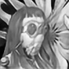
Illustration for a book coming up.The title is the page number, as it stands now.
That might change. This is the main character in a time of crisis.
The razor is not a photograph, but a drawing, done digitally, in fact this is all digital.
Related content


Comments: 29

That is some fucking amazing drawing and texturing right there. D: *stares in awe* Beautiful illustration work...
👍: 0 ⏩: 1

Hey thanks, glad you checked it out. If you dig that one, check out the book that it is in.
There are quite a few other illustrations in that series in it.
The book is called God's Acre, the Ravens and the Rhyme here is a [link]
👍: 0 ⏩: 0

Thanks, this is from God's Acre, Book One, the Ravens and the Rhyme...it's a pretty cool book and there are more works I made in this style.
Check it out if ya wanna here: [link]
👍: 0 ⏩: 0

wow, the razor looks so real!!
The rest looks like a drwg...you tought me to see digital in a different way, artistically...
👍: 0 ⏩: 0

fucking amazing depth! Just the layering, and texture is absolutely fantastic. I really enjoy the scratchy lines on his shirt and arms. It really gives you that nervous, and unstable feeling, and that all the intensity is on his shoulders.
This is going to make for a great illustration in this upcoming book.
👍: 0 ⏩: 1
Thanks very much. The book is out and doing pretty well now.
You can read a review of it here: [link]
Good to see ya!
👍: 0 ⏩: 0

Thank you very much. Glad you stopped by to see it!
👍: 0 ⏩: 1


Wow, really amazing piece. I love the style you made of the figure, just that whole scribbly plus shading style just looks really nice. Very emotional.
And that razorblade is excellently done. Don't you love it when people find something in your picture that looks so realistic they swear it's a photo, and you're just grinning knowing you made it by hand? Really excellent work making that look photo realistic; it definitely does look like a photo.
I'm loving your textures in the background too. Amazing work.
👍: 0 ⏩: 1
Hey thanks for stopping by and checking that out.
I appreciate the in depth analysis.
This is actually one page of a book that will be coming out later.
👍: 0 ⏩: 0

I really like the mix of techniques here, the realistic with the sketch-like...kinda what everything in life is...half real half undone...
I am terribly philosophical today...lol...
👍: 0 ⏩: 1
Hey that is a good thing.
And yeah, I am loving the combination.
I am also getting into hand coloring of the prints with watercolor too.
It makes a nice result.
👍: 0 ⏩: 1
well it was one of those days....now I'm just plain tired...hehe
The combination is beautiful...watercolors are great, you can have so much fun with them..you can create very surreal mixes...
👍: 0 ⏩: 0

Really nice - the composition is great and the mix of elements blends togehter perfeclty.
👍: 0 ⏩: 0

very interesting. good to know you are getting work. well-paying work i hope!
👍: 0 ⏩: 0

you know it's good .. (grin) .. what can humble i add ..
👍: 0 ⏩: 0

I like the way the lines look scribbled.
👍: 0 ⏩: 0


I will have to agree with Dakin. The combination of styles makes for a rather jolting whole... I'd expect that is an intentional effect though, and could be appreciated when viewed with the book's content as a context? Maybe I am mistaken, but as it seems to be a piece partnered to some other work, work that likely colored this piece's formation... In anycase it does seem that as an image standing alone it is a little unbalanced.
--
BTW, your last icy Breed submission rocked. Think you can make us an iTunes skin based on that?
")
 (Wink)")
👍: 0 ⏩: 1
The the whole of the illustrations for book was about going for it, less about adherence to a set of stylistic guidelines and just letting the forms flow. Beauty in the banal, more like capturing that flavor of fever where things merge and blend and are superheated and the least light or scent makes you want to vomit. That is where a lot of it came from, but some of it was about being pretty and conventional where necessary. I find as the years go on that I have developed a taste for 2 things:
Really hot sauces como los de mexico, and wandering quality of line, scraggled, nervous, and disintegrating.
Sketches are really my favorite things to see now, the rudimentary moments of working it out.
That is what I wanted to capture, like little kid drawings... but I don't think we can ever really get back to that, not really.
👍: 0 ⏩: 0

I'm not sure how well the blurred-out background, the (very) realistic razor fit, or the sketchy figure fit together as one image.
In and of themselves, they're well done, but I'm not feeling it.
👍: 0 ⏩: 1
That's cool, I dig the feedback.
Some people will, some wont but that's still great.
👍: 0 ⏩: 0
Thanks, when the book comes out I will be posting the news.
If there is enough interest, I could also make some prints.
👍: 0 ⏩: 1

awesome.
by then i sould have the money.
👍: 0 ⏩: 0