HOME | DD
 shirotsuki — Edolie - Remix

Published: 2009-04-20 14:50:47 +0000 UTC; Views: 71108; Favourites: 5630; Downloads: 0
Redirect to original
Description
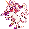
Edolie! One of the oldest characters, she first popped up in the story five years ago and looked.. pretty stupid. The only thing that I kept from that is her face - it still speaks to her character, so it's good to go.From her last incarnation though she hasn't changed much, (see older deviation: ur doing it wrong) except her colors, a few tweaks on her outfit, and actually coming up with how I think the wings need to look. I referenced the angel wings of Stephanie Pui-Mun Law for a start, she's got such a mastery of flow in her sketches and I was really tired of drawing wings that looked immovable and flat.
Yes, wings. Im aware of the cliche'. Painfully so. But, I like them. There's nothing more fun in the entire universe to draw, and if I want to draw five hundred feathers over and over again, that's just my prerogative. That, and they're not totally redundant, they stand for something. If nothing else, I seriously needed something easy to spot that identified her class of character.
Antique bronze is the new black! It didn't make any sense to keep painting her red and black. Coppery sunset orange is also a better fit for her anyway.. and look, no shoes! I guess that means she's got really dirty socks.
Hooray! Off to work on other stuff now. Thanks everybody for tagging along, the idea for this project is to have it ready to be worked on by the summer. So hopefully come june I'll have some information on a place for this thing to live! Finally! First i'm still working on a format to actually tell the story in, since comics have a way of eating my brain to death.
Actually, for anyone and everyone who makes it this far into the comment, if you've got an example of neat/imaginative storytelling, please send me a note with a link! I'm studying a lot of different ways of getting this thing unstuck to the roof of my skull and out there, but I'm trying to be more outside of the box than I usually am about it. Help!
Related content


Comments: 264

Overall
Vision
Originality
Technique
Impact
When I first saw this picture, it was the colors that stood out to me. While it's essentially monochromatic (dealing with mostly browns and oranges) it's still visually striking.
However, since this a critique, let's continue onto things I think you need to work on.
First, is light sources. I'm not really sure, while looking at this piece, where the light source is from. At first I thought there was a light source that shines on her left shoulder and creates that dynamic golden glow on her left shoulder and breast. However, looking closer, I realized it was actually part of her outfit! Then there's the seemingly lower light source that emits light from below her, and shines up at her and creates the 'bending' of light on her shins and stockings. But that light source doesn't show up anywhere else (like the bottoms of the wings, or on her clothes) to suggest that the light's really there. This also happens on the wings, so it's hard to tell how the wings really bend, or where the light's actually hitting the figure.
Moving only slightly away from that topic, the constant light (or lack thereof) doesn't hit her face at all, and her hair (opposed to the rest of her body and clothes) isn't hit by any of that orange, dynamic light at all. There's a white light, but no orange. Doesn't that seem strange when orange light seems to hit everything else (mostly her arm and shins) but not her face and hair? While the rest of the picture seems together in some sense, the face stands out as an 'unfinished' part of the piece. I would suggest concentrating on unifying your piece more.
Lastly, while the wings are certainly well drawn and intimately a focal point of the piece as a whole, they don't fit. Why? Because the lighting on the wings is entirely different. The wings bend, while her body doesn't. The wings light up from a light that doesn't affect the body. This seems unnatural.
Overall I'd say your piece was nice, well drawn, and visually appealing. However, if I was asked to base my opinion of you on this work alone, I'd say you needed some work still. I'd suggest focus on your lighting and how light bends and changes when hitting a three-dimensional form. Remember that if a light is orange, anything it touches will be affected by that color and somehow reflect it.
Good luck, and good job! I look forward to seeing you get better with leaps and strides and seeing your wonderful art!
👍: 0 ⏩: 0


Impact
I love the colours you used and the way they perfectly fade into each other. Her hair and outfit are very nice!
I love the wings! I don't really care if everyone and their mom draws wings on their characters, because they're really interesting to view, especially in this case because I've never seen wings drawn like this.
The only problem I have is the left arm looks awkward to me maybe because of the left wing. I kind of want to bend her arm at a 90 degree angle [but maybe I'm just crazy!]
All in all good work!!
👍: 0 ⏩: 0

Overall
Originality
Technique
Impact
This is a wonderfuly drawn picture! Personaly I am pleased you did not make the wings uniformed as most people do, since that looks fairly unnatural.
The color scheme is well blended there are no outstanding, or too outlandish colors everything fits together smoothly.
The pose brings to mind a sense of shyness, with a mild touch of "don't mess with me I might bite... only a little."
The only thing that stands out a little is her arm on the left, it seems like her elbow is protruding on the oppisite side of where it should be, as if her arm was broken..
Her face also reminds me of "Sakura" from Street Fighter, mostly since she wears a bandana, and has bangs in the same manner as your character is drawn.
One other thing that would make this picture stand out is a background, however since this is just a character representation, a white background works. Just a suggestion for the future.
Over all Wonderful work! Keep up the good progress that you are making!
👍: 0 ⏩: 0
Overall
Vision
Originality
Technique
Impact
There are two things i instantly notice when looking at this piece.
First there are the wings, which demonstrate an attention to detail that I very much admire. The silhouette they create is very eye catching and adds an interesting twist to the character especially since her outfit is pretty simplistic. The wings also have a sense of movement, and the one on the left is angled in a very interesting way.
The second is the left arm (her right arm). It doesnt look like the elbow or hand are positioned right based on the way the shoulder is rolled forward. It almost appears to be facing the wrong direction in some points, or that the arm is severally twisted. It would make more sense to me if the elbow was bent up towards her other shoulder so that her arm covers her chest, or if the should was not rolled so far forward at all.
Overall the color is really nice, i love the coppers and yellows mixed with the reds. The character herself looks very well thought out and simple, yet edgy and memorable.
👍: 0 ⏩: 0

Overall
Vision
Originality
Impact
Very nice detail and the feathers on the wings are amazing. But the one thing that is bugging me is how the wings are turned. If may be you could flip the right and left wing positions it would look more natural with how she is turned. Right now her right wing seems to be bending back at an odd angel compared to how her left one is. That has to be uncomfortable for anything with wings attached to their backs.
Other then that amazing work as always. I love how you shade your images. Keep up the good work >^^<
👍: 0 ⏩: 0

hello, first of all start by saying that this is an excellent work.
BG is not required to make a major impact because it is so well done the pose is so well placed in the space is not necessary, but can be recharged drawing
Your technique in the digital coloring is perfect, your work leaves me speechless, I have no criticism about that.
personally, my favorites are the details of hair and feathers, show that you're someone who likes the detail and care about them
you made the choice to use a few colors, I think it was a good decision, it is a very good combination, are colors that give me the feeling of autumn
please continues to make excellent work like this
to the next!
Vali
👍: 0 ⏩: 0

I really like this character. A very clean presentation helps a lot towards making a good character, and you've got it here. I'm not sure what her colour scheme looked like before (you said it was red and black), but I like the orange/bronze/sunset colours she is now.
The short, unruly hair and her wide headband make her look a little younger, as does her playful pose. The bright stockings/long socks add just enough punch of bright to soften the large amount of dark bronze.
I, personally, would have liked to see a bit more visual intrest around her throat/upper chest to break up the dark solid colour, especially since her dress goes all the way up her neck.
The two buttons on her sleeve/cuff add a bit more of the visual intrest I mentioned earlier, and help the eye focus on something.
This might not matter to you, but when I first saw her, the wide headband, pixie looks and something about her stripped stockings reminded me (very breifly) of Yuffie Kisaragi from FFVII.
I really enjoyed the wings, and although I'm not sure what you meant when you said they were over-done, they really fit her perfectly.
I'm really interested in seeing more of her.
👍: 0 ⏩: 0

Overall
Vision
Originality
Impact
I really like the soft edges on the character, around her hair and wings especially. She has nice proportions and small breasts which suits her innocent look. I'm not sure about her arm though, the perspective makes it look awkward and contorted. The colours are excellent, especially her wings. The colour and shape of her wings remind me more of that of an eagle than an angel, which I find interesting because you mention that you used an other angel as a reference. Overall I think this piece is excellent. Carry on and I look forward to seeing more of your work in the future.
👍: 0 ⏩: 0

Overall
Vision
Originality
Technique
Impact
Ok, well, this piece is really interesting. The wings are actually rendered excellently, with incredible attention given to each feather and, especially, the form of the bone structure in the wings. Your color choices are, from what I can see, in the analogous color scheme. And this works well, giving the piece an overall aesthetic. Assuming the girl is fairly young, in the pre to early teen years, you represent her age well within your style. And your style, as always, has a very recognizable quality to it. The image also has a good(if simple) composition on the page, with her wing outstretched to the right and her placement on the left.
That being said, there are a few kinks that could be worked out.
The first, major kink is light sources. From what I can tell, you either have four separate light sources, or you're trying for some kind of atmospheric light, such as the light you might see outside on a partially cloudy day.
If this is what you were going for, it's fine, but then the wings actually need less contrast. The way you rendered them, it would seem as if there is a strong light source from both her left and right, and then also from above. This is because of the high contrast between the brightest bright and the darkest dark in the wings.
Now, if you weren't going for an atmospheric light source, then you really need to clearly define one or two major light sources, and figure out where the light would be hitting the wings (so, perhaps not on top). This would also be applicable to the girl's body, which would need more contrast and, again, clearly defined light sources.
I also get the feeling that you don't really render shapes with dark colors. As in, beyond the midtone of an object, all of the shapes in your images flatten out because you give them this smoky, undefined rendering. This makes it sometimes hard to differentiate between shapes and, like I said, flattens forms.
I understand that your style is to create very very soft shaded images, and you can still do this while moving cohesively from a darker dark to a lighter dark. And, for harder angles or folds, putting a dark dark next to a light light will give a better sense of a quick change, or angle. A strong point in this image would be the girl's leggings in reference to this, specifically her ankles. And a weak point would be her dress/long shirt, mostly in the middle. You can still work with this in your style, by keeping most things extremely soft, but even skintight material has folds in it when the body moves.
Lastly, I'd just like to mention a few fairly quick-fix anatomical issues. The eye on the left side of the piece is a little too high. The ear on the right side of the piece, you wouldn't be able to see it the way her head is turned. The breast on the left side of the piece should move up with her shoulder, not down, and be more in front of the other. And the arm on the left side of the piece, while I understand that you are trying to make it flow with the character, is bending backwards at an impossible/uncomfortable angle. Her hand would be better suited on her leg, with the wrist bending towards the direction of that leg and with the fingers splayed. Allow the hand and wrist to suggest the motion more than the elbow.
I know this was wordy, but I know I enjoy any opportunity to improve my artwork. So I hope this helps for you. e.deviantart.com/emoticons/t/t… " width="15" height="15" alt="

👍: 0 ⏩: 0

I love her colour scheme. Like a combination of liquified bronze and gold...
 (Smile)")
👍: 0 ⏩: 0
She kinda reminds me of Yuffie because of her attire and hair with focus band. ^^
👍: 0 ⏩: 0


I dunno why, but the first word that pops into my mind is "Yes!!" XDDD
👍: 0 ⏩: 0

what soft ware do you use
are you liking the results

👍: 0 ⏩: 0


"One of the oldest" and also one of the cutest characters
yep)
👍: 0 ⏩: 0
brilliant. this piece features a good choice of colours, its very dynamic-looking too.
and the wings are possibly the most plausible wings-on-a-humanoid i've seen on dA.

👍: 0 ⏩: 0

Lmao my name is so similar xD
I love this tonnsss <3333 your colouring is so nice and I love how the linearts are nice and sketchy~
👍: 0 ⏩: 0

Aw shes so adorable! I love the softness of her expression and the fading colors and the wing detail is all amazing ^_^
👍: 0 ⏩: 0

hi, um, could i make a pixel base off of this? you'd be given full credit and i would link back
👍: 0 ⏩: 0

i love how soft and " feathered" it looks, really makes the theme of the picture
👍: 0 ⏩: 0


oh j'avais une pote qui m'avait recommandé ta galerie et je croyais pas t'avoir déjà vu mais ce dessin si!! °o°
j'adore!! surtout tes colos!!! xD
👍: 0 ⏩: 0

I love these warm colours and her eyes - what a pretty girl!
👍: 0 ⏩: 0

I love the posture you gave her, and the wing's position is very cool. :3
👍: 0 ⏩: 0


")

The half violet-half purple chest is a neat touch. The wings look funny though--are they pointed backward?
👍: 0 ⏩: 0


Oh my, what gorgeous colours!
It's like melted caramel and chocolate moulded into an outfit and wing form, and embossed with steam-punk-esque metals
What a pretty, delicate yet strong looking character too, you shouldn't feel that she is clichéd!

👍: 0 ⏩: 0


I think it looks great and the colour scheme definitely works well.
👍: 0 ⏩: 0

I think she's beautiful 
👍: 0 ⏩: 0

The colors are so wonderful. 8D The detail in the wings is..really...amazing, too. XD I'm not great at critique, though, ahggg. The lighting looks a bit questionable in some areas, as if the light source changes randomly, but again, I pretty much have no idea what I'm talking about. xD
👍: 0 ⏩: 0
SunSpriteRaven [2009-04-28 07:28:32 +0000 UTC]
I love her design! Wonderful colors and the wings are amazing!
👍: 0 ⏩: 0

I LOVE her design! the wings are beautiful and the colors too ^^ and she's really cute! haha
👍: 0 ⏩: 0


great work, tho some constructive critism: he right shoulder looks a bit akward, other than that amazing stuff!
👍: 0 ⏩: 0


The wings do look absolutely fantastic.
I'd add a little more shadowing onto her thighs to counteract the bright yellow stockings, and perhaps sharpen her features a little so her face doesn't fall so far back that it blends with the wings.
The colours are lovely.
👍: 0 ⏩: 0

| Next =>