HOME | DD
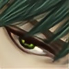
 silentillusion — Rainy Day

#comicart #digitalart #digitaldrawing #oc #ocs #originalcharacters #rain #rainy #rainyday #characterart
Published: 2016-01-07 00:48:27 +0000 UTC; Views: 404; Favourites: 20; Downloads: 0
Redirect to original
Description
Happy New Year everyone!
It's been raining a lot lately. It makes me happy ☔
Survived the holidays, so I can get back to chapter 2 of Centralia.
Don't forget that the comic is looking for guest art! More info on that here: centralia2050.com/looking-for-…
It's a good way for me to help promote you and your work ⭐
Read the comic at www.centralia2050.com !
Related content


Comments: 7

You have a cool style! The white and black (as others have commented before me) are really impressive. I like how you've managed to make everything so well contrasted and all the details stand out.
👍: 0 ⏩: 1

Thank you very much! :3
👍: 0 ⏩: 1

I like your linework, the use of white on black area is pretty clever! great work
👍: 0 ⏩: 1

I like how you use the white contour lines in black areas, and how that allows greater flexibility to add more flat black areas. Are you in the school of "half the page space should be black" ?
What are you looking for in terms of guest art? Like a pin up or cover art style?
👍: 0 ⏩: 1
Thank you! I haven't heard of the rule about half the page space being black, actually. I was just trying to make the blacks more balanced.
As for guest art, I'm looking for any illustrated fanart of Centralia that fits along with the feel of the series and nature of the characters.
 (Smile)")
👍: 0 ⏩: 0