HOME | DD
 SKIRANGER — Elven Rangers at Dawn

Published: 2011-12-31 23:21:20 +0000 UTC; Views: 1336; Favourites: 35; Downloads: 43
Redirect to original
Description
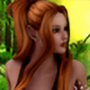
Edit: Redid the skyscape; had to take out all that pink.This is my most ambitious effort yet. Been working on it the last two weeks and have nearly 40 test renders to show for it; changing lighting and shadows, fixing, fixing again, and oh yeah...fixing some more. I have screamed in the air a few times, like when my mouse curser disappears while using general translator and I have to quit DAZ for it to come back (this happen to anyone else?). I know its far from perfect, but I had to stop somewhere because I was really starting to nit-pick. Learned a lot about lighting here.
All rendered DAZ Studio using too many parts to list specifically: Genesis, V4, M4, Skyscape, Versatile Terrain, etc.
Thanks for viewing!
Related content


Comments: 32

I love the concept. Reminds me of Lord of the Rings and even Game of Thrones.
")
👍: 0 ⏩: 1

Thank you so much! That is such a complimentary comparison! You are too kind.
👍: 0 ⏩: 1
Just being honest. It's what I see.
👍: 0 ⏩: 1

This is amazing. I love 3D works, and this one is pretty well made. ^^
👍: 0 ⏩: 1
Thank you, very nice compliment for a piece I spent a lot of time on.
👍: 0 ⏩: 1
Great lighting and fire affect and nice little adventure group. I'll bet the main problem was a huge polygon count. I have tried rendering a large group like that a few times myself. My computer about dies LOL
👍: 0 ⏩: 1
Thank you so much. You're the first one who seemed to notice what I was trying to do with the fire ball and rising sun lighting. Duly flattered.
👍: 0 ⏩: 0

Will send a note tomorrow after some sleep but.. remind me to tell you about apply smoothing modifier for poke thrus. Love this option. Hugs, Tina.
👍: 0 ⏩: 0

Much better  (Smile)")
 (Wink)")
Good points by Jammin!!
👍: 0 ⏩: 1
Thanks. Gonna tweak some more. Glad I can edit without deleting. Hadn't realized I could do that 'til I tried.
👍: 0 ⏩: 1
I like DA over the other sites. They give you the ability to post a bigger image if you wanted compared to the others who limit you on the number you can post and the size.
👍: 0 ⏩: 0

First of all, I want to say you did good here
Since you asked specifically for a critique, I gonna go ahead and do my "nit picky" here hehe
k, first, I think you have the surface settings looking good here, though I do wonder about the girl on the right, her legs color look different then the rest of her body. Is that supposed to be a pair of light pants on her? Or a pair of tights?
The brightness of the lights... it looks good on the characters/ground, but the sky doesn't exactly match. If you want the lights to match the sky, I would make it brighter. If you are using a spot light for this scene, I would ditch it, since you can't set shadow softness on them. If you're using multi lights, ditch all but 1. If you don't have UberEnvironment loaded, load it, here's a good lesson on some setting with UE... [link] Load either the Distant light or DS4's new Linear Point light, set the shadows to Raytraced Shadows, and shadow softness to about 10 to 15 to make them softer and more natural. Load another light (distant light if you loaded a distant light, linear point light if you loaded a linear point light), parent them to the main light, and set all position/rotation to zero. Set the light on "specular only", intensity to 30, color to maybe grey or light blue, and shadows as same as the main light. The color of the light actually looks nice
The sky, I don't know what you're using, a skydome? A plane background? Or are you setting the sky as background? I notice the sky looks brighter behind the characters, yet you have the shadows going the same direction. If this is a skydome, I would rotate it to where it's going from brighter (left of scene) to darker (right of scene which is behind). Either you can do that or rotate or position the lights behind them where the shadows will point the opposite.
This is all I can give for now, as I don't know what your scene consists of. Let me know if this will help, or if you have a different set up, I'd like to know what lights you have here.
I like your set up and theme here, and most of the work done here looks great
...wolfie
👍: 0 ⏩: 1
Thanks so much for your time here. You've given me lots of things to consider and play with; much appreciated.
Thanks for the kind words.
👍: 0 ⏩: 1
Absolutely welcome, friend!
👍: 0 ⏩: 0

I agree with everything Nythande said. The pink background is really garish but had you made a more subtle sunset gradient background in PS it would have tied in really well!
I'm appalled it took you almost 40 renders to get it right. I would have gone MENTAL!!! Kudos for your patience though XD I think you'll get the hang of it real quick. I've seen some pretty awful renders out there even from people who have been doing it for a long time. I find in DAZ and PS you're ALWAYS LEARNING! Looking forward to seeing more attempts from you!
Oh, as a side-note! If you send yourself mad dealing with poke-through, PS is great for cheating and cover-ups. I know I do it. XD .png files are your friend. There's AWESOME stock backgrounds here on DA. Use them well!
👍: 0 ⏩: 1
I hear you, and I agree. There is nothing like looking at your work through the eyes of others. I must say it just didn't look so brightly pink until I saw it here 
More frustrating than than the renders was the constant finding of some little detail error i'd missed. I read here on dA about long render times, but my macbook churned all those renders out in five to twelve minutes at high resolution. It used to crash when I first started rendering but it hasn't done that in a while (to my surprise; I save everything before rendering). Thanks for the input.
👍: 0 ⏩: 1
Yeah. it's easy to make posing or clothing mistakes too when you're doing wide shots like that. I'm doing one at the moment and I just can't seem to get a characters goddamn eyes to look at the viewer because he's far away and if I zoom in to redo it, I lose the framing and it's out of whack again! Annoying! XD
👍: 0 ⏩: 0
Posing and composition of your characters looks good, but the pink sky is distracting...heh hurts my eyes

👍: 0 ⏩: 1
I put the dragon in-debated about it and then kept him in. Yeah, the sky seems more vivid now (it appears even more so in the smaller version), as well as the orange on the big elves face; now wishing that i'd toned them down a tad. The sky is a layered background, my first time using it, and I played with the colors per layer (not sure exactly what I did this time around, will have to study it for later). Wanted the shadows like that and Im happy how they turned out; they can be turned off.
Still don't know how to use ps, though I have the latest version. I need to get on that.
👍: 0 ⏩: 1
so you wanted more of a sunset image? is there a way to darken the sky like your characters are looking towards the sun going down so the sky behind them would be darker or instead of pink, orange?
👍: 0 ⏩: 1
I had control of the colors in DAZ; I just left it as is. In retrospect it seems a little bright. I do want to learn to use ps as you describe. I will check out didi-mc's backgrounds.
Yes, I would like to incorporate outdoor shots as background, though I want them to blend with 3d format; don't want to photomanip. Just don't know how to do it yet. Im kind of
👍: 0 ⏩: 1
Well, the best way to learn how to use something is to play around with it. PS is fun when you start getting the hang of where some things are located. Think of layers like those picture books we would have as kids where it is a book make up of clear images that stack on top of each other so you take one page away, there is less of an image showing, or other way around, add the pages and the image builds up...that is what you're doing with layers.
So when I do postwork, I will duplicate my original image, and if I have to fix poke thrus I will either work on the duplicate or if I have to do important drawing and might require an eraser I will go with a blank layer. Draw what I need and if I screw it up, I haven't destroyed the image, and allows me to erase to my hearts content. When I first used PS I was clueless on what layers were until it just clicked one day.
Look at this [link] she made this by taking images of woodlands and messing with PS to add the glitter effect and coloring.
👍: 0 ⏩: 1
Ive played with it a little, though not enough, that is what I need to do.
👍: 0 ⏩: 1
Right now I am working in PS, trying to make an old furry rug look furry...LOL it's an old prop from like 5 or so years ago so it renders flat as a pancake as in it's texture appearance, so it doesn't look very animal skin furry...I should have messed with the displacement map now that I think of it...hmmm next time. But I'm having to draw furry marks all over it to make it look soft and comfy...tedious, but I hope it works.
👍: 0 ⏩: 1
I vow to get my PS on.
Thanks for you're constructive critique on this image; it was needed. Currently re-working the piece; wish i'd have been more patient before submitting because Im more dissatisfied every time I look at it.
👍: 0 ⏩: 1
You are welcome. Anytime.
It is good to be brave to post stuff as you're just getting your feet wet! Like I said before I was ever so proud when I posted my first image on another site and after posting I realized I forgot the lights...no wonder that image was dark! LOL But it's nice when people offer tips, like I never thought of using a blue light to make white hair show up better! Lights still confuse me, I'm find using lights from packs an easy way out of doing my own, but I really need to learn and since I got my new book in the mail, I'm going to give it my best shot. There might be times when you think you're not getting it and want to pack it in, that would the time to walk away from it for a little bit and then tackle it again with a clear mind. This has been one hobby that I'm surprised I've stuck with...Usually I start a hobby and buy the gear and then pffft I'm bored with it...I've been using Poser since 2004 so this wins the aware for being the longest running hobby for me.
👍: 0 ⏩: 0

anytime my friend !!
👍: 0 ⏩: 0
Definitely best viewed as download-though it might take a few minutes.
👍: 0 ⏩: 0