HOME | DD
 SoraChiiy — Fanart: Sushush

#glasses #green #hoodie #red #unknowngender #sushush
Published: 2018-11-24 15:33:59 +0000 UTC; Views: 441; Favourites: 26; Downloads: 0
Redirect to original
Description
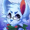
My sister kept on telling me how the eyes looked ugly in fav.me/dcsrp6a so i changed it to this (i would like to know what people(you?) think about the two) which is better?Related content
Comments: 18

Hey, I'm from ProjectComment!
This is adorable! The shading on the eyes and hair is great, and the lineart is mostly clean and varied.
The anatomy is okay, although a few things are off. The neck curves inwards and then outwards in an odd way, the nose is too high, and the whole figure is on the left of the image rather than centered.
Aaaand that brings us to the composition, which is the main thing making this piece look a little off. There's no reason why the figure should be cut off so close from the bottom of the screen, and they're tilted sideways. The top of the hair is also very close to the edge of the canvas. As well, the light orange seems an odd choice for the background, because everything else is so bright and has a scheme. I'd suggest a white background, which would make the figure pop.
Lastly, the lineart just needs to be cleaned up a bit. There are just a few iffy areas and it looks odd because the rest of it is so smooth and clean.
However, this is a really good piece in general. The lineart shows your mastery of strokes and the colors, while bright, are pleasing. Great job and keep drawing!
👍: 0 ⏩: 0

hey i'm from project comment! . First of all i love the work. The style is really easy on the eye simpel but still pretty. I'm not a pro yet myself but i think the neck is a little long but that can also be a style choice and i peronally like it as it is. KEEP UP THE GOOD WORK
👍: 0 ⏩: 1

Ty for your feedback <33
👍: 0 ⏩: 0

Hello, I'm from project comment
This is cute! I think the eyes are quite well shaded and highlighted, and the little highlight on the hair is a nice touch. However, I think that to improve this, you should add some shadows! shadows would both make the drawing appear more three dimensional and defined, but also make the highlights look more effective and atmospheric! But, if you feel like shadows aren't what you're going for, I think it would be really cool to explore this sketch with a lineless more textured drawing (though that's just an idea!). The linework itself I like a lot, the thick and curved lines really sell the cute and soft vibe, the only thing that bugs me is how some of it is coloured and some of it which are pure black - which is quite a striking contrast. I'd suggest maybe colouring it all next time, maybe not all the same colour, but I think that it would look more cohesive if the lines correlated more with what it was near - as pure black lines would be a bit too bold for a drawing like this. Also - I think the other eyes were cool!! different facial expressions are always interesting, it both adds emotion and diversity in what you're looking at. I'd encourage you to go one step further and change her body language too! Experimentation is always an important aspect of developing your art :^)
Sorry if i came across as rude or mean in any way, I wish you the best in your artistic development!!
👍: 0 ⏩: 0

The whole color scheme is pleasant to look at and does not cause it to be hard to look at. The hair and eyes are really pronounced so they become the focus of the drawing, and this is fine because the colors match and look well done. If I were to give a bit of advice to make this drawing even better than it already is I would say finish darkening the circles around the eyes. All in all though it's a great drawing that gives off a happy feeling when first seeing it.
👍: 0 ⏩: 1

xD Ty I will try fixing it but do you mean as in fix the lineart or add dark circles around the eyes?
👍: 0 ⏩: 1

When you look at the left eye there is a small white line on the side, and for the right there looks to be a erase slash at the bottom of it. Although these in no way take away the fact this drawing is great, I only noticed because I'm a stickler for some details.
👍: 0 ⏩: 1

i tried fixing it (i just edited the picture now is it gone now?
👍: 0 ⏩: 1

whoa my eyes so bright O_O
I like the hoodie and hair, and the eyes are really nice too 
👍: 0 ⏩: 1

xD I'm sorry I knew the colors were bright but I didn't think they were that bright to hurt your eyes
and ty ;3
👍: 0 ⏩: 0

Tbh the other version looks better, more stylized and original. Not saying that this one is bad but the other version is just better.
👍: 0 ⏩: 1

Thank you for your feedback <33
👍: 0 ⏩: 0


