HOME | DD
 SpeedysSketchbook — I V.S. II

Published: 2009-09-15 23:00:31 +0000 UTC; Views: 6975; Favourites: 259; Downloads: 482
Redirect to original
Description
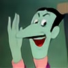
Ey gang, I felt a lil robo today.")
So got me all rawrg about robofun. So, I did this.
I tried to just do it in Sketchbook Pro. I think the results came out nicely enough. Woulda thrown it into photoshop, but I think it woulda taken a bit too much time on my end. Well, in any case, enjoy. :3 Lil story for this, Leslie (the one on the left) is given orders to seek and destroy unit FM28D - Evelyn. She's a rogue unit that went out and never quite came back to headquarters. Leslie was told she'd be dangerous, and well, she wanted to make sure she's able to take on Evelyn. And thus, she goes into a simulator. Enjoy.
Leslie © Me
Evelyn ©
Related content


Comments: 87

 (Smile)")


")

you're welcome
👍: 0 ⏩: 0


wow and i wasn't there to stop those XDDDD, man being a super antivirus isn't that easy XDDD, nice detail in the weapons, suits, and the poses, also i like the background very Tronish XDDDD good work maybe when i have some money i can ask you something like that but with two powerful antivirus XDDD
👍: 0 ⏩: 1


looks good... looks reeeaaal good >3<
Your fighting scenes are allways the best =3
👍: 0 ⏩: 1


That she does.
👍: 0 ⏩: 0

Some one bring me Popcorn and Beer!!! HURRY!!!
This fights gunna be intense!!!
Great pic man, the suits are really creative as well.
I geuss the Robotitis is going around on DA, everyone including me now is making a robot, or android.
👍: 0 ⏩: 1
Really? I haven't really been around dA often to know that.
Also, they aren't really new. I just haven't posted anything about em til now.
👍: 0 ⏩: 0

")


I love the colors you used in the picture. The two females looking cool also. The picture makes me think of the movie Tron.
👍: 0 ⏩: 1
Hehe, I think it might make people think of that cuase of the background.
👍: 0 ⏩: 0


I like the outfit on the girl on the right. very unique.
👍: 0 ⏩: 1


👍: 0 ⏩: 1

Neat stuff! I like how you added the Tron-like background for the fight.
👍: 0 ⏩: 0

Hehe, thanks. Coulda been a lil better though. Oh well.
👍: 0 ⏩: 1


This is really good. The anatomy could use some work (a couple of noticeable mistakes on both girls), and the perspective's a little off, but other than that it's really well done, especially the colors. If you'd allow me to, I'd like to critique it (I don't critique unless I have the artist's permission).
👍: 0 ⏩: 1
Sure, go for it dude. This was a butt to do, so whwnever something like this comes up, I'd like to know what I should think about before doin it.
Perspective and anatomy stuff I know about though, but do give your thoughts.
👍: 0 ⏩: 1
Well, I'll do my best.
Let's start with the background, since it's the most noticeable mistake (but also the easiest to fix). Simply put, the way you set up the lines makes it look like a really cramped room with a low ceiling. This can be fixed easily, though. First, the floor: The horizontal bars are set up perfectly, but it's not enough to give the floor a sense of depth since they get thicker and brighter at the end. Simply put, the farther away the line is, the thinner and less bright it should be. Second, the ceiling: If it's like a virtual reality world (which it is), then it should have the same amount of lines as the floor (this is a computer world - they're usually built like that). In other words, add the same lines on the floor to the ceiling at the exact same position and distance. Also, raise the roof a little. Third, if it's a simulator, I'm kind of expecting a wall of some sort, not an endless red void. Of course, this is just nitpicking (you can have a wall-less simulator if you want), but you might want to draw one anyway in order to line up the vertical lines in the floor and ceiling perfectly (right now they look kind of askew). You might want to also add a gradient to the red, make it darker as it goes further down, but again, nitpicking.
Now for the girl in the left: Face is okay; so is arm positioning. Hands are well-drawn (they're usually the hardest part - at least for me), the boobs look okay (if a little deflated for their size; try giving her left one [the one on our right] some extra volume)... The problem starts showing on the body behind the boobs, which is positioned too far to the left, making the boob on the far side and her left arm look like they're floating in midair. Just move the whole body under the arms and boobs a bit towards the right or add some volume to the right (at the risk of making her look chubby - not that it's bad, mind you, but that's probably not what you planned). Her legs are another point of focus, since they're too far apart under the crotch area (her back leg should be further back, her ass cheek coming out from behind the front leg instead of her crotch). They also seem to be bending in awkward directions: The back leg seems to be angled uncomfortably towards the back, and the front leg seems to be bending forward from too low on her body. I don't know how to explain it well (not a native English speaker), but see the line made by the bottom of the suit? That area going around the legs towards the back is where the legs start, so the front leg should be drawn as if it was part of that area, not separated by those curves you did right beside the crotch. Also, at this angle, the butt cheek shouldn't be so pronounced (outline looks good, but remove the line going from the leg towards the inside). Taking these things into consideration, the back leg should start a bit higher, the butt cheek shouldn't even be noticed from that angle (keep it straight, not curvy), remove the line coming from her crotch in the middle of the leg (it makes it look like it's twisting outwards) and make it thicker - legs seen from the side are thicker than when seen from the front.
Now for the girl in the back: The upper section of the arm on her back is too long, making it look like it's bigger than the front one. also, make that arm and the fist smaller, to simulate foreshortening. Also, the way the arms and breasts are set up, one would expect that her body should be coming from behind, but instead it looks like it's coming from the bottom, which not only makes her look like she's bending unnaturally, but also gives her a chubby look. The best way to fix it is to make the whole body underneath the front arm a bit smaller and raise it until it really does look like her legs are behind her instead of somehow popping out at the same distance as her extended arm.
That's all I could come up with - hope it makes sense. You're a really good artist, and going out of your comfort zone (drawing sexy women in sexy poses) is the best way to improve, since you end up noticing stuff you didn't know you needed to work on.
👍: 0 ⏩: 2
| Next =>