HOME | DD
 SrAbel — [EVANGELION IN MY HEAD] 01Ikari, Shinji

Published: 2014-05-25 19:57:25 +0000 UTC; Views: 1428; Favourites: 14; Downloads: 5
Redirect to original
Description
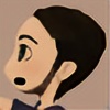
"So... where is my reality...?"So, how would be Neon Genesis Evangelion if it would be drawn by me?
Well, since I'm feeling okay enough to start painting again, I'm going to do a series of it.
Not 3D used here, just photoshop and an Intuos 5.
Evangelion characters, stories and logo rights belong to Gainax Co. . No copyright infridgement intended.
Related content


Comments: 11


this is a great piece of art and it is amazing to me because how you put it together from the big to small details in it , to the rich color color layout with the sharp edge to smooth edge it make it pop out to the screen and with the well play warm to cool colors willing catch my eye and the flow of it again amazing beautiful piece of art
 (Smile)")
👍: 0 ⏩: 1

Oh, thanks for the kind words ^^ but it's not that great, in fact the original is B/W, just added simple colors to make it pop out a bit and relate it to the show more.
👍: 0 ⏩: 0

The metal is super epic realistic but the actual person looks not very realistic. Your should try to make the whole piece the same level of realism.
👍: 0 ⏩: 1
No, actually that was the point, and it has 3 main reasons: 1. Its based on an anime, a genre that has proportion/perspective/anatomy mistakes on purpose, this is clearly seen on the eyes, for example. 2. As the anime characters tend to be almost always the same, in this "rework" I try to focus the attention on the technology part. (Because in this particular case the point was to show that new helmet/suit thing design). 3. On the animes, as animstors dont want to die, linesrt tends to be quite simple as well as shading. But, if you look at animated things in NGE such as the EVAs, the actual lineart is quite complex, opposite to the characters. Tried here to take that gap into a new overall complexity gap, maintaining that cartooney look, leaving some strokes, painterly style on the boy. Believe me, if I can work the helmet like that I could have just spent some minutes on the face if I wanted to. In addition, I have this kind of sickness which makes me nust zoom snd start painting almost pixel by pixel details that people wont probably see when its zoomed out, and this happened aldo on the helmet, haha
👍: 0 ⏩: 1
Oh I see. I didn't really get any of the background info I was just giving my opinion as a viewer with no idea what any of it was from. But that makes sense to me. The metal stuff was very good and impressive.
👍: 0 ⏩: 0

I wish I was this good! Amazing
👍: 0 ⏩: 1
")