HOME | DD
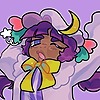
 strike-sprinkles — Satisfied [SPEEDPAINT]

Published: 2017-05-22 00:53:25 +0000 UTC; Views: 422; Favourites: 36; Downloads: 0
Redirect to original
Description
idkdoesanyoneevenlikethese: www.youtube.com/watch?v=bVEHck…p l e a s e
c r i t i q u e
p l e a s e <3
Related content


Comments: 27


Originality
Technique
overall, this is a pretty good piece and i could not do better! but here are some tips! The shading is a bit off, I do have a video I watched on shading, it is by one of my personal favorite artists, lavendertowne, www.youtube.com/watch?v=ZkEZIj… . Also, maybe use some references even if you have a more cartoony style. like for the dress and wine glass. again with the shading, the hair shine needs some work. I love hamilton and this piece! Your a really good artist, I am just trying to help! I hope I do not sound too mean or harsh!
👍: 0 ⏩: 1

thank you! this was super helpful <3
👍: 0 ⏩: 0

Overall
Vision
Originality
Technique
Impact
The idea is nice, yet simple.
The anatomy could use some work, you can work on anatomy by studying real life people (such as people) and drawing them, and then redrawing that in a cartoon style.
The lines are very nice, but they could be cleaned up a little.
The shading seems only half done, not completed. Use models and picture to find lightsources to discover where you should shade and stop shading.
The hair is done very lovely, but you could try giving it a little more volume and detail.
The color choices is absolutely beautiful and well chosen!
👍: 0 ⏩: 0
Overall
Vision
Originality
Technique
Impact
Overall this drawing is really nice. It's well focused and clean. The color choices are really nice and relate to the pink color scheme. However there are a few things that throw this drawing off a little. First, off the shading is rather abstract. I'd fix that by making a light source, probably focused at the top where it could cover some of your already shadowed areas such as under her arm, chest, and neck. Not only is that part off but the shading under the neck makes the style a little inconsistent. Instead of doing that, it would've been better to just continue to use the regular blended shading.
Next, is the position of the character. I know this is cartoonism where anatomy has its stretches however I suggest using simpler frames for the hand, using basic shapes for fingers, like you did the hand. It would also be better if you did reference for simple objects like the wine glass. It is easy to depict the shade of the wine glass but not the wine inside, so it just makes the side of the wine glass seem white and red, instead of a clear wine glass.
👍: 0 ⏩: 0

Overall
Vision
Originality
Technique
Impact
I haven't wrote a critique in years well okay here we go
I would first like to start with the shading, it's everywhere, and doesn't have a light source. The lighting in the hair looks random. And the Shading on the dress does too.
The perfect circular head really takes away from the piece, it takes away from her as a character personally, giving more shape to the head really distinguishes characters. Just a rule of thumb.
her pose seems extemely unnatural, her arms are short, and the forearm is really small compared to the bicep. Where as the other arm it's the complete opposite
I'd also like to point out the glass doesn't have a bottom too it.
The hair seems flat, and could really use more too it, curls tend to be messier. And not so fine and perfect like it appears here.
I would also pay more attention to the lines.
To sum this up, do a bit of research on basic anatomy, using a lighting source, and clean up the lines.
I'd also like to state, there's so much more you could have done with this piece other than her just sitting there holding a cup. It comes off as just another piece out there.
Keep at it though! I see a lot of potential
👍: 0 ⏩: 0

Overall
Originality
Technique
Impact
This looks good! I love the white outline you used so it's easier to see the main focus of the drawing!
One major thing I noticed is your shading. Your shading seems to be a bit all over the place, I recommend watching this video by LavenderTowne on youtube: www.youtube.com/watch?v=ZkEZIj…
It helps with positioning shading and how to shade well, it really helped me with my shading so I hope it'll help you!
I also noticed that her right shoulder seems a bit too high, and where the shoulder meets the neck it goes inwards which makes the arm position look awkward. I want to point out that the wineglass doesn't have a bottom part, it's just kind of a stick with a cup on top. Also you should work on folds in clothes, with no folds it gives Angelica a very flat look.
In some parts of your lineart, lines go over eachother which makes it look a bit rushed, I recommend spending more time on your lineart. I also recommend using the "Pen" brush in Medibang if you want your lines to look more solid, this will make the piece pop more.
I hope you found that helpful, remember to never give up drawing and to constantly try to improve! Most importantly, have fun!
👍: 0 ⏩: 0

Overall
Vision
Originality
Technique
Impact
This looks generally very nice!!
I'd suggest possibly making the shoulders a little bigger and work on light direction while shading in order to improve this piece. The tears could've been executed a little better (maybe less blurry and more logical placement). The placement of the words is really nice and the color of the background is a good color that compliments the rest of the coloring.
this may be something stylistic, but in my opinion you should attempt to make Angelica's skin a little darker next time as it seems quite light compared to how she is in the canon.
Good job though!! This is a really nice piece of work!
👍: 0 ⏩: 0

Overall
Vision
Originality
Technique
Impact
The drawing idea itself is smart, but not that original as many people have been drawing hamilton lately. It is a nice throwback to the show, and im sure hamilton fans will enjoy it. the colors are well thought out, and the positioning is quite well designed. unfortunately, the linework is somewhat messy and uneven, and the shading is mediocre. if i were you, i'd go for a less intense pink to shade with. the anatomy of the fingers and body are uneven and messy, and a lot more thought could have been put into it. the clothes are flat and dimensionless. the source of light is unknown, and the white lines are sloppy and uncomfortable. if i were you, id go back to anatomy basics before you try to deviate into a cartoon style. happy drawing! :V
👍: 0 ⏩: 0

i'm too lazy to write a long critique iim-
this is really good!! everything's really clean and nice to look at, and the background is a nice color! but the tears seem a bit too blurry :'0 real tears are kinda transparent and have dark and light edges!
that's all i can think of honestly :"0 this looks really nice overall though so good job!!
(filler) v v v v v v v v v v v v v v v v v v v v v v v v v v v v v v v v v v
👍: 0 ⏩: 1
Thanks so much for the critique egg! I was trying something new with the tears and I have to agree, it does look weird X3
👍: 0 ⏩: 1

The piece is pretty good for the most part, but, there are a few things that could be improved:
-the tears, as they fall down a person's face they tend to gather at the bottom and don't really align with eachother.
-Angelica's skin is much darker than what is presented here.
-the pose looks very stiff and unemotional. Don't be afraid to push the boundaries of expression and body movement!
-the arms do not correspond to regular human anatomy but the piece is cartoony so that doesn't really matter. The problem is that her right shoulder is raised way too high and it gives off the look of nervousness rather than the emotions of unsatisfaction and sadness.
-the hair could look more alive if you went back in with more little poofs, and make it look more disheveled since Angelica is in a state of despair.
-the expression makes it look like she's crying tears of joy, which is not what you want. The eyebrows should be lowered into something of a slight straight line and you should darken the parts of her face nearest to the eyebrows.
-liquid doesn't touch the glass and instead creates this tiny bit of space between the glass and the substance inside it.
-the white poofs on Angelica's arm are more wavy and should drape around her hands like they do in the play, try to study the wrinkles to perfect this look.
-some of the lineart looks rather sloppy due to the fact that it crisscrosses and makes little bump-like shapes.
-the shading should be blended more since it just looks like slabs of color placed ONTOP of Angelica.
None of this is meant to discourage you, keep drawing and you will be great!
Have a good day~!
👍: 0 ⏩: 1
thank you so much for the advice!
yeah, i did the skin tone like that because every time i try a darker skin tone, it looks really weird. idk what i'm doing wrong :/
and i'm trying to work on how i draw my hair a little bit, i know it looks super stiff and weird
and i'll try that next time for the shading!
thanks for the critique! you really helped <3
👍: 0 ⏩: 1
I'm very glad I helped! There are tons of different tutorials and modules that can help you with your issues.
I only wish the best of luck to you~! <3
👍: 0 ⏩: 0

Looks great!
The only, Thing I Cam critisize are the tears, they Look a little bit too blurry
I'd recomment to try drawing those Anime or Cartoon tears, Like the ones in Steven universe!
But anything else Looks Amazing!
👍: 0 ⏩: 2
thanks
and thanks for the advice as well!
👍: 0 ⏩: 0
FFS i hatE my german autocorrect
👍: 0 ⏩: 0
Everyone give it up, for the maid of honor!
👍: 0 ⏩: 1

Angelica Schuyler! *cheering*
👍: 0 ⏩: 0
thank you guys so much for all the critiques! BUT
please keep in mind that this is a cartoon style, and it is not meant to be realistic
also, please don't just tell me what I did wrong, I know there's lots of things wrong with this image, try to tell me how to fix it! I'm a very inexperienced artist and I don't really know what I'm doing sometimes lol
but thanks again for the critiques! I really appreciate you guys taking the time to do that <3
👍: 0 ⏩: 0


I REMEMBER THAT NIGHT I JUST MIGHT--
👍: 0 ⏩: 0