HOME | DD
 Th3FalleN — Heaven+Hell

Published: 2004-11-26 19:01:59 +0000 UTC; Views: 5569; Favourites: 103; Downloads: 271
Redirect to original
Description
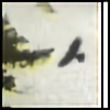
Made this with 2 different Apophysis renders (which my trial has now run out for). It's supposed to depict Heaven & Hell. Was a quick throw-together piece and I didn't spend ages on it, but I think it works.Comments welcomed.
 (Smile)")
Related content


Comments: 32

Wow. Its like a perfect depiction of two spiritual realms...good and bad, dark and light, Heaven and Hell, God and Satan etc. A world outside of physically, mortality and time. I guess the darkness in the middle represents earth? lol
👍: 0 ⏩: 0


Wow. This is amazing. I love the colour blend. It's amazing.
👍: 0 ⏩: 0

I agree with every praise that has been exclamated before me. Very good work indeed!
👍: 0 ⏩: 0


Amazing work! Great for something that hasn't had much time put into it.
👍: 0 ⏩: 0

There is something ethereal about this... I don't know what it is, but the colors, lines and pretty much all else about this draw me to the picture... it is beautiful in all aspects... yes, good metaphors for Heaven and Hell...
You say that this isn't your best work in those renders... I think this is superb.. yes, very nice... you wouldn't mind if I printed this to put on my wall now would you... heh...
👍: 0 ⏩: 0

this is really nice! i love how the picture blends but also strays apart....in a way...lol. Good job over all!

👍: 0 ⏩: 1

oOo this is sexy, love how heaven has symetry and peace where as hell has no set pattern and is very arbitrary which perfectly illustrates how hell is thought to be. Looks really good - if you haven't already, add :fadingart: to your buddys and we'll favourite it
👍: 0 ⏩: 1

Very impressive contrast between the 2-on a random note the upper point of the divine bit reminds me of Eva unit01's wings when it awakens in the eva films a little
The only thing I would perhaps point out is that while the heaven side has that sort of crest pattern that reminds me somewhat of wings, the eye catching bit of the hell side is a little more undefined
But that's no biggy-I like the piece, just thought I'd offer something useful 
The darkening in the middle was a good choice and over-all gives an interesting and deep composition
Sometimes I find the 'hidden meaning' in this sort of art is a little shallow or dubious, but it's plain and unarguable here-nice work

👍: 0 ⏩: 1

Wow... thats for all the feedback guys, didn't expect THIS much. O
Thankyou all.
👍: 0 ⏩: 0

")


Apophysis doesnt have a trial
i like hell

👍: 0 ⏩: 0


the texture is like scratched ice and copper. wow. even if you didnt spend a lot of time on it you definitely know how to make an eyecatching piece. this is absolutely beautiful, very nice on the eyes.
👍: 0 ⏩: 1
heheh, thanks alot m8.
👍: 0 ⏩: 0