HOME | DD
 The--Ticking--Clock — Dark World Galaxy

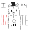
#mario #spaceship #mariogalaxy #crossoverfanart #fluffyboi #deltarune #ralsei #deltarunefanart
Published: 2019-02-10 16:37:28 +0000 UTC; Views: 1467; Favourites: 42; Downloads: 5
Redirect to original
Description
Heya there! So, a crossover between Deltarune and Mario Galaxy... I guess this is a thing now. Pretty happy with how it turned out though (I wanted to include star bits in this drawing, but I can't get what their shape is supposed to be for the life of me, I swear-). I'm pretty much new here, so this is my hello to y'all! Bye bye!!Related content


Comments: 19

👍: 0 ⏩: 1

Thank you for your kind comment!!
👍: 1 ⏩: 1
👍: 0 ⏩: 0

THE FLUFFIEST OF BOIS!
👍: 0 ⏩: 1

Yes, hm, yes. THE ALL POWERFUL FLUFF BOI IS HERE!!!! ΦωΦ
👍: 0 ⏩: 0

Hello, and welcome to deviantART! It's nice to see a new deviant joining the ranks. We hope you have a wonderful time while here.
I would like to start by saying how colorful this piece is. It's eye-catching, and I love all the different hues you have used. Variety in colors is a sure-fire way to get noticed, especially when used correctly. However, it comes at the cost of needing to use many different shades and lights to make something less two-dimensional and more three-dimensional. In this case, you have added shading, and it is easy to see what shapes and forms you were going for. As mentioned, you might want to darken the shading in some areas, to truly show each form. If you want to forego this in order to stick with your style, however, that is also optional.
The second thing I will mention is the background. An empty background makes you focus on the foreground, but it can also break a picture's immersion. In this case, you added a stunning galaxy background, with many different stars and colors. You did very well on making a space-like theme! It can be difficult to make a piece feel 'galactic', but you nailed it. The only thing I might change is how well the colors blend into one-another. This is a very slight amount of blending, however, because overdoing it would make everything look muddied.
The third thing I want to mention is Ralsei. I'm not in the fandom, so I can't talk about anatomy or coloration. However, I do believe that a slightly larger amount of shading on the clothes, even if just to make the creases more evident, could make a big difference. The glasses are well-done, I will add, and they actually look like they have lenses! The hat is also well-shaded, and I am happy with that.
Overall, I believe you did very well, especially with the use of so many colors in one area. Your backgrounds and foregrounds are not at all lacking, and you are showing depth with the use of shade. Make sure you pay attention to how dark and how light these shades and tints are. Don't be afraid to use a little more on the shading tool, because it's your friend, and it wants to help. The glasses and hat are great, especially when you show the lenses, and it continues to add more depth. The biggest thing you should keep in mind, though, is to find your style and don't be afraid to explore the possibilities!
Happy browsing!
👍: 1 ⏩: 1
Heya there, thanks for the feedback! I'll certainly try to get better at those points you mentioned (I absolutely agree that I should have shaded Ralsei's clothes a bit more)
")
👍: 0 ⏩: 1
You're welcome! Don't look back and feel bad about things you might have changed. Instead, keep those changes or ideas in mind for the next time. Getting angry or upset at yourself for not doing something never helps. It only keeps you from moving forward. Keep your head up and keep making art pieces, because we can see greatness ahead!
👍: 1 ⏩: 0

This is pretty nice, and welcome to deviantArt and
I'm going to start off by saying that I really like this piece! The concept and execution, especially of the shapes and forms, are really well done in my opinion. The galaxy in the background is really nice and colorful, though it could be a bit more blended and smoothed together. The colors themselves are really nice and I like the textures, but I feel like they're too bright. Colors are usually always more neutral and dark then our mind interprets them as, so when you're drawing try to keep the tones more neutral, because then the bits of brighter colors you do put in will really pop out. As it is, Ralsei seems to be brighter than he really should be, try making his fur a bit grayer and clothes a darker shade. The way he's colored, he seems out of place with the rest of the picture, not really being affected by the lighting going on there. If the effect is intentional and Ralsei is glowing, then the patches of land close to him should be more dramatically affected. If you study light irl for a little bit, you can see that when you put a light closer to an object, the light areas get lighter, but the dark areas get darker as well. More contrast between the light and the dark in your works would help it pop more and make it more appealing to the eyes. To summarize: darker darks.
Anyway, I hope this was helpful! You definitely have skill, and it has a lot of room for improvement, but I'm sure you'll be great with practice and work. Happy drawing!
👍: 0 ⏩: 1
Thank you for the feedback!You're right about Ralsei being too bright, I should have picked a less saturated shade of green :3
👍: 0 ⏩: 0
That is so pretty!! I love the planets and the beautiful colors
Keep up the awesome work
Also welcome to Deviant art I hope you have a fun experience
I recently started too
👍: 0 ⏩: 0
I'm fine. How are you?
👍: 0 ⏩: 1