HOME | DD
 theslider — Encounters
by-nc-nd

Published: 2008-05-05 16:45:11 +0000 UTC; Views: 529; Favourites: 20; Downloads: 54
Redirect to original
Description
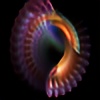
UF4...Masking...the first encounters


 ...
...Featured by in her Journal (07/08/2009)


Related content
Comments: 11

Thanks a lot, I am very happy you like it 

👍: 0 ⏩: 0

Yow!
Jumps to attention!!
... a triple Julia node!!
There is gong to be some great stuff in there.
(I like the bright suns and lines, that is where the action is!)
I am putting you on Watching ... because you're doing great! ... (On your first try -- that's enough to make me cry -- ~happily for can-do-manship) ... Very nice.
... makes note to get UF4!
👍: 0 ⏩: 1

That's what I wanted to...and it reflects my sunny mood!!!
Thanks a lot for 


Many thanks
--
Leonardo
👍: 0 ⏩: 1

Well .... don't feel flattered, feel "inspired" 
.. because ...
It is that little bit of extra that goes to exceptional that makes the grade for you, ... if you follow my drift!

But most of all ... Happy Creating!
👍: 0 ⏩: 1

OK, I will be inspired by your words
Many Thanks again for everything!!!!
--
Leonardo
👍: 0 ⏩: 0

I like it, but I think I'd like it betr if those saturated sun-looking things weren't there :/ did you use ultra-fractal for this?
👍: 0 ⏩: 1

Thanks for your comment... really appreciate it!!!
Yes I used UF4 (...would like to learn also Apophysis...)!!!
I know in my image I tend to use over-saturated colors which not always is the best choice...I like the sun, its light and above all wide places in contrapposition to darkness and small environments...(a bit claustrophobic??? 
👍: 0 ⏩: 1

Hehe no problem 

👍: 0 ⏩: 0

Tanks a lot Robert also for the 
👍: 0 ⏩: 0


