HOME | DD
 Thevastcanvas — Open Broken

Published: 2011-01-05 17:04:18 +0000 UTC; Views: 1324; Favourites: 16; Downloads: 0
Redirect to original
Description
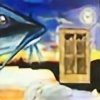
Acrylic on 18x24 CanvasRelated content
Comments: 34


I must say, I ADORE piece! Right off the bat, I could tell that there was a heart, and that there was something going on with the heart. When I read the title of "open, boken" I was able to see the broken heart.
However, I also feel like the blue overpowers the red, making the composition a bit lopsided. What makes the blue overpower is how bright it is. To fix this, one must simply either ease on the white that lightened the blue, add orange to the blue, or add white with to the red. Try to avoid going crazy, however, for this is a delicate work.
I think that the purple background really helps with the balance issue. The purple (quite literally) meshes the two colors and forces them to interact.
In summary:
What I didn't like:
The overpowering shade of blue
What I liked:
The twist on the concept of the broken heart.
the swirls in the heart cause movement
The purple spirting from the heart (as well as surrounding it)
Even though it is abstract, I can still tell what it is.
I must ask: why did yo call it "Open Broken". Why not just call it "Broken"?
👍: 0 ⏩: 1

Thank you for the critique. I'm actually thinking of revamping this one. I call it open/broken, because depending on my perspective, it can look like a broken heart, or it can look like an open heart, with love gushing out of it.
👍: 0 ⏩: 1

No problem on the critique! I see where one can see the open heart, now that you mention it.
Also, feel free to critique my work!
👍: 0 ⏩: 0

Very rhythmical! 
👍: 0 ⏩: 1

Thank you, very much.
👍: 0 ⏩: 0

This is wonderfully done. The amount of work you must have put into it is easily seen. I am so glad I found this today. Keep up the great work, and I hope to see more from you!
👍: 0 ⏩: 1

Nice blending. I know it's difficult with acrylics.
👍: 0 ⏩: 1

Thank you very much!
👍: 0 ⏩: 0

wow looking at this, It's full of emotion for me. as if rage/anger is fighting sadness/despair
👍: 0 ⏩: 1

Very insightful, thank you for this and the fav.
👍: 0 ⏩: 1

Nice color contrast, I mean warm and cool colors. That is one interesting and balanced art!
👍: 0 ⏩: 1

Thank you very much, for all the favs and the watch!
👍: 0 ⏩: 0

Thank you for this, and the fav.
👍: 0 ⏩: 0

i really like the colours...and the whole idea of them big swirls...
its really good!!!
👍: 0 ⏩: 1

Thank you very much.
👍: 0 ⏩: 0


