HOME | DD
 TokyoMoonlight — Mightiness

#dragon #purple #red #watercolor #woman #female #portrait #portraitpainting
Published: 2017-11-28 21:05:46 +0000 UTC; Views: 1265; Favourites: 120; Downloads: 0
Redirect to original
Description
Created on 26.11.2017watercolor
size A4
I started this painting back in September...but then the Inktober came and I left it on the side


I'm so happy I'm back to my watercolors


 , but I like ink now too. It's great for making quick paintings because you don't have to think about which colors to choose from...or which color mixes to use


Related content
Comments: 26

I love the way you blended the colours. Great depth, I love the purples mixed in with the pinks and blues. Jewel tones are my favourites. I really like the character’s pose too. Nice job.
👍: 0 ⏩: 1

Thank you for the lovely comment.
👍: 0 ⏩: 0

What I really like about this painting are the colours, they work together well, and that you included a dragon! I love dragons! I also like the cloudy (?) textures in the top right and bottom of the painting. How did you create those?
I do have a few things I feel could be improved though:
- ear
I'm a bit confused by the ear. For me, it looks like it's merging with the background in a weird way, and looks like it has spikes of some kind. Is that intentional (maybe going along with the dragon imagery...)?
- wobbly lines
Some parts (i.e. edges) of the painting are very wobbly, like the lips and part of the throat. I like that you don't use outlines, but I think that's why it's very important to make sure the edges of your shapes (e.g. the lower edge of the lower lip) are "clean" as opposed to wobbly.
- face colours
I feel that even though a big part of the painting is so colourful, there is no variety in the colours of her face. As far as I can see (but please correct me if I'm wrong with that) you only used one colour, only varying the darkness. I think it would be nice to have a bit of the colours around the face "reflect" in the face itself (not literally though; what I mean is mixing a bit of the blue you used into the highlights and/or a bit of the magenta/red into the shadows). I think it would have added a bit more life to her face - or it might have made the whole painting look too colourful, I can't say for sure.
- white space
I think there's a bit too much white space on the left side of the painting. There's so much happening towards the right of the painting that there has to be some kind of compensation for it somewhere, to keep the balance. But I think that would work better if there was at least a little more subtle background on the left (e.g. up to her lips).
All in all I think you did a great job, keep it up!
👍: 0 ⏩: 1

1.) Cloudy textures: color and regular salt
2.) Ear: this is called being lazy 
3.) Wobbly lines: at first I didn't understand...but now I see what you mean...again being lazy...and also it's the way the color had dried 
4.) Face colors: yes, I only used one color. Normally I like to add light pink/red on the face, but this time I didn't. Can't remember it for sure, but maybe I didn't want to have too much going on...too colorful...
Here's an example where I did that:
5.) White space: I didn't want it to be too busy, so I wanted to leave lots of white...it kinda goes diagonal. I always put too much color on the paper and don't leave enough white. Basically I'm lost with that white thing
for the critique.
Now I can see my artworks in a different light.
👍: 0 ⏩: 0

I really like the color choices and the use od wet on wet here.
👍: 0 ⏩: 1

👍: 0 ⏩: 0

which part did you start with in september and which part is freshly finished after your ink phase?
👍: 0 ⏩: 1

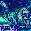
There's just a little bit of it visible in this photo (the left one)...
I don't have other wip shots of this one...
Everything was more or less colored with 1st layer. The were just little parts that didn't have color (mostly on the dragon).
After the Inktober I did:
- additional layers of skin tone under her jaw bone, on the ear and on the eye lid
- added more layers of hair...also added some hair strands around the ear
- the most work was done on the dragon...before there was only the light blue color painted and the purple "hair" without any details or texture...
- the background part / texture was at it was before Inktober...I didn't add anything to it
👍: 0 ⏩: 1

quite a full recital of the steps you took
I actually found the dragon to be most pleasing to look at, while the face seemed stale
take my congratulations on making good progress!
👍: 0 ⏩: 1

Thanx
I mostly tried to experiment with the things around her...so the dragon was a huge focal point.
And I liked to play around with the background too...it was quick and easy
👍: 0 ⏩: 0

Marcela, this is very interesting and beautiful painting! I love it! Wonderful choice of colors)
👍: 0 ⏩: 1

Thank you...I want to be more fantasy, surreal oriented...but I'm still staying too much on the safe side
Still need to upload it on Instagram though...with videos...but that editing and posting part I just seem to get nowhere
More difficult than to paint something.
👍: 0 ⏩: 1

Marcela, I understand you perfectly. Now a lot of different social networks and all need a lot of time to post in all social networks. Yes, it really is more difficult than to draw a new artwork.
👍: 0 ⏩: 1

That's the modern age for us artists...even we can't go without pc or smartphones and apps
👍: 0 ⏩: 0


