HOME | DD
 Topazuu — Nekoi

Published: 2017-12-22 22:36:29 +0000 UTC; Views: 343; Favourites: 16; Downloads: 0
Redirect to original
Description
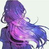
something i decided to do between commissions because i've had this idea in my head for 2 days now and its been killing me that i might forget to paint it :")it turned out pretty good, but mEH theres some slight anatomy + shading problems but i dont really care much??
Related content
Comments: 7


I Love the artstyle and how its somewhat modern but isn't like my and other artists style when it comes to the manga and anime type. The shading is amazing and i cant figure out even how to do simple shadows! I Think the expression on your characters face is very nice because of how calm they look. I think you should add some sort of eyebrow/eyelid definition to show if the are concentrated or just calm. The simplicity is very nice with this color scheme because of how the blues fade and mix. I also think the fish need some scale type design or maybe a face or detailed tale because, well, they look like goldfish crackers. i also think the arms are a little too long but not by much. Other wise this piece is beautiful and stunning!
👍: 0 ⏩: 0


this post reminds me of the horrid time in my life when i got this big ol fuckin jar of a fish tank, which was just.. covered to the brim with alien shit in it. like science decor. i always filled it up with fucking water and shoved god damn 20 fucking bags of goldfish into that jar, resulting in a soggy ass mess of crackers sitting at the bottom to the top of this fish tank. then you had to clean the wet fucking bowl, which was covered in soggy fucking cheese cracker bits. i always got my babysitter to clean it, though, because i only did it when they were around. just to fuck with them.
👍: 0 ⏩: 0


This piece has absolutely stunning quality, and the colors work so marvelously together; this is truly a beautiful deviation. The only thing that could really be improved upon is probably the fish and the shading on the head. The fish, obviously, are uneven little blob bois. It's understandable that you wouldn't want to put that much detail into them, especially because of your style and the fact that you want the character to be the focus of attention, but I think if you put a little more effort into making the fish more fish-like it could enhance the image (Or just art in generaLlL). And the shading is inconsistent- it's cel shading in some areas, and it's blended shading in others. The head especially showcases cel-shading, whilst the arm on the right showcases a more blended look. Other than that, this art is absolutely beautiful, and I simply adore how every detail and addition to the piece just works so perfectly with the rest of it. Also that lighting is spot on. I love it. Reeee.
👍: 0 ⏩: 1

eEK fish have always been a weakness wheeze
i did originally have it pure-blend shading but then you couldn't make out basic anatomy so i just decided to add a layer of cell shading just to define certain parts wooPs
bUT THANK YOU FOR THAT I REALLY NEEDED IT AHG
yOUR TOO NICE MMMM
👍: 0 ⏩: 0

A very beautiful mythical and artistic piece! I love the color palette used for this piece and the whole concept of the image! It's like the character is dancing and in his mind he imagines a whole world around him~ I really like that. My only suggestion would be to paint darker lines around the character, using a paintbrush tool blending in maybe a dark blue color with the main color, it would help define where the characters legs are in the bottom, and also would make the character pop out! A few details here and there are also missing, like the fish and bubbles, but you know what, I think I like it that way because it's a minimalist style and I like that.
👍: 0 ⏩: 0


