HOME | DD
 Toradh — Three Angels Down

Published: 2013-09-24 13:03:07 +0000 UTC; Views: 1836; Favourites: 46; Downloads: 16
Redirect to original
Description
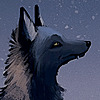
I‘m totally not sorry for all the Avantasia fanart. I promise to do something different next, though, and maybe even something with a background…I wanted to have Gabriel, the nameless Scarecrow and Aaron together in one picture, so I did. It was fun.
Thanks to suggestions by julsteele.deviantart.com and shatiel85.deviantart.com , something golden-brownish for a change! As usual, the scanner ate some sharpness, but at least the scan doesn’t have the printer stains from the lineart anymore, hrrr.
Obvious music suggestion: Avantasia song of your choice, though I‘d prefer The Scarecrow or Another Angel Down (fun fact: before the longplayer album was out in 2008, I thought the Lost in Space EPs were continuations of the Metal Opera. Guess what, I tried to find out how the lyrics relate to it…). Hey it fits the album design.
On the other hand, I also listened to Bleeding Out by Imagine Dragons quite a lot. It must be the “I will be your scarecrow” line…
Watercolours with some acrylics. I used lose references for the poses, as usual, and some pictures of Tobi Sammet’s face of course…
Related content


Comments: 29

All that Avantasia art from you actually got me to listen to their new album out of curiosity")
👍: 0 ⏩: 1

Now I feel awesome
👍: 0 ⏩: 0

Wunderschön, die Figuren sind so lebendig!! Du kannst wirklich unheimlich schön zeichnen und aquarellieren. Und das Papier gibt noch eine tolle Textur dazu.
👍: 0 ⏩: 1
Witzigerweise hat das Papier eigentlich so gut wie gar keine Struktur, aber mein Scanner hat das einmalige Talent, die noch so subtilsten Papierstrukturen aus dem Bild herauszuhämmern und dafür Farben zu schlucken und Kanten zu verwässern
👍: 0 ⏩: 0

Ich muss gestehen, dass ich die Motive in der Lineart ein bisschen übergangslos nebeneinandergesetzt fand.
Gut, dass ich meinen Kommentar erst jetzt abgebe, denn mit dem farbigen Hintergrund wird wirklich eine Einheit draus.
Sehr schöne Farbwahl im Hintergrund und die Federn sind wirklich der Hammer. Vor allem bei dem Uhrenmann find ich den Übergang zum Hintergrund sehr gelungen (leichte Reminiszenz an Dalí  (Wink)")
👍: 0 ⏩: 1
Sie sind ja auch in der Lineart übergangslos nebeneinander gesetzt
👍: 0 ⏩: 1
Auf jeden Fall.
Man sollte sich nie ein Urteil bilden, bevor man nicht das endgültige Werk gesehen hat
👍: 0 ⏩: 0

Ich finde die Farben auch super. Und die Bildkomposition mit den Federn, die den Blick leiten, ist auch toll. Wie groß ist denn das Original?
👍: 0 ⏩: 1
Gar nicht so groß, mit Rand 20x13cm oder sowas… Also vielleicht 18x11 höchstens? Bin gerade zu faul, nachzumessen.
Schön, dass mein Plan, die Federn als verbindendes Element einzusetzen, funktioniert hat. Wenigstens zieht sich das Motiv ja durch TMO und TWT, bei der Verbindung zu Aaron muss man dann kreativer werden ")
👍: 0 ⏩: 0
Klasse, die Farben funktionieren ja ganz wunderbar!  (Smile)")
Mir gefällt auch das grüne Jackett dazu sehr. Und die Federn, die wirken so schön fluffig!
👍: 0 ⏩: 1
Und ich hab beim Malen noch befürchtet, sie wäre zu grün geworden… sollte eigentlich grau werden, hab mir dann gedacht ach passt schon, klatsch drauf und dann war's natürlich geschehen… maßlose Selbstüberschätzung der Mixfähigkeiten. Man merkt wohl, dass ich sonst viel mit blau und wenig mit gelb arbeite. Da wird es plötzlich grün.
Die Federn haben Spaß gemacht x3
👍: 0 ⏩: 1
Oh, ich hätte nicht gedacht, dass das Grün ein "Unfall" war. Meiner Ansicht nach passt es gerade deswegen gut, weil's einen Kontrast zu dem übrigen Braun bildet und das Farbschema etwas auflockert.
👍: 0 ⏩: 1
Es ist nicht immer alles Absicht was ich mache, ich tue nur gerne so
👍: 0 ⏩: 1
Solange Du das nicht verrätst, passt das super.
👍: 0 ⏩: 1

I was always trying to figure out what the hell Lost in Space was about, both the song and the albums. Do those follow a story or are they just albums?
👍: 0 ⏩: 1
I doubt the EPs follow a story, even though The Scarecrow, The Wicked Symphony and Angel of Babylon do so of course. I failed to follow it past I Don't Believe in your Love, though, too. I kinda got the impression The Wicked Symphony and Angel of Babylon were simply a caleidoscope of the Scarecrow’s feelings…
👍: 0 ⏩: 1
They almost seem like short story compilations rather than a full story.
👍: 0 ⏩: 1
Or something like that, maybe. Never thought of them that way, but I agree!
👍: 0 ⏩: 0

Woaaaaow.
Seeehr cool. Das Farbschema steht dir! Deine Bilder sehen immer so schön gekonnt zusammengestellt aus.
👍: 0 ⏩: 1
Ich glaub auch, golden war eine ganz gute Wahl hier. Zugleich verträumt und dramatisch ohne abgenutzt zu sein, das war hier genau richtig. Hätte mir auch früher einfallen können, schließlich sieht auch eins der Alben-Designs so aus
www.nuclearblast.de/static/art…
Die "Komposition" ist try and error mit der Skizze in Photoshop
👍: 0 ⏩: 0


Sehr cool! V.a. weil ich ja die Line Art schon super fand und es jetzt noch koloriert sehe. Ich beneide, wie du mit einer Selbstverständlichkeit und Leichtigkeit mit den Farben umgehst!
👍: 0 ⏩: 1
Das sieht bloß so aus. Gibt viele Sachen, die ich auch noch üben muss, zum Beispiel das richtig Farbenmischen mit Gelbtönen
👍: 0 ⏩: 0

yeah i was sure it would have worked right ^__* great work!
👍: 0 ⏩: 1
And you were right! Thank you so much!
👍: 0 ⏩: 0

Dann hab ich sie ja richtig ausgesucht
👍: 0 ⏩: 0