HOME | DD
Published: 2008-11-29 06:26:12 +0000 UTC; Views: 48519; Favourites: 968; Downloads: 117
Redirect to original
Description
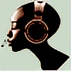
Here's a quick pic I did for the Pinkitude contest. This wasn't really a contest I entered in order to win something; I just wanted to help spread the word and raise awareness for the ladies. Get yourselves checked!And check out some of those Pinkitude entries that're already submitted. There're some pretty sweet ones in there.
 (Smile)")
Photoshop CS4: 4 hours 30 mins.
Original size: 4800x7200 px
Reference pic of Audrey Hepburn used:
[link]
[UPDATE]
Hey gang, turns out I'm one of the 40 finalists for the Pinkitude contest, woot! dA requested that I make my submission available as a print, hence the resubmission. And remember, dA will donate ALL of their share of the print profits to the Susan G. Komen Foundation! Makes a great Christmas gift and it's for a good 'cause!
Related content


Comments: 79


INCREDIBLE. Completely photo-realistic face. Amazing.
👍: 0 ⏩: 0

i really love this image
when i saw it on small view i thought it was a photo that you'd edited the pink onto - the face looks so real !!
an instant favourite. love the concept, execution and the idea it represents
👍: 0 ⏩: 0


..:: 270 DELUXE FEATURES ::..
please check the 
many thanks and have a nice day!!! greetz, =cybaBABE


👍: 0 ⏩: 0
I think this is one of the best images submitted for this contest. It sure was better than the ones that won. Good work. I am glad to see your shirt design won. That is a cool image. I just wish they were available in some thing other than an ordinary T-shirt. I would prefer a V-neck or Tank-top.
👍: 0 ⏩: 1
transfuse In reply to Darrian-Ashoka [2009-03-31 13:13:51 +0000 UTC]
Thanks. Actually, the entry that had the most favorites (like over 2500) prior to the announcement of the winners was even better (she deleted her entry after the results were posted and she found out she wasn't a winner, unfortunately-- guess she was kind of a sore loser, but the drawing she did was really cool). I personally didn't mind whether I won or not 'cause I entered this contest for the good cause. Although I was still very surprised with the winners and the fact that the aforementioned artist wasn't one of them.
👍: 0 ⏩: 0


")


I was absolutely certain both you and `BlueBlack would place, if not either or win Grand.
My entry wasn't sexy or pink enough, so I get why I didn't even semi-final, but you two have such hypnotic styles that really speak volumes- I don't understand why.
Anyhow, this is fabulous work and I really love it, especially the way you blend and colors together. It's a lovely style.
👍: 0 ⏩: 1
transfuse In reply to pseudolirium [2009-01-08 06:03:33 +0000 UTC]
Hehe, you know I was pretty certain myself that at least BlueBlack would've placed, but I was actually expecting her to easily win. Seemed like there was no question she would win. But apparently a high degree of artistic creativity wasn't what the judges were looking for... In the end, while I was initially caught by surprise by the winners, I wasn't surprised with the results-- given the choices of the 40 semi-finalists...
👍: 0 ⏩: 0

")

The contrast of the hair gradient with the realistically painted skin is so eyecatching! Love it. And even better, its for a good cause.
👍: 0 ⏩: 0

Amazing artwork! The mix between vector and non-vector is very eye-catching.
And the important message comes across with your lovely style.
👍: 0 ⏩: 0

Gorgeous! I love your choice of colors and shades; it really works here excellently. Beautiful job! ^_^
👍: 0 ⏩: 0

Wow, your new direction for your art is intoxicating. I'M REALLY liking it!
Good job on going into a contest and not even trying to be a finalist and still getting it! XD Crazy man, crazy!
Nice colours and vector usage right there in combination with a realistic face. That is tough to execute. O_O Sooooo much respect for you for trying something as difficult as that and pulling it off so well.
👍: 0 ⏩: 0

The only thing cooler than the work is the motivations behind it. That's a very nice way of spreading the word! Good luck, galls!

👍: 0 ⏩: 0

I don't really like pink, but this time the color is just perfect!
Great job
 (Wink)")
👍: 0 ⏩: 0


... You could do a little better.... It might be "original" but that doesn't make it good...
👍: 0 ⏩: 1
That's a very non-specific kind of statement to make don't you think?
Can you offer something a bit more in depth about how you think they could improve instead of saying they could just "do better"?
👍: 0 ⏩: 1
Well... That's Why I said "you could do better" Because I think he/she could do better. Also because I actually pondered thw matter of "how" for several minutes. But because I have never been very good with words and I really couldn't put it any other way. Also it might have something to do with the fact that english isn't my native tounge/language so Saying these things is rather hard for me sometimes... Why do you care?
👍: 0 ⏩: 1
Because I believe if you are going to critisize an artists work, the least you can do is offer a more detailed description as to why, as opposed to just "you could do better".
👍: 0 ⏩: 0


I love the detail giving to skintone and the use of greyscale amazes me. I really like how well you done this pic Transfuse. Excellent work. I hope you win.
👍: 0 ⏩: 0


what font face did you use, if you don't mind my asking?
👍: 0 ⏩: 1
transfuse In reply to asteria24 [2008-12-09 03:32:50 +0000 UTC]
I dunno what the font is. The text was a vector image that came with the download pack for the contest. Sorry.
👍: 0 ⏩: 1
haha
i remembered that
about 2 hours after commenting
D:
sometimes my brain acts without thinking
👍: 0 ⏩: 0

Wow I almost mistook this for a photo manipulation until I looked a bit closer ^_^
👍: 0 ⏩: 0


I love the contrast between the simple colors and the detailed greys. It's a really interesting technique and very eye-catching.
👍: 0 ⏩: 0

uuuuuy este está genial!!!!!!!!!!!!!!!!!!!!!!!!!!!
👍: 0 ⏩: 0

I love the mix of realistic grey-toned, and the eye-catching color punch! This looks faboo!
👍: 0 ⏩: 0


glad to see you're still at it, and what a good cause to draw for... my mom would likely hug you if she could
👍: 0 ⏩: 0


The eyes, the lips... The face in general is extremely pretty. The colour choices and the highlights in the hair are awesome too.
I really think you did a piece that suits the idea of that contest very well, and it's gorgeous to boot!
👍: 0 ⏩: 0

That is beautiful. I really love your work, transfuse.
👍: 0 ⏩: 1


| Next =>