HOME | DD
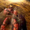
 Valognir — heated argument

#anime #digital #digitalart #digitalartist #digitalartwork #dragon #fight #furry #furryart #screenshot #daggerclaw #furryartist #fire #animestyle #fakescreenshot
Published: 2019-03-31 18:16:43 +0000 UTC; Views: 772; Favourites: 59; Downloads: 5
Redirect to original
Description
This started as a warm up sketch before working on commissions, but... it got too hot to pass, and I burned to finish it. I have absolutely no idea what's going on there.Related content
Comments: 25

Hello there, I found your piece in ProjectComment ! I hope you'll find my comment helpful c:
This piece is very eye-catching, and that's mostly the reason why I have decided to view this. The composition is well thought of and the use of space was very efficient. I commend you for successfully setting the theme or tone of the picture which also made the scene very clear to read. I like how you applied the concept of perspective, with the blurring of his tail. And lastly, I love the touch of streaks of fire you used.
With that said, I've found some aspects of this piece that can be improved. It will mostly focus on the subject of the work. As I mentioned a while ago, I acknowledge that you used perspective on the tail but that's not quite the case with his back legs which are pretty clear. It would have helped if it was blurred a little as well to signify that it's farther. The character looks like it's facing 1/2 away rather than 3/4(ish) without the head defining the desired position you're trying to portray.
The head and face were drawn very well. His expression fits with the subtitles and I really liked how you drew his mouth and teeth. His eyes tend to be the focus of the viewer, which is very good. I get that he has bangs, but without those thin highlights, maybe I wouldn't have noticed that. I suggest that you could've put a shadow so that the bangs are identifiable. It's the same case with his head to his body. I noticed that there's nothing to tell the viewers that he has a neck in between or it seems that it's directly connected and that's the in-scale size of his head. It seems that he's the type of species to have a fluffy mane, it would help if maybe you added another layer of fur and also lines to divide the two portions of the body.
Style based, I really like your style! But there are some minor anatomy issues that I see. I'll assume that he is heavily based off on canines. If this species has unique anatomy you followed, then disregard what I'll say. I noticed that his right back leg is very thin- it gives off an unwanted illusion that his legs are too far apart and his body structure is the very wide-type. Maybe if you extended the back part of the leg to the gap between and it may look better. His snout tends to lack in volume- unless his snout is the flat type (somewhat like bull-terrier). But it looked fine because of his fur pattern and it kind of defined the shape of his snout.
The bloodstains look awesome, especially the ones on his head and mouth/teeth. It becomes a little awkward when it comes to the body. Maybe you could have exaggerated the length of the wounds so that it gives off a more "badass battle" kind of vibe. Also the fur. The fur on his body is also quite odd. It's raining and I understand the purpose of making the fur look wet. It looked very well on his face/ear fur but the one on his body looks too kept and uniform to look like "fur". Using different stroke styles on fur will help it look more realistic and spontaneous. He just came from a battle, his fur will most likely be somewhat messy.
Overall, great work! I hope I said helpful and appropriate comments on your work~ Keep up the good work <3
👍: 0 ⏩: 1

👍: 0 ⏩: 0

So I see you'd like some critique of your work, is that correct? I saw your submission in ProjectComment. If so, I'd love to share some tips. I really enjoy helping out!
👍: 0 ⏩: 1

Okay, sorry for the wait, I got side tracked.
---
Anyways- here’s my little bit of advice from me to you- and I am a kind of picky -but that doesn’t mean your art isn’t good, so don’t feel like I’m attacking you, it’s just a me thing. Helps me learn what to look for in my own works too!
So let’s see…here’s my opinion of the subject.
1. The mixture of the rain and fire is curious, but not defined enough and feel blobby. Maybe if you added splashes on the fur and flickers to the flames (that are in high contrast/sharpness) maybe it would stand out more than just a blur. I believe you did blur it for effect, but to make it really stand out, I think that would help in future works. For the future of your works, I would really take some time to hash out little bits of environmental details. Doesn’t mean go nuts with detail but do make it so the scene can be enjoyed just as much as the actual picture you want people to experience. I struggle with backgrounds personally, and so I rarely do them.
2. I really like the whole anime vibe- it suits this character well! It’s also a very safe way to color, if you’re trying to be more graphically appealing. Though I was a bit confused at first as I looked closer. At first glance it looks like a wolf, which I think you meant to do, but to further the look of your OC here, to not just appear as a wolf, maybe enhance the textures of the scales and feathers and fur parts. For future works, I’d suggest making the colors of these areas more flaunting than low key.
a. Fur: The highlights are kind of weak in the idea of showing the details of the fur, but I think you still did a good job. I would suggest you add some more vibrant hues. Not to make the character colorful per say, but to show off the OC’s array of various thicker and thinner fur areas better. So for future works, I’d suggest more depth in general. And maybe add a little more wrinkle definition to the snarl. That would really bring out the expression I believe.
b. Feathers (?): I assume these are that (like the ones on their bum) so I’ll just try to make it simple lol You define the feathers as feathers, but because the scene is so dark, it gets lost in the picture without a second or third look. I didn’t even realize there was a long tail along with it until I really looked. Maybe that’s just me, but, again, show off the OC’s highlights and lowlights! Even if you are going for an anime/cartoon feel, even if not realistically speaking, adding extra oomph to the texture and ‘grain’ even, adds to the feeling of the work. For future works, I would suggest stronger lines and more clear definition between the darkest parts of the body against a dark background. Even a little bit of highlight can make a huge difference I feel.
c. Scales (?): I’m not entirely sure what’s going on with the back legs, but I can sort of tell they’re bird like correct? I love the way you added the sheen of the light source from behind- I think you should keep doing that. However, its far and few in-between and only shows a little of the wonderful visual you have here. The white-ish coloration is hard to tell between the regular white and darker off white. They look too similar to me, and kind of get lost in the color battle of ‘off’ and ‘pure’ colors. For the future of your works, keep the spark of highlights as vivid as you feel comfortable and appealing to you, but color-defining as best as you possibly can. Because I looked closer, I can see the potential for some people to overlook the subtle color differences. Trying to see what your audience sees is always a on going challenge. Sometimes what a mistake you made is really just overlooked by anyone else and vice versa.
3. I love the way this OC appears battle worn and soaked to the very bone, anger is obvious and a mysterious one liner makes for a tense scene indeed. I believe if you do something like this in the future, again, the tips I gave you I feel would greatly bring out your art’s potential. I wish I could draw this good myself, but alas, I am able to see the differences and depths rather than be able to do so myself. Sort of ironic that.
I hope this proved useful for you! If there’s any questions in regards my comment, feel free to let me know. I tried to be as frank as possible without too much yadda-yadda. I based my thoughts on what I would do myself, not off of anything but my own ideas of what could be done. I do think you did a wonderful job, but it could be so much more.
I could see with a little bit more enhanced details, this would look like a movie scene instead of just a still scene. You captured the moment, but what then? I can envision the flames dancing in the back while the rain is pouring and the heaving of a struggle to breathe. Keep doing whatever you feel is right and I think you could go places! Happy drawing!
~Aster
👍: 0 ⏩: 1

👍: 0 ⏩: 1

👍: 0 ⏩: 0

👍: 0 ⏩: 1

👍: 0 ⏩: 1

👍: 0 ⏩: 0

👍: 0 ⏩: 1


