HOME | DD
 Veinctor — Versions of Mai and Harpies

Published: 2008-02-20 23:44:51 +0000 UTC; Views: 7105; Favourites: 60; Downloads: 371
Redirect to original
Description
I had a tough time deciding which colors would fit bestfor my recent deviation Mai and Harpie Lady Sisters [link]
Few of the choices were the following:
1 - vanishing harpies
2 - reduced the vivid Harpie colors
3 - b&w harpies
4 - original and final
5 - sepia tones
6 - pink bg
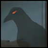
7 - shadow harpies
8 - blue bg
9 - white bg
if you are not as puzzled as Iam, feel free to tell me your opinion.
 (Wink)")
(cause I'm planning of making a wallpaper soon)
The most popular numbers are 2,4 and 9 so far. Thank you all!
Related content


Comments: 39

Out of all of these, I think I prefer #4 the best.
👍: 0 ⏩: 0


Congratulations! Is The Kind Of Work What I Cn Really Enjoy!
Specificaly For Mai Kojaku There! She Is Pretty Nice, I Found A Comentary From You In An Old Image Drawing By Me And Colored By Zarsh009 About Her. I Drawing Her A Couple Of Times And One Of My OC´s Disguised Likes Her, If You Likes Take A Tour For My Page And Not Just In My Mai Kojaku´s(Valentine)Images You Are Wellcome...
Thanks You A Lot For Sharing Your Images With Us In The Comunity!
👍: 0 ⏩: 1

Thank u very much!!
I like Mai and I love Harpies
and My fav deck is Harpie Deck!
And you welcome!!!
👍: 0 ⏩: 1
Of Course I Likes Them Too... They Are Called Eagle Ladies In Mexico... Uy! That Is Not Right But Anyway An Harpie Lady From Yugi Oh Called In Another Way, They Can Be So Gorgeous And Sexies Anyway... Mwahahahahahahahahaha!
👍: 0 ⏩: 0

 (Smile)")
hey thanks!
'2' seems to work fine, ill make a wallpaper with that!

👍: 0 ⏩: 1

no problem ^^ 
👍: 0 ⏩: 0

sorry pou den polygrafw kai den lew leptomereies alla genika den eimai poly sta panw mou teleytaia.
Poly wraia douleia kai para poly omorfo apotelesma!
👍: 0 ⏩: 1
episkeutika tin selida sou kai diabasa pou eisai down kai pou exeis kairo na baleis kamia eikona alla den eixa ti na pw stin sigkekrimeni fasi. ipomoni, ti allo na kaneis
euxaristw gia ta comments kai fav, to sigkekrimeno pethana na to bgalw alla einai apo ta kala mou komatia.
stay strong

👍: 0 ⏩: 0

Ah... I can see why you have such hard time deciding! It's very cool to see so many versions of the picture, and they all look very nice. I personally like 2 and 9 the best. 4 is a bit bright for my taste.

👍: 0 ⏩: 1
I was told 4 was bright otherwise I wouldnt have done this.
Im planning to release a wallpaper soon. this time I'll go for '2'
thank you for your nice comments and support! 
👍: 0 ⏩: 0


OMG!!! XD WOW THIS IS VERY AMAZING I LOVE IT *0*
👍: 0 ⏩: 0

Ψηφίζω το 4. Το μαύρο background στέκει καλύτερα με τις έντονα χρωματισμένες φιγούρες, εκεί.
👍: 0 ⏩: 0

I would have to say two! Nice work tho! they fit well together!
👍: 0 ⏩: 1
hehe
2 has the harpies with less vivid colors..
I think 4 im the most impressive.
I want to make a wallpaper and I like dark wallpapers myself

👍: 0 ⏩: 1
haha. yeah...the colors are more vivd in 4.....hmmmm...yeah...four works. ")

👍: 0 ⏩: 0

bre! to pio mauro dialekses!
egw telika protimw to 2 i to 4 giati sto 1 to mastigio ginete gkri
opote pires to zonk!


👍: 0 ⏩: 1

I have to say, it hard to pick which one. All look good to me.
👍: 0 ⏩: 0

i really like the 1, and 2, but the original good too
👍: 0 ⏩: 0

I prefer the white background better as it pushes the piece out, black tone to me just is a tad bit to heavy at least for a background color.
So I prefer 9
👍: 0 ⏩: 1
thank you
but.. damn its hard to decide what's right!!
you are the second one to chose the white color!
👍: 0 ⏩: 1
Well im torn between 9 and 8 actually. Your welcome
👍: 0 ⏩: 0

xexe thanks!
to 2 einai to authentiko pou ekana.
to 4 einai i deuteri epilogi mou..
opote.. mauro background kai ola mia xara, thanks kai pali!

👍: 0 ⏩: 0

For me, the original (4) is the best, with no doubt!
But, if I were choose a different from the original, I would choose the last one (9).


👍: 0 ⏩: 1
so its the same colours..
either black or white background..
interesting!
lol! thanks!
👍: 0 ⏩: 1
You're welcome!!!
The colors of the original drawing are perfect, regardless of the colour of the background!!!

👍: 0 ⏩: 0