HOME | DD
 VulnePro — Lavess SoSo Mirari 0 FOIL

Published: 2010-06-09 08:13:23 +0000 UTC; Views: 12527; Favourites: 293; Downloads: 355
Redirect to original
Description
The FULL 4K PNG 400dpi resolution illustration is available on my Patreon's 5 dollar tier (along with quite a lot of other works at full res exclusively to my Patreon): www.patreon.com/posts/full-res…Slightly delayed due to epic quest to capture pirate kittens. Yar! XD Yes, spent the day wrangling pirate kittens... on a boat... no less. OK, the boat was on land but still a boat, HA!
OK, this one has been a long time coming. Most likely one of my most complex (if not THE most) TKP FOILs I've created so far; the cubist-esque fractal beast Mirari 0. This is actually the 2nd pass on this idea as I have had a cubist FOIL (and have done cubist inspired sendai before as well) in mind from the very beginning of Theos's inception.
Sometime around 2000-2001 I had a notion of a marquee FOIL being cubist themed and a few years later I began the first pass (never posted though I probably should have, it was well before the pseudo cubist stuff in the Transformers movies). That first pass just never clicked with me so I shelved it. Well this current attempt really came together rather quickly, it just flowed.
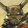
Lavess SoSo Mirai 0
Combat Cavalry FOIL late 4th generation.
(The word “mirari” was an ancient word for a fantastic wish-granting artifact, tapping into its wielder's desires and making them real. Latin root of mirror and miracle)
The Lavess SoSo Mirari 0 is completely custom machine, there are no mass produced versions. This visually outrageous beast is a one of a kind. The machine was built for Indus's ace pilot Saa Katsual. The Mirari 0 is a visual personification of Ordo ab Chao (Order out of Chaos) with it's highly complex fractal pattern breaking surfaces. Lavess SoSo FOILs are typically custom built, one off, machines. Thus far Lavess SoSo has yet to build a mass produced model although anything is possible.
Saa ends up becoming the primary rival of Endial Koh, TKP's central protagonist, so I had wanted Saa to have a rather "different" FOIL from the get go. Attempting a design with a cubist theme (of course not true cubism, this is the TKP setting afterall) seemed like an interesting idea to pursue.
I expect this will be a work in progress to some degree so I consider this more proof of concept than anything. I'm very happy with the result so far though. My goal was to make sure it looked cubist-esque, looked like a FOIL, and have some sense of visual flow, no matter how chaotic... and maintain my sanity XD
hmmm...
Successful, or not, it gets the idea across of a highly fractal cubist themed FOIL. The result has a rather aggressive aesthetic.
Digital paint conversion, in CS3, of a pencil thumbnail. The light star field BG is from a copyright free collection of illustrations book I have, it seemed apt for this one. The original FOIL thumb is here: fav.me/d2dkv25 Middle top. I rather liked the silhouette and took it from there.
Well, this one out of the way (for now) so more to come
 (Smile)")
Cheers!
Related content


Comments: 71


👍: 0 ⏩: 0

Do you ever worry about making your mechs complex to the point that they are difficult to draw again in an accurate manner? Like if you wanted it in a comic or something.
👍: 0 ⏩: 1

That's an excellent question and certainly something to consider depending on how much you personally will be redrawing a design.
The answer will depend on what I had in mind. For this one I totally looked at it as "proof of concept" and it was always intended to be a 3D asset in an animated series. You can get wilder with 3D but my approach to designing this was purely to let my imagination run wild and see how far I could push it as an illustration completely by hand. Being The FOILs were always intended to be realized as 3D I didn't hold back on seeing where my mind could go with their design so I hope that gives a clear answer as to the intended medium if they went to actual production.
Currently I am working on something where I will be drawing stuff like this regularly and, yes, it's not as complex as this but I still am creating unique and challenging (to my own abilities to realize them) designs
Again great question and something one should always consider when approaching stuff like this.
👍: 0 ⏩: 0

Awesome these mechas you're making!
I love it's head design and the body shape... and these personal descriptions!
Great job!

👍: 0 ⏩: 1
My thanks, I appreciate it
👍: 0 ⏩: 0

")

Thanks a ton man, glad you dig it
👍: 0 ⏩: 0

woow...i'm honored to know you
your artwork is awesome!!! i'm fall in love with it!
keep working great!
👍: 0 ⏩: 0

so great mate!
besides digging all the details and shapes i especially like whats going on in the hip area! these leg joints are so delicious!
👍: 0 ⏩: 1
Thanks again Adam, glad you dig this guy
👍: 0 ⏩: 1
yeah you mentioned your cubism background once
the aggression in this one is strong
👍: 0 ⏩: 0


I really admire your depth of insight into your own work. You know exactly how to describe it in words just as much as create it visually.
I adore this FOIL. Can't wait for more.
👍: 0 ⏩: 2
My thanks for the kind words, I really appreciate it man!
Much of this stuff is pretty well thought out before I even begin the process of visually exploring it so it's easy enough to describe it in the posts. Much of TKP is planned out and written in notes and screenplay form. So, though I won't give away the finer details of the plot, of course, I will happily share with you guys as many peeks into the setting as I can
👍: 0 ⏩: 1
That's a very good strategy. And, of course, sharing details probably helps you to develop your ideas as well. At least, that's how it is with me when I'm starting to formulate my ideas for a piece of writing.
But yeah man, no hard feelings if you don't have time for comments in my opinion. With how long it takes a lot of the best artists on dA to complete their works I can see how you wouldn't have much time.
Also, I haven't been around much for the past few months so I'm not sure if you do this or not, but do you think you could manage posting a time estimate on how long it takes you to complete these pictures?
Its not really important, but its really fun knowing how long it takes for people to finish such awesome artwork.
👍: 0 ⏩: 1
The time it can take varies depending. Being these are my own original designs I often will work on them in a more casual pace and allow myself some breathing room to really explore the ideas. This one, in particular, actually went pretty fast so it was probably a few days of work (not non-stop but more or less working on it for several days off and on). Sometimes a design just pour out rather fast, sometimes I will work on them in spurts, again due to this being original work with no real looming deadlines.
If I have a deadline though, I always work with speed to make those deadlines and retain the same quality if reasonably possible to do so.
👍: 0 ⏩: 0
I also adore how passionate you are about your work haha. Your comments are just as much, if not more, filled with you as they are with your fans.
Take care!
👍: 0 ⏩: 1
Again thanks
Still I plan to do the best I can  (Wink)")
Best!
👍: 0 ⏩: 0

Now that's a comparison I would have never expected
That was a great show but didn't influence anything in regard to designing this. Eureka Seven did have some interesting designs though.
I can't think of too many mecha designs that ever came close to attempting some visual take on cubism. The only immediate things that come to mind are the Deceptacon designs from the live action Transformer movies and, personally, I didn't feel they flowed too well visually. And also the design of the main "Frankenstein" mecha from Argento Soma had a decidedly cubist/futurist vibe (that one had a really nice look to it though).
👍: 0 ⏩: 0

You really pushed your boundaries with this one. This has to be the best FOIL I have yet seen from your gallery.
Keep it up man!
👍: 0 ⏩: 1
Thanks man
There is certainly more work to come
👍: 0 ⏩: 0


Love it, love it, LOVE IT! I especially like your use of the background gradient. You're also making some changes in your overall design elements - most cool!
👍: 0 ⏩: 1
Big thanks Newton, I appreciate the kind words
👍: 0 ⏩: 1
Mike:
You've definitely created a set of visual "rules" for the FOILs. They stand out from any other mecha designs as purely your own! This one I'm particularly partial to because the detailing makes me think of Mamoru Ito's detail work on the Man-Machines of "Gaia Gear." I assume you've seen his work - I don't know where he is now, but he took the Gundam UC styling and projected it 200 years into the future of the milieu. To say I'm impressed with your work is an understatement; that said, I'm eager to see what new twists you incorporate into the FOIL designs as time goes on.
I'll stop gushing now - keep it up, bro!
👍: 0 ⏩: 0

The cubist mecha thing is fascinating. I can see what you mean about it not being true cubism, but there are definitely points in the design where the conventional forms and patterns of mecha design break down into something more fractured and abstract and a cubist quality emerges.
👍: 0 ⏩: 1
Huge thanks for the observations
👍: 0 ⏩: 0

Amazing mecha design!!! Looks like a fusion between an Armored Core and Zone Of The Enders! ^^
👍: 0 ⏩: 1
Thank you, I appreciate the kind words
👍: 0 ⏩: 0
very nice feel. it does stand out among the FOILs.
👍: 0 ⏩: 1
My thanks man, indeed it does stand apart
👍: 0 ⏩: 1

drawing this from another angle seems like it would be.... difficult xD
👍: 0 ⏩: 1
LOL Yeah this thing is a monster of angles and planes so it would be a pain in the ass. This is why it's a proof of concept piece for the design. If TKP went into production, as an animated series, the FOILs would likely be cell shaded 3D so this is really intended to be done in 3D at some point. I expect the final design to change but this illustration here does what's it's supposed to, get the idea across
👍: 0 ⏩: 1
ahah, yeah 3d is starting to be the norm it seems, but yeah, it totally gets the idea across xD
👍: 0 ⏩: 0


I dig the new angular look. Makes sense as a high-end custom model. But still unmistakably a FOIL!
The etymology of the Mirari concept is fascinating as well.
👍: 0 ⏩: 1
Thanks a ton Rob, I appreciate it man
As to the name, this one actually does have a basis in established meaning, however in the TKP setting often naming conventions don't track with any current sense today. This has to do with the fact that humanity's connection to it's history is rather fractured and broken, like a jigsaw puzzle with tons of missing pieces.
👍: 0 ⏩: 1
I appreciated that fractured history aspect in your earlier FOIL comments as well.
In a way, the cubist inspired design has an effect somewhat similar to "dazzle" style camouflage. Sort of intentionally disorienting for an attacker. By the time you can draw a bead, your ass is iced!
👍: 0 ⏩: 1
| Next =>