HOME | DD
 wakingsparrow — Jason stage II
by-nc-nd
wakingsparrow — Jason stage II
by-nc-nd

Published: 2010-07-30 23:56:10 +0000 UTC; Views: 803; Favourites: 17; Downloads: 20
Redirect to original
Description
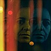
I'm still trying to figure out the background (not my strong point, by any means) for this portrait, but I think I might be about half way done. Okay more like half way done with the face and 1/3 done with the rest...Opinions? I really suck at backgrounds, other wise I wouldn't usually be a bother and post a painting halfway through
Related content


Comments: 9

I love it - it's brilliant! what else are you adding?
👍: 0 ⏩: 0

honestly if you kept the background like that I would think it would look cool. But if you want it to look as refined as the figure I would say that you could finish that cool design stained glass look behind him and it would also look good.
👍: 0 ⏩: 0

wait that was not the foil party painting..was it??
👍: 0 ⏩: 0
i see greens and blues contrasting the warms... o_O
foil party freakout
awsome work
👍: 0 ⏩: 0


maybe some green blues to contrast the orange values in the face? im a fan of gradients personally
its very eye catching, what medium are you using?
👍: 0 ⏩: 1

I'm using oils, so I've been trying to give them some time to dry (any failing at trying because I want to keep messing with it).
I agree with the green blues as well. I was trying to go for it around the head, but the paint was too wet and it ended up muddy.
Thanks for the advice!
")
👍: 0 ⏩: 1
nooo probs, some thin layers might be nice too
 (Smile)")
👍: 0 ⏩: 0