HOME | DD
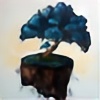 waterhealing — fake hope's colony

Published: 2012-06-04 10:30:30 +0000 UTC; Views: 640; Favourites: 15; Downloads: 9
Redirect to original
Description
phew ! finally i found a camera to use it ! although ,it is not so good ! but it works ! when i painted this piece i was very upset ! because that day everyone was annoying me ! and they just wanted to fight me because of my personality ! and through this i found peace with all emotions which almost had destroyed me ! i found peace ! i went towards light ! i realized that if there is life ,light would be exist ! this character represents living for and empty hope (most of times this hope would be love ) . sometimes love becomes a dreaded painful curse .... this lady found love in a negative hopeless place .. the flower on top of her hair is that love .. she is a little bit of green ..that represents living for that hope sleeping with that fake hope .....you sometimes live with that hope and you do know it is a lie ! the lady shows her flower to attract her lover ! she waits with her fake hope ..... actually when i painted this painting i was very sad .. but if we think about the balance of universe ..we realize that butterflies are attracted by flowers ..so the butterflies come to her flower ....the butterflies will love her they will save her ..you can see that the butterflies are made of light ...they will save her from her darkness ... they will die but their molecules will remain around her ...she needed to be loved by a human ! at first she didnt see the light around her ..she didnt realize that she is surrounded with light ...guys! most of times we are surrounded with light but unfortunately we just see the darkness ....... at the end i want to tell you FIND YOUR INNER BEAUTY ! FIND PEACE !


 (NOTE : i do not like this one too much :\ )
 i do not like the description ...i may change it in future !
and please tell me the weak points of this painting .
the photo is fuzzy :\
and i will tell you more about this piece if you ask me ...that would be great if you open a conversation XD
P.S. : i am looking forward to getting a good camera to take a photo of it ! so if i have that camera i will change the photo..because i am sad because this piece is not so good ... and the camera ruined it more


 !
! oil on canvas
Related content
Comments: 17

i love the colors you've used here. The dark energetic brush strokes with that spot color really helps keep everything not over bearing for the viewer.
my only critique would be to suggest to focus on developing your human figures more. don't be afraid to use a photo on DA for a reference because theres many of those available for peoples use ^_^
👍: 0 ⏩: 1

thank you dear !
hell yeah ! human anatomy ! yeah ,i shall ! but i am too lazy to practice XD ! and if yo noticed ,her arms are too small for the body XD ....at first i wanted her arms to be thin ...but when i finished i said WTF ! but at the end i realized a lot from this painting !and i did learn from my mistakes !i got a new painting .... when i show it here ,i will let you know ^_^ ...
👍: 0 ⏩: 1

hell yeah ! human anatomy ! yeah ,i shall ! but i am too lazy to practice XD
awe, you need to get over that lazy bone and dive into it and try to advance your skill level :3
👍: 0 ⏩: 1

yeah ! someday i will face the human anatomy ! XD ! i thought about what you told me ! and i will have an art class for my holiday ! i guess i will start from tomorrow :3 ..
P.S. : the books that you recommended for me were very helpful ! my cousin will bring me one of them ...because the post will cost me 100$ and that is a lot for me ...she will bring me "drawing on the right side of the brain" as well .
👍: 0 ⏩: 0

This a beautiful piece, it's just as expressive as your emotions. I think the camera did a fine job 

If the camera is giving you problems, would you happen to have any computer software to help adjust the picture?
👍: 0 ⏩: 1

i am very glad you like it ! 
👍: 0 ⏩: 1

Send it over ^_^ I'd love to read it once you can get a hold of it.
👍: 0 ⏩: 1

i will send it soon ! 
i will submit three new paintings as well .
👍: 0 ⏩: 0

It's lovely, hun and you have a great concept behind it. I'm glad you were able to help yourself with the piece even if you don't like how it turned out that much. Always remember that even if a piece doesn't come out the way you wanted it to, you still learn a lot from it and you can apply that to the next piece to make it even better. So no piece is ever truly a failure. (:
My critique is with the butterflies as I don't think they illustrate bringing the light of life to her. Their color looks too much like the darkness around her. Perhaps some bright colors trailing behind them would illustrate that better? I think this is a great concept for you to continue exploring as you could really do some neat stuff with it. ^~^
👍: 0 ⏩: 1

oh.. thank you dear ! well there is some white behind them ! but the photo is not good enough to show that ! 


👍: 0 ⏩: 1

You're welcome, hun! I figured part of that was probably the photograph quality haha but I wasn't sure. LOL try photographing it without the flash in bright sunlight. (:
👍: 0 ⏩: 1

will try ! and now i have a painting which is a little bit of ditailed ! and the photos can not show the details ! what should i do !
👍: 0 ⏩: 1

Really the best way to photograph things is with full, natural sunlight. If you can get it outside and then lay it at an angle from the sun and photograph it with the flash, you can get a really good shot that way. You might have to pop it in Photoshop and adjust the contrast but it works really well.
👍: 0 ⏩: 1

will try it ! ah, BTW i started drawing with soft pastels ....working with it is so fun 
👍: 0 ⏩: 1

Okay! Pastels are my favorite. XD <3
👍: 0 ⏩: 1

i know ! they are awsome XD !
👍: 0 ⏩: 1


